Apple Watch Series 2 Review
Update: You can now read our Apple Watch series 3 review!
Intro
Apple has a well-deserved reputation for helping to define our expectations for what are still, to many shoppers, new product types. The iPhone showed both consumers and other handset manufacturers alike how much untapped potential there was in the burgeoning smartphone market, and the iPad helped tablets move away from their characterization as either under-equipped laptops or blown-up phones to a novel, useful form factor in its own right.
After those milestones, it was only understandable that all eyes were on Apple as the smartwatch movement began to take shape. Companies like Pebble started getting that ball rolling, and by early 2014, smartwatches felt like they were on the brink of going mainstream, with Android Wear about to make its debut – so where was Apple's eagerly awaited effort?
We had to be patient, and confirmation of the Apple Watch didn't land until the waning days of summer 2014. Even then, it was still a bit of a tease – Apple may have announced its inaugural wearable product, but it wouldn't be until the spring of 2015 that users could actually pick up an Apple Watch for themselves. But when that day finally arrived, Apple quickly picked up a sizable chunk of the smartwatch market with an attractive, well-executed series of models offering a variety of material types, sizes, and style options.
But for all the Apple Watch did well, ever since its debut we've been wondering, “what's next?” After all, that odd pre-announcement strategy sure felt like Apple was rushing to get its wearable to market, and maybe we'd see a very different Watch once Apple had some time to sit back and see how consumers responded, experiment some more with design and construction techniques, and reflect upon what it learned from this first-gen launch.
It took well over another year, but last month we finally saw the fruits of those efforts, with the release of the new Apple Watch Series 2. It's far from a back-to-the-drawing-board upgrade, and if this were an iPhone, we'd be calling it the Apple Watch S, but with a smattering of new features, some upgraded watch software, and a fresh new iPhone to pair it with, is this the Apple Watch sequel we've been waiting for, or a case of too little, too late? Let's take a look at the new Apple Watch Series 2.
In the box:
- Apple Watch Series 2 (for this review, the 38mm Silver Aluminum Case with White Sport Band)
- Pair of Sport Bands (S/M and M/L)
- Magnetic wireless charger
- AC adapter
- How-to-guide
- Safety/warranty slip
Design
Upgrades await within, but that's one familiar-looking body
In the months leading up to the launch of Apple's second-get Watch, rumors furiously speculated about what sort of look we might get. Would Apple add new hardware like a camera to its wearable? What about changing up the design with something like a curved display, or adding new controls to the existing button and crown?
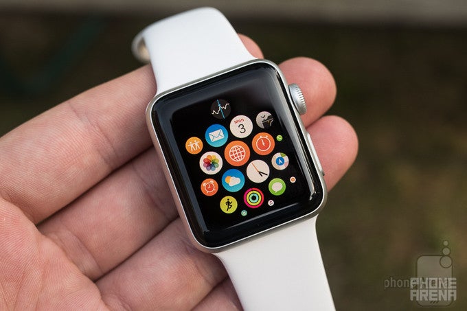
Well, after all that noise, we're coming away with an Apple Watch Series 2 that's a near spitting image of the original; unless you plan on flipping one over and checking the text surrounding the Watch's optical heart-rate sensors, you'd be hard-pressed to tell this one apart from the first model.

That may upset Apple fans who were looking to see the company take more risks with its wearable's design, but really it speaks to Apple's confidence that it was headed down the right path the first time around; sometimes you need to take a few stabs before you find a look that really resonates (look no further than Samsung's early Galaxy Gear watches), but if you do manage to come up with a hit right out of the gate, maybe there's something to be said for staying the course.
None of this is to say that Apple's new smartwatch is a pure rehash of the first-gen model, but the manufacturer has been positively conservative in the upgrades it's decided to employ. And while there are some surprises lurking within, there's little in the new Apple Watch's design that betrays its upgraded internals.
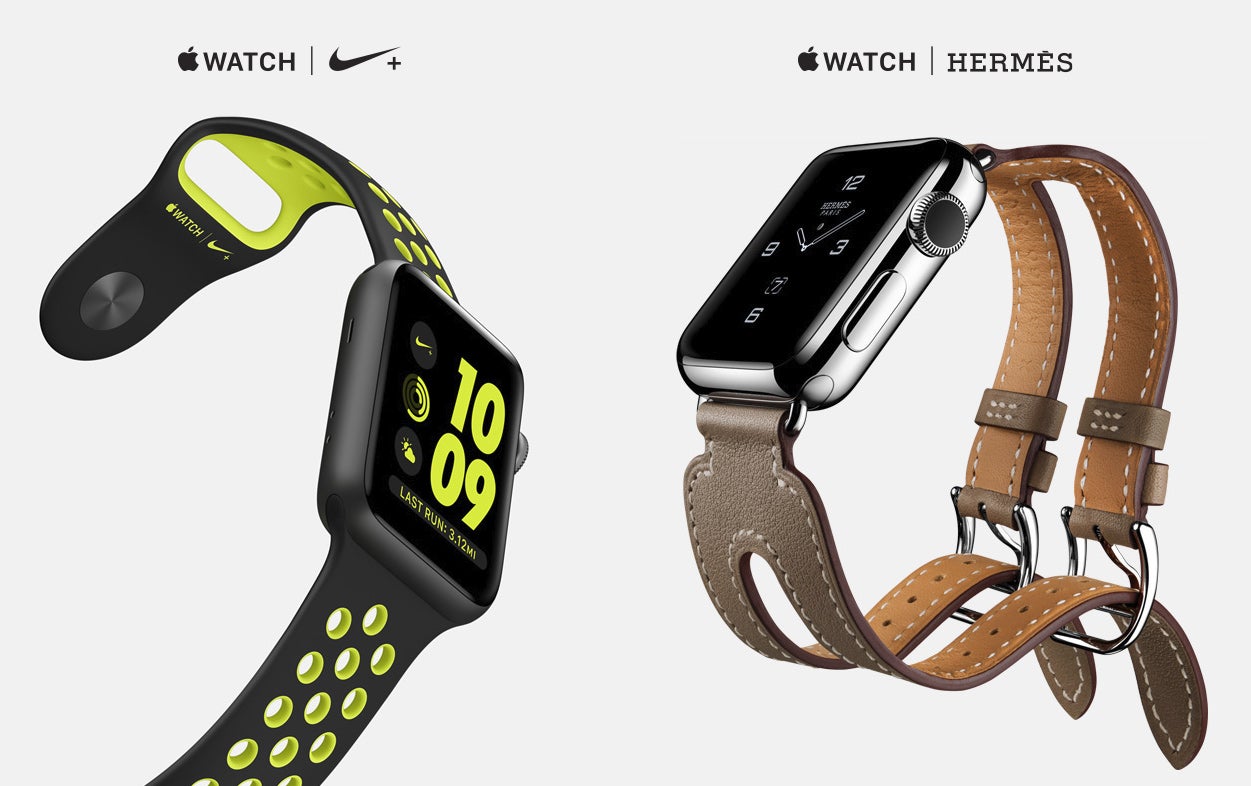
Maybe the clearest indication that you're dealing with a new Apple Watch comes in the form of some new Series 2-only variants. For instance, there's the new Apple Watch Nike+ with its perforated strap and multi-tone styling. And the high-end Apple Watch Edition graduates from a conspicuously showy gold body to one crafted from extra-strong ceramic. There's even the Apple Watch Hermès, with its designer straps and buckles. But for all these variants, the basic look of the Apple Watch remains more or less unchanged.
What changes to that basic look that can be discerned are almost too small to spot, which is good because they may just be steps in the wrong direction: while the face of the new Apple Watch retains the same dimensions as the first-gen model, the watch body itself grows just under a millimeter in thickness – from 10.5 to 11.4mm. And correspondingly, weight takes a step up, too, as the 38mm Watch grows from 25 to 28.2 grams, and the 42mm model from 30 to 34.2 grams. Those figures are for aluminum bodies, and will vary for steel and ceramic. Oddly, the 38mm ceramic Apple Watch is thicker than every other model, at 11.8mm.
Thankfully, the new Apple Watch doesn't really feel that bulky, despite its growth spurt. With the 38mm model we looked at, the watch's curves help it appear slim even with its objectively thicker build, and the extra weight doesn't make the smartwatch feel overly burdensome to wear. With wearables, thin is great, but if you can (smartly) do slightly thicker without ruining things in the process – well, we suppose that works, too.
Finally, we've got a functional change, that we might as well talk about in the same breath as these other external hardware updates: Apple's super-charged the Watch's water resistance, moving from protection against sweat, rain, and a quick hand-washing (though with Apple advising against full-on submersion) to rated for submersion in depths up to 50 meters. There are still all sorts of asterisks attached to that classification, though – Apple warns against the combination of water and high speeds, like you'd experience while waterskiing. But even with those concerns in mind, this is still a big upgrade to the smartwatch's durability.
Display
Apple heard your demands for a brighter screen and delivers
Arguably even more so than with a smartphone, we expect a lot from a smartwatch's display. It needs to be easily readable in all manner of environmental conditions, as usable up close as at arm's length, and convey all its information to the user without sucking dry the watch's battery in mere hours.
The OLED panel of the first-gen Apple Watch was already quite attractive, offering a screen that blended seamlessly in to the watch's glossy black face, while also proving the bold colors and sharp contrast that OLED screens are known for.
With its second-gen hardware, Apple – much like with the wearable's overall design – didn't decide to move in a drastically different direction. We've got the same resolutions as before: 272 by 340 pixels for 38mm models, and 312 by 390 pixels for 42mm variants. And just like before, the most affordable aluminum options protect their screens with Ion-X strengthened glass, while steel and fancier options – now ceramic instead of gold – get synthetic sapphire crystals.
All of this sounds like business as usual, but there is one key upgrade hitting the Watch's display: with Series 2, the screen is now noticeably brighter; Apple claims twice as bright as the original, hitting an output of 1,000 nits.
That sound likes a big deal, and truthfully it goes a long way towards helping out with daytime visibility. But it would still be nice to see more fine-grained brightness controls in Apple's software. Right now, watchOS offers only a three-way toggle between brightness levels, and there doesn't appear to be a huge difference between the middle and top spots. While that makes it harder than it should be to appreciate all this extra brightness, we didn't really have any problems with visibility during our tests.
Interface and Functionality
A maturing watchOS adds some new functionality, but still hasn't overcome old mistakes

The arrival of the new Apple Watch brings with it the latest (and for now, greatest) release of watchOS. If you're already familiar with past iterations of the software, get ready for some adjustments, as Apple's changing both how some things look and how certain tasks get done.
It used to be that to get an overview of what was going on with your favorite apps, or just to toggle between them, you'd hit up the Glance view. But with watchOS 3, Glances are replaced by a new Dock, accessed by pressing the side button on the Apple Watch. That brings up a list of both apps you've selected to permanently appear in the Dock, as well as the most recent one you've been working in. The ability to reorder and customize that list is nice, and helps users create an interface that feels tailored to their particular usage.
We also see changes coming to the system's Control Center, which picks up new features like the ability to use the Series 2 Watch's speaker to manually eject water after a quick dip. While that's easy enough to get to, other swipe-to-access screens just aren't as responsive as they need to be, and one in particular that gave us trouble was the left-right swipe to browse through available watch faces, often ignoring our inputs.
There's a big focus on health and fitness with the new watchOS – or a renewed focus, anyway – and in addition to improvements to Activity and Workouts that make exercise data easier to access, add new controls, and support sharing of accomplishments with friends, there's also stuff like the new Breathe app, encouraging users to take a break and relax throughout the day. Combined with reminders to get off your feet and stand up, we can appreciate Apple's drive to ensure its users are happy and healthy, but we imagine a lot of them will be looking for a way to disable such notifications straight away; they tended to get on our nerves, and fast.
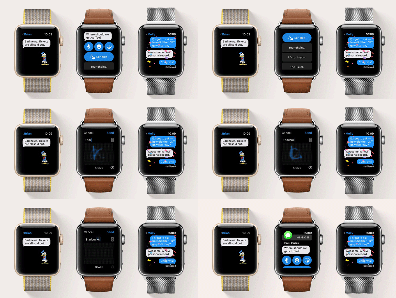
Other apps evolve to catch up with their iOS equivalents, like new support in Messages for stickers and text effects.
As a whole, the latest watchOS is easy enough to get around, and even if you get lost (a far-from-impossible situation considering you're working with such a small screen and only two hardware buttons), it's not difficult to find your way back to somewhere familiar.
Still, there's a lot of room for improvement, and one of the most frustrating things about using Watch apps is how often they refer you back to your iPhone to complete some necessary step: granting access to location data, setting up photo album preferences, and any number of other tasks that feel like they should be perfectly capable of being performed on the Watch itself. Some of this is clearly due to the privacy and permission model Apple's employed, but that doesn't make this back-and-forth implementation any less cumbersome.
Worse, sometimes there seems to be a gap in communication between the Watch and iPhone, leaving you with situations where you've completed the required steps on your smartphone, yet the Apple Watch hasn't gotten the message and sits there pointlessly waiting. Considering the limited amount of feedback you tend to get from Watch apps, and the similarly sparse options for interaction, that can prove to be a positively frustrating occurrence.
Another inconsistent hiccup in an otherwise well-done watchOS feature is the lack of a standard set of input options for text. If you're in Messages, you're set: you have your choice of dictating into the Watch's microphone for some speech-to-text action, or tracing out letters one-by-one in scribble mode. That latter options is fantastic if you're trying to keep a conversation private, or are just exhibiting common courtesy while in a public space. But try to interact with Siri, or search for a destination in Maps, and you're stuck with voice input only; there's no matching letter-by-letter pure text input system. With Siri, we get how Apple's really pushing voice interaction for its virtual assistant, but the absence of scribble text-entry in other Watch apps is confusing.
Processor and Memory
Tiny devices can be powerful, too, and the S2 delivers increased performance – but is it enough?
Apple may have stuck with a familiar design for the exterior of the Apple Watch Series 2, but there's fresh silicon powering the smartwatch within. The wearable is built around Apple's new S2 system-in-package, delivering what Apple reports to be a 50 percent increase in performance and double the graphics capabilities of the first-gen S1.
As a result, navigation through the OS and into apps is mostly brisk, though we did spot a few problem areas. Occasionally, 3D graphics would tend to stutter, and apps dealing with lots of imagery – and Maps comes to mind as a prime example of this – would experience bouts of low frame rates. Some of that may be due to the need to constantly pull data from external sources, but regardless of where the bottleneck exists, be aware: not every nook and cranny of the Watch user experience is buttery smooth and consistent.
Of all Apple's upgrades, the S2 feels like the most important to the future of Watch as a platform, and that's exemplified by Apple's introduction of the Watch Series 1 alongside the new Series 2. Series 1 is for most purposes the same as last year's model: same lower-brightness screen, same lack of GPS, same lesser degree of water protection. But it upgrades the original S1 to a new S2 package, bringing the wearable Series-2-like performance. That sure suggests to us that Apple's getting much more serious about more demanding Watch apps, and wants to make sure that its fast new hardware ends up on as many wrists as possible.
Connectivity
Don't hold your breath for a cellular-connected Apple Watch, but at least we get GPS
Like the first Apple Watch, the new model lacks its own cellular radio, and instead communicates with the world primarily through its Wi-Fi and Bluetooth systems. Both are back for Series 2, as well as the NFC transceiver used for Apple Pay.

Apple adds GPS reception to its watch
Apple uses GPS data for more than just recording your position, too, and also relies on that information to accurately calibrate things like stride length – which can then be referred to independently of making GPS readings.
There's no easy way to turn the Watch's GPS capabilities on and off to save battery life (short of disabling location permissions altogether), but thankfully its presence doesn't seem to have a pronounced and obvious deleterious effect on the wearable's stamina.
Camera
Still no built-in FaceTime camera, but remote functionality works nicely
It wasn't too long ago that rumors seemed convinced that Apple would go the path of Samsung during its early smartwatch days and try to squeeze a camera into the Watch's hardware – maybe a front-facer for some FaceTime action?
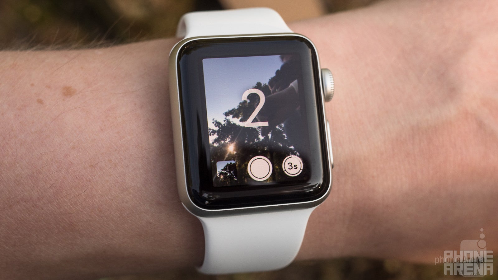
While that clearly did not happen, the Apple Watch continues to be an occasionally useful accessory for your iPhone-driven photography exploits, letting you use the smartwatch as a remote viewfinder for the phone's camera.
You can view the action in real time, control zoom, and set focal points – just like on the iPhone itself. The video preview is clean-looking and not particularly laggy, making the feature a lot of fun to use. The only real downside is its limited usefulness, though it's still a nice feature to have when you need it.
Multimedia
All ready to provide the tunes to keep your workout going
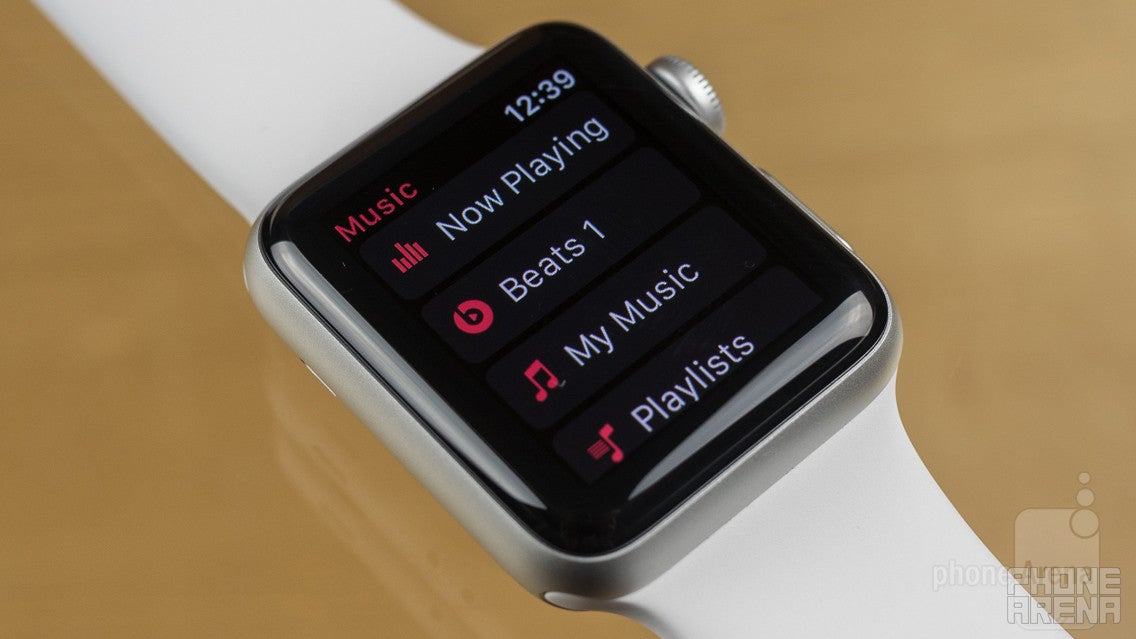
You may not be holding your Apple Watch up to your face to enjoy the latest YouTube clips, but there's still a nice spread of multimedia support available for the platform. Music controls let you direct the action on your tethered iPhone, or you can sync playlists to the Apple Watch itself. Combine that with a pair of Bluetooth headphones, and you're all ready to enjoy some autonomous tunes. It's still unfortunate that Apple won't let you play music through the Watch's own speaker.
And just as you can take photos remotely with the Watch's camera app, you can also view your pics on the Watch's own screen. Like so many other apps, this one suffers from pull-out-your-iPhone-itis (why can't you choose the galleries to view right on the Watch itself?). And while you'd think that the Watch's compact display would work well with some extreme zoom controls, letting you blow up little details until they're big enough to be seen, Apple severely limits just how close you can get. We'd guess the company is trying to save storage space, but then why not give us a full-res option?
Call Quality
For a tiny speakerphone, calls on the Apple Watch really aren't that bad
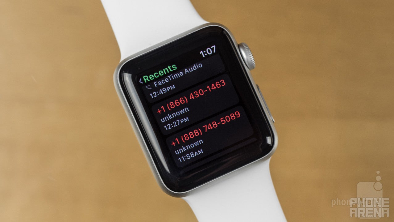
It's probably not the first use case that comes to mind when you're thinking about smartwatches, but the Apple Watch Series 2 has a microphone and has a speaker so... why not make some voice calls with it?
And indeed, just like you were able to with the first-gen model, you can do just that, either through your phone and over the standard voice network, or with another Apple user through FaceTime Audio. Since you're essentially on speakerphone the whole time, just how intelligible your call ends up is going to be hugely dependent on the environment you're calling from, but the speaker is decently loud, and in our tests we were able to hold calls without significant problems.
Battery Life
Apple burns any gains from a larger battery on increased power demands
Apple first launched its Watch with the promise of eighteen-hour battery life. Now we've got this new hardware with a more advanced processor, brighter screen, and GPS reception, and Apple says that users can expect … to still get eighteen hours of use between charges.
You won't find official numbers from Apple, but teardowns of the fist-gen 38mm Watch revealed a 0.78 Wh battery, while the Series 2 has a higher-capacity 1.03 Wh component – that's a noteworthy 32-percent improvement. But as Apple's own calculations would suggest, you should expect essentially the entirety of those gains to be eaten up by higher power demands.
In our real-world tests, the Apple Watch never ran out of charge during a day of usage, but we have to admit that we popped it back on its magnetically attaching wireless charging disc midway through the day once or twice when planning to be out particularly late. That was probably playing it safe more than anything, but even just six or seven hours of casual usage (at peak brightness) can cause the wearable's charge to drop below 50 percent – which doesn't bode well for Apple's eighteen-hour claim.
Worst-case situation: at the very end of a day when you're burning the candle at both ends you may be forced to engage the Watch's Power Reserve mode, turning off access to apps and extended features and reducing the smartwatch to a simple timepiece in an effort to keep the lights on. But that's an extreme measure, and it's not too difficult to get a solid day's operation our of the Watch without resorting to such measures.
But make no mistakes: this is no charge-every-few days wearable. If you're taking advantage of even just a few of the Apple Watch's interactive features, you should expect to be charging it every night.
Conclusion
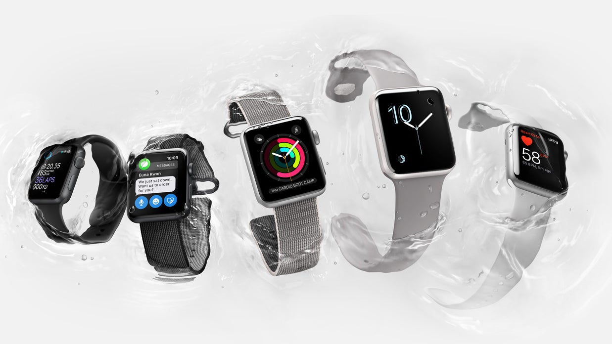
In a lot of ways, the Apple Watch Series 2 feels a lot like an Apple Watch 1.5 – and we already made the comparison to one of Apple's S-year iPhone upgrades. While the user experience has matured since the first-gen model, most of that's due to the upgraded watchOS 3.0 software, meaning that even old Apple Watch units are able to enjoy the same benefits.
So if we're to evaluate the new Apple Watch based on its hardware, we're looking at a very specific feature set: the new, faster S2 processor, brighter display, GPS reception, and a fully waterproof design. The S2 is a really nice improvement, even if we're already wishing it were just a bit more powerful. The GPS and waterproofing are nice to have, too, but they seem much more focused on catering to athletes than general users – and remember, the original Apple Watch was already splash-proof, just not equipped for something like swimming while wearing the smartwatch .
If the idea of an insanely powerful fitness tracker is right up your alley, the Apple Watch Series 2 probably sounds like a smart purchase – and with pricing starting at around $370, it very well may be.
But if you're already going to have your iPhone on you most of the time, anyway (negating the benefit of the GPS), and you can live with the more restrained water-resistance of the first-gen wearable, you might want to think twice about paying full price for the new hardware.
Instead, a tempting alternative is the Apple Watch Series 1 – basically the original Apple Watch hardware, but with the new S2 processor. Sure, it doesn't have the twice-as-bright screen as the Series 2, but it also costs $100 less. And at the price points we're talking about, that's a really significant discount. Is that $100 worth the display upgrade and some fitness-focused features? We love having options, but this one's making our buying decision a lot more complicated.
Ultimately, we'd suggest taking a cold, hard look at exactly which features you need. We know, the desire to have the latest and greatest tech is pretty powerful (especially in Apple-land), but if you don't really need each and every one of the Apple Watch Series 2's quite limited list of hardware improvements, it might be smarter to go for the Series 1 middle ground.
On the flip side, if stand-alone GPS and some pretty robust waterproofing are on your list of must-have features, you won't be disappointed by Apple's next-gen wearable.
Update: You can now read our Apple Watch series 3 review!





Things that are NOT allowed: