ASUS ZenWatch 3 Review
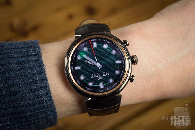
Introduction
Have smartwatches reached an impasse? We've seen what the technology can do, and watched plenty of big-name mobile manufacturers release wearables, but lately it's felt like the time of the big smartwatch experiment has come and gone. Is it still possible for a smartwatch to generate consumer excitement?
Well, right now we're on the cusp of another new chapter in wearables, as Android Wear 2.0 gets ready to make its debut on commercially available hardware. And while that's sure to be plenty exciting on its own, before we get there we've got one more Android Wear 1.5 model from late last year to check out, as we take a look at the newest generation of the ASUS smartwatch lineup, the circular-screened ZenWatch 3.
The package contains:
- ZenWatch 3
- Magnetic charging dock
- USB charging adapter
- Charging stand
- Intro guide
- Warranty card
Design
A smart, attractive design … that still feels quite chunky
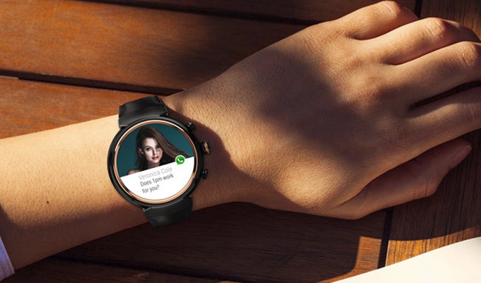
Arguably more so than is the case with phones, a smartwatch can live or die based on the quality of its design. For its first two models, ASUS went with standard rectangular watch faces, but still took the time to dress them up with curved glass, polished metal, and a body that did its best to look refined and professional.
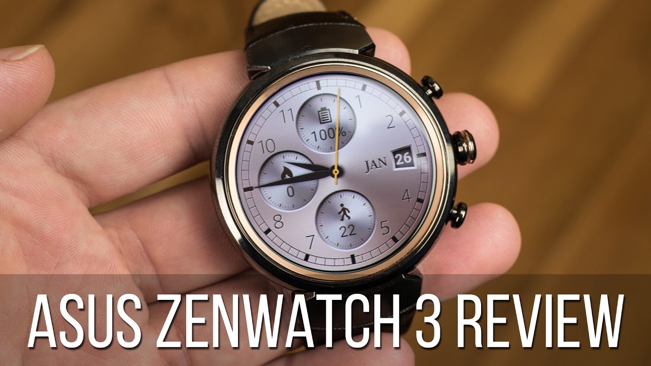
With the ZenWatch 3, we see ASUS trying something new, while still retaining certain elements of that original style. The biggest change by far is the move to a circular screen, and considering the extent to which such models seem to dominate Android Wear sales, it's almost a little surprising it's taken ASUS this long to come around.
But even with that new shape, there's ample aesthetic hold-over here. One key element is the pairing of multiple metallic colors: silver and dark gray juxtapose against brassy, golden hues that give the watch a striking look. The exact match-ups will vary based on which of the three color configurations you go with, but none are bland, single-toned offerings.

Even though it doesn't look particularly rugged, the ZenWatch 3 still enjoys an IP67 rating against dust and water ingress.
Maybe the worst part of the ZenWatch 3's design is its strap. While replaceable, the strap connects to the watch at an awkward obtuse angle that seems to suggest it's built for those with very large wrists; the strap juts out the side, rather than following the contours of your arm. There's also an issue with the bands that are intended to hold the loose end of the strap in place; rather than do so, they have a tendency to slide out of place, rendering them quite useless. That's all a shame because the strap looks quite nice – it's just a bit lacking in terms of refinement and functionality.
Display
Bright, round, and with nary a trace of a flat tire to be found
ASUS is making a big break from tradition with its move to a circular screen, and not everyone's going to feel about that the same way. On one hand, the round display on the ZenWatch 3 makes the wearable look substantially more like a standard wristwatch, possibly helping to improve user acceptance. That said, a square screen is arguably a better use of surface area (at least in terms of UI design), and we're sure the old look still has plenty of fans.
Even with that big change, the display still has a lot in common with the panel from the ZW2: we're looking at another AMOLED component and while resolution is higher here, differences in screen size (here, giving us a 1.39-inch display) mean that pixel density is very much in the same ballpark – 278 pixels per inch with the ZW2, vs. 287 for the ZW3.
By default, the screen is nice and bright, with five brightness levels and an auto mode, and you'll also find a brightness-boost option available if you're still struggling to see things in really sunny outdoor conditions.
In order to get the most out of your watch, you may want to keep the ZenWatch 3's always-on mode engaged. That reduces watch face complexity when you're not actively interacting with the watch (removing the second hand and dimming the screen, for instance), while still letting you see the time. Even with the efficiency of AMOLED, though, that still takes a big toll on battery life, and you may want to disable it to maximize time between charges.
Interface and Functionality
While we can't wait for Android Wear 2.0, even this older interface has a few tricks left
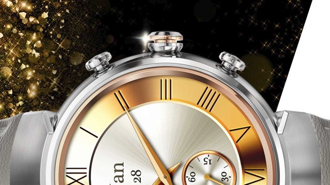
Android Wear is still Android Wear – at least until version 2.0 lands – but there's more to using the ZenWatch 3 than you might be familiar with if you're coming from the ZenWatch 2.
ASUS improves the watch's interface by adding some new hardware buttons. While the last-gen model just had a crown that acted as a screen-on toggle, the ZenWatch 3 comes armed with a trio of push-button inputs: one in the crown position, and two additional buttons above and below.
By default, the top button launches the ASUS ZenFit app, the bottom engages the power-saving Eco Mode, and the crown takes you back to the watch face. While the crown functionality is set, the top and bottom buttons are totally configurable, letting them quick-launch the apps of your choice. That's a really nice extra convenience, and helps you squeeze a little extra functionality out of the smartwatch.
Processor and Memory
The ZenWatch 3 is far from hurting in terms of performance
Considering the relatively basic tasks we assign to smartwatches, they don't need a ton of power under the hood, and the ZenWatch 3 makes good use of its Snapdragon 2100 processor – one of a new generation developed expressly for wearables. Certainly, using the watch felt swift enough, with the only real hang-ups when we found ourselves waiting from data from the tethered phone – whether that was GPS coordinates or internet connectivity.
ASUS gives its new wearable the same memory and storage options as the ZW2, pairing 512MB RAM with 4GB flash. Unless you're storing a ton of local music, that's probably more than sufficient, and we didn't hit any problems during our testing.
Connectivity
A lack of cellular reception won't kill the ZenWatch 3
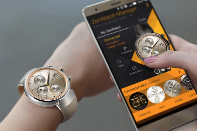
Like plenty of other recent wearables, the ZenWatch 3 provides both phone-tethered Bluetooth connectivity, as well as the option for direct Wi-Fi where available, bypassing the phone.
Autonomous cellular support might make for a nice extra, but that also means added cost, added size, and most likely decreased battery life. We'd love to have the option to consider (or at least put the cellular and non-cellular editions head-to-head), but it's hard to blame ASUS for choosing the path of least resistance and only giving us the connectivity options it did.
Battery
ASUS tries so hard, but the ZenWatch 3 struggles to make it through a heavy-use day
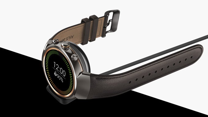
Phones, we're used to charging all the time, but watches? Standard watch battery maintenance is such an infrequent chore that we rarely consider it at all, but smartwatches turn that situation on its head, making power requirements a first-line question when evaluating watch models.
The 340mAh battery in the ZenWatch 3 is a bit smaller than on the ZW2 – no doubt a consequence of the new shape – but the change of processor should decrease consumption by quite a bit. ASUS also emphasizes a “HyperCharge” mode that claims to bring the watch from a fully depleted battery to a 60-percent charge in just fifteen minutes.
Our experiences with the watch's battery life were a bit mixed. With the always-on watchface engaged, and receiving all sorts of notifications when on the ground in Las Vegas covering CES, we found the ZenWatch 3 quickly burning through its charge throughout the day. By mid-afternoon, we were switching the watch over to Eco Mode, disabling networking and turning off notifications, just to get through the rest of the day. Even still, we occasionally ran out of juice before going to bed.
That problem's compounded by fast-charging that doesn't always prove to be all it promised, either, and we've seen the watch take two-and-a-half hours to go from 15 percent to 75 percent charge. Other times, it goes from 25 to full in about an hour – it just seems really inconsistent.
If you're going light on the ZenWatch 3, maybe day-long usage won't be a problem, but what's the point of a wearable when your weighing every interaction with it on the impact that will have on remaining battery life?
Conclusion

Battery life is also a big problem for the ZenWatch 3. While you can manage it through judicious control over screen brightness and killing data connectivity, that's hardly the smartwatch experience most of us are looking for. Nightly charging we can live with, but having to strategize just to make it through the day is a little much.
ASUS sells the ZenWatch 3 direct for just about $230, much less than an Apple Watch or Huawei Watch, and less than a Samsung Gear S3. That does help a lot to make the ZenWatch 3 more attractive, but this still isn't going to be a watch for everyone. Maybe most importantly, you're definitely going to want to try the wearable on for yourself – and make sure it's not too big for you to wear comfortably – before seriously considering it as a smartwatch option.
Even then, you still have to ask yourself some hard questions about the sort of usage level you envision for the ZW3, and if you can live with battery life that might have you sweating bullets (or turning off features) in the evening hours.
Ultimately, the ZenWatch 3 shows ASUS learning a lot from its earlier models: it's both more attractive and more functional than any of its predecessors. But it's also clear that ASUS still has a bit of learning left to do; suffice it to say, we're hugely curious to see what the ZenWatch 4 will bring.




Things that are NOT allowed: