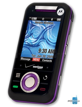
Great looking device and the slider is very smooth. I bought the silver and white versions and am very happy with it. The touch keys are simple to use and and sending messages on the qwerty is also easy. The camera, video and zoom features are better than ENV3 which I checked out in the store. The dial pad changes with the theme selected, and there are a lot of customization settings on the phone. I love that I can search for contacts with last and first name (you do have to change the contact search mode under phone settings). I am an email person, so I was able to change the chat key to launch email directly under phone settings..
I just bought this phone today. I was thinking of buying the Alias 2, but decided on this one because of the touch screen on the outside and qwerty keyboard when you slide it open. Also, I didn't like the gunmetal gray color of the Alias 2. The Rival is very easy to dial with the touch screen and text with the keyboard. The symbols and numbers light up green when you tap the Function key. It seems very user friendly. It also has a LOT of ring/alert tones to choose from. The only thing I don't particularly like is the "O" directional key on the front, but it works great! I also like the emoticons key and the fun frames for pictures :o). I have it in white and chrome, which is very attractive and modern looking.

![[deleted]](https://s-cdn.phonearena.com/build/wp/images/icons/avatar.svg)