YouTube Music update to include a carousel in Now Playing
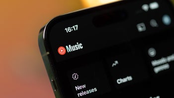
YouTube Music might have abandoned its old revamp, but it could still be working on changes to the Now Playing interface. Interestingly enough, pictures that surfaced on Reddit show a new and updated version of the music app, which promises a ton of spanking-new buttons. One of them is a carousel.
What changes can users expect with the rumored new redesign? For one, the top corner doesn’t feature “Playing from,” which was first introduced in the now-abandoned mid-November redesign. The album cover now takes up slightly more space on the interface. Plus, the rounded corners are much more prominent than before.
The video/song switcher, and overflow menu, alongside the Cast button, remain largely the same. The artist/song name is aligned left on the new interface, just like in the now-ditched YouTube Music Now Playing redesign on Android. And then, there’s the carousel.
Without a doubt, the most exciting new feature is a carousel of actions. It allows users to download, share, and save their favorite songs easily. The existing thumb up/down buttons are kept, but now they don’t appear on either end of the song name. Instead, they’re united in a separate section on the farthest left of the carousel, just below the song/artist name.
In case you missed it, the now-dumped Now Playing update, initially launched by YouTube Music for Android devices in mid-November, was ditched at the beginning of this year. Expectedly, the old design was returned to Now Playing for Android smartphones afterward.
What changes can users expect with the rumored new redesign? For one, the top corner doesn’t feature “Playing from,” which was first introduced in the now-abandoned mid-November redesign. The album cover now takes up slightly more space on the interface. Plus, the rounded corners are much more prominent than before.
Without a doubt, the most exciting new feature is a carousel of actions. It allows users to download, share, and save their favorite songs easily. The existing thumb up/down buttons are kept, but now they don’t appear on either end of the song name. Instead, they’re united in a separate section on the farthest left of the carousel, just below the song/artist name.
In case you missed it, the now-dumped Now Playing update, initially launched by YouTube Music for Android devices in mid-November, was ditched at the beginning of this year. Expectedly, the old design was returned to Now Playing for Android smartphones afterward.
There’s one thing a specific audience has been demanding for some time that’s still missing from Now Playing. We are talking about a live lyrics function, which, sadly, isn’t included in this update. In comparison, both Spotify and Apple Music apps have live lyrics. When (and if) users get to enjoy this particular extra is yet to be determined.





Things that are NOT allowed: