YouTube Music artist pages look good now

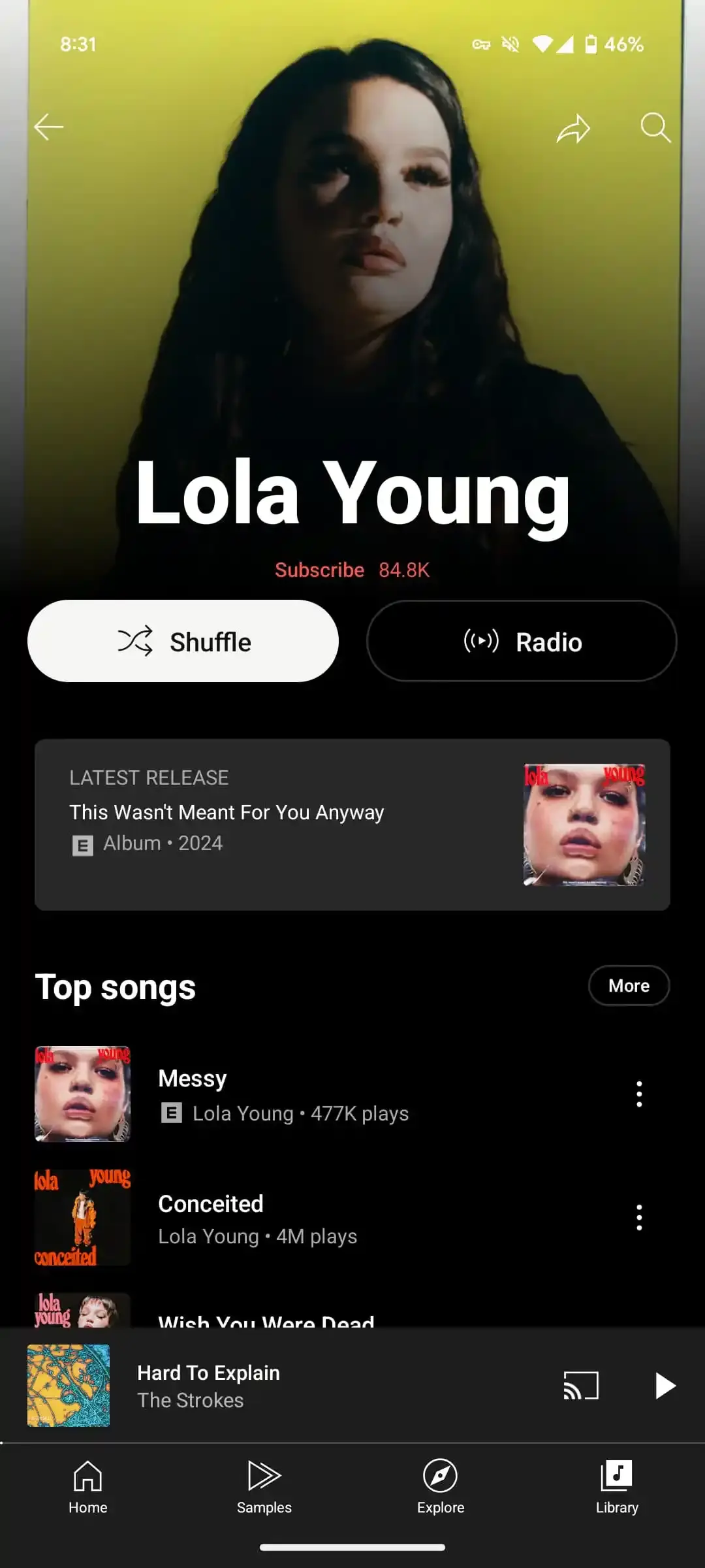
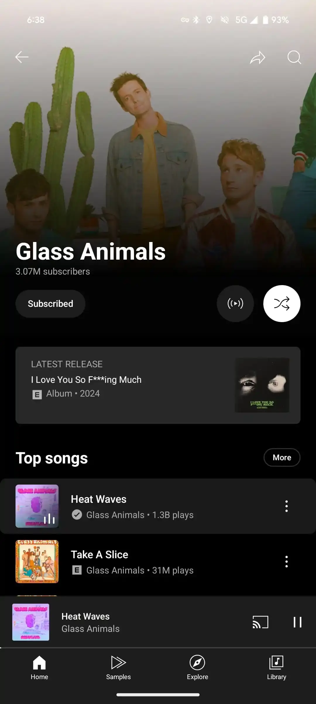
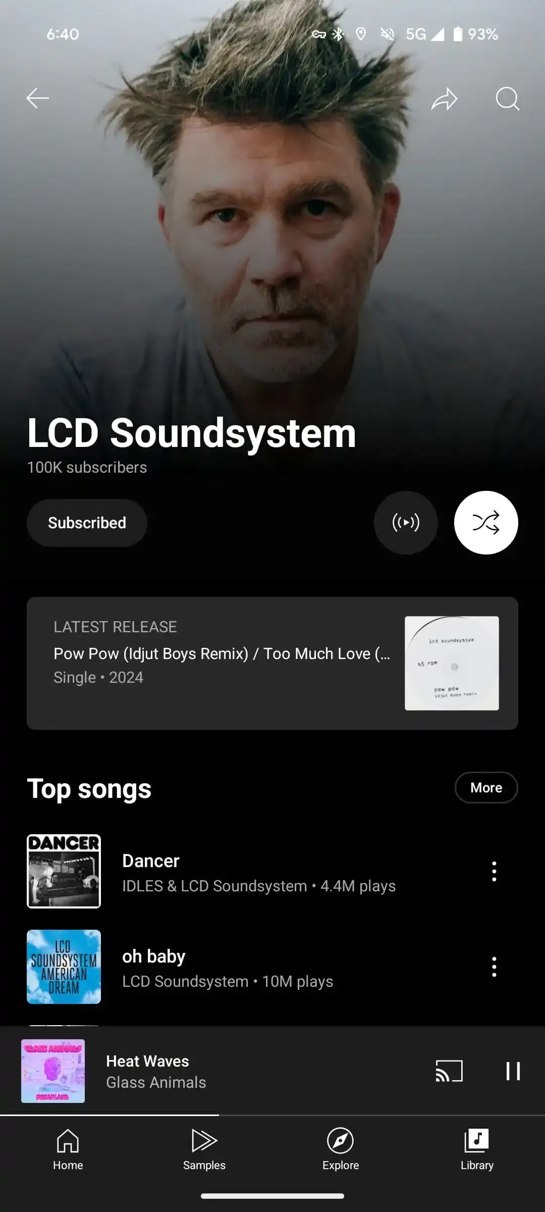
YouTube Music is now rolling out a redesign of artist pages on Android and iOS, following the updates on Mark as played for podcasts and Sound Search. The redesign includes a left-aligned artist name position, subscriber count, and a proper pill-shaped button for following.
Across from those, we have the option to start radio and shuffle, with YouTube Music testing "play" earlier this month as well. We also get circular buttons for smaller touch targets and an overall better look.
The visual tweaks allow for a more modern and compact look. The new design matches the redesign of the album and playlist pages from 2022. The previous artist page dated back to 2019 (with a Material 3 tweak a bit later on), so it was in dire need of refreshments.
The update is a server-side one, and it is now starting to roll out both on Android and iOS.
I personally love the new design - it looks more minimalistic and clean and gives more free, resting space. Having resting space is great, especially when we're talking about a relatively small screen (like on the phone) where if you have too many items and too big of buttons, the space looks cluttered and less enjoyable.
Across from those, we have the option to start radio and shuffle, with YouTube Music testing "play" earlier this month as well. We also get circular buttons for smaller touch targets and an overall better look.
The Latest Release card remains available before you get to the Top songs sections, and then you get the rest of the feed after that.
The visual tweaks allow for a more modern and compact look. The new design matches the redesign of the album and playlist pages from 2022. The previous artist page dated back to 2019 (with a Material 3 tweak a bit later on), so it was in dire need of refreshments.
The update is a server-side one, and it is now starting to roll out both on Android and iOS.
I personally love the new design - it looks more minimalistic and clean and gives more free, resting space. Having resting space is great, especially when we're talking about a relatively small screen (like on the phone) where if you have too many items and too big of buttons, the space looks cluttered and less enjoyable.


Things that are NOT allowed: