The Google Drive file picker on Android gets a practical redesign

The Google Drive file picker is getting a redesign on Android. The file picker is found in Gmail, Google Chat, and other Google Workspace apps.
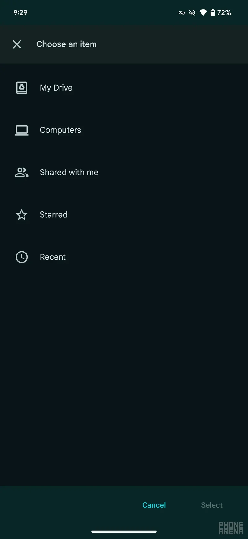
Previously, in the Google Drive file picker, you had a simple list for My Drive, Computers, Shared with me, Starred, and Recent. To see any files you may want to pick, you had to choose one of these options and tap on it.
As usual, you will be able to switch between list and grid view for convenience.
This change is basically saving you a tap, but that's not all that it does. In fact, Google says that the new update makes it easier to find recently viewed Drive items. On top of that, you will be able to clearly see what other storage locations besides "My Drive" are available to you, such as items you have access to in shared drives.
The new Google Drive file picker redesign has been spotted live in Gmail and also Google Chat. It may roll out to other Google applications soon as well.
I find that the new design is way more convenient, especially if you're looking for a file and want to locate it more quickly. When I send emails, I usually work on a file or check the file beforehand, so it will likely be in Recents when I want to attach it. So, this convenient new update is very useful, in my opinion.
Previously, in the Google Drive file picker, you had a simple list for My Drive, Computers, Shared with me, Starred, and Recent. To see any files you may want to pick, you had to choose one of these options and tap on it.
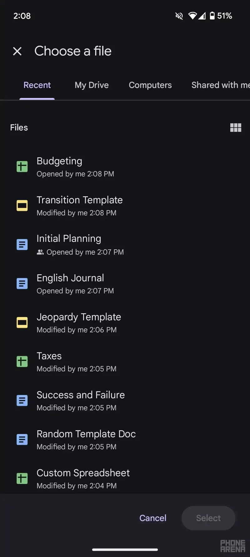
Now, these folders and views are going to be shown in a carousel with the new update. The file picker will immediately display a list of Recent files, so if you don't want to tap on a folder or a specific view, you can quickly pick your file from your recent ones.
As usual, you will be able to switch between list and grid view for convenience.
This change is basically saving you a tap, but that's not all that it does. In fact, Google says that the new update makes it easier to find recently viewed Drive items. On top of that, you will be able to clearly see what other storage locations besides "My Drive" are available to you, such as items you have access to in shared drives.
The web version of the file picker was redesigned last year, and now, the Android version is getting some update love.
The new Google Drive file picker redesign has been spotted live in Gmail and also Google Chat. It may roll out to other Google applications soon as well.
I find that the new design is way more convenient, especially if you're looking for a file and want to locate it more quickly. When I send emails, I usually work on a file or check the file beforehand, so it will likely be in Recents when I want to attach it. So, this convenient new update is very useful, in my opinion.








Things that are NOT allowed: