The Galaxy S24 Ultra mystery: Apple-influenced Samsung not letting the Galaxy Note design die
This article may contain personal views and opinion from the author.
We may earn a commission if you make a purchase from the links on this page.
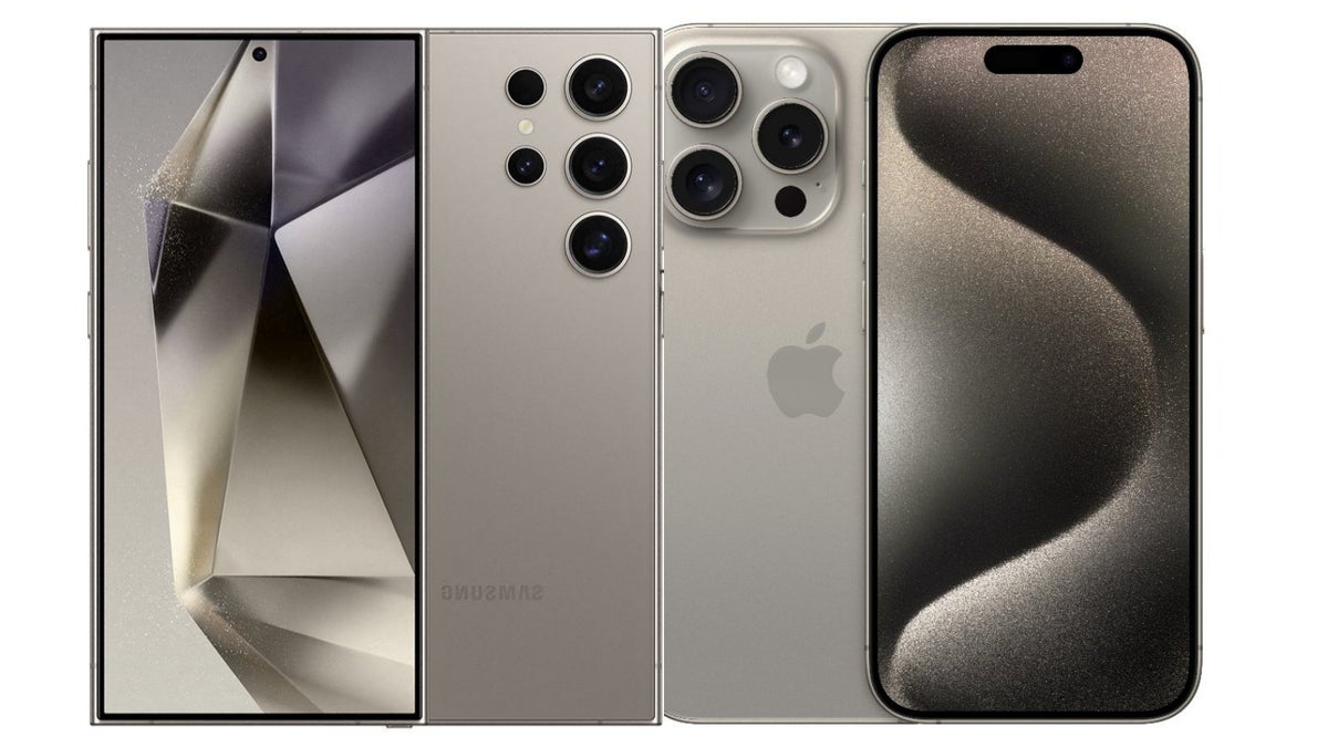
I’m not a big fan of Samsung’s decision to emulate Apple’s iPhone design strategy over the past few years.
Samsung is pulling an Apple with the design of the new Galaxy S24 Ultra, and I don't hate it
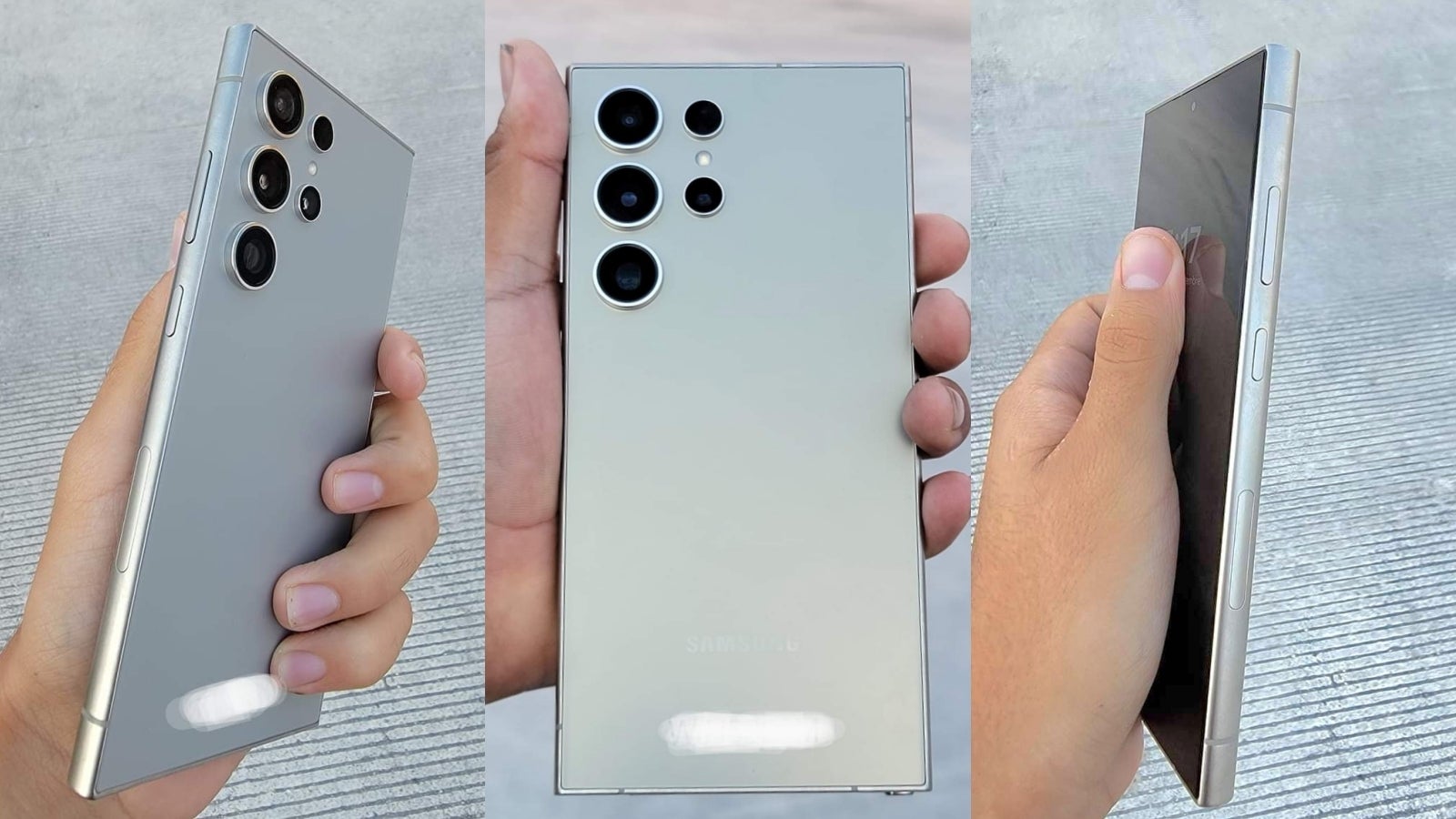
Leaked hands-on images of the Galaxy S24 Ultra, rocking a brushed titanium frame and almost a 100% flat screen.
- Judging by all leaks and rumors, the Galaxy S24 Ultra is expected to adopt a new brushed titanium frame, similar to that of the iPhone 15 Pro
- As you can see in the leaked renders, Samsung is betting on “professional” looking colors, very reminiscent of the color palette of the iPhone 14 Pro series - the matte gray finish is suppose to be “gold” as per tipster Ice Universe
- Another subtle but notable change in the design of the Galaxy S24 Ultra is that it is getting Samsung’s flattest premium flagship display in a very long time - you can see subtle curves on the edge of the glass but the actual display area of the S24 Ultra seems 100% flat now
- Another subtle but long-awaited design change, which I like seeing is symmetrical bezels on Samsung’s premium flagship for the first time ever (the vanilla Galaxy S22 models received this upgrade a while back)
The adoption of Apple’s “design refinement” strategy taught Samsung (and its fans) how to be patient like iPhone users
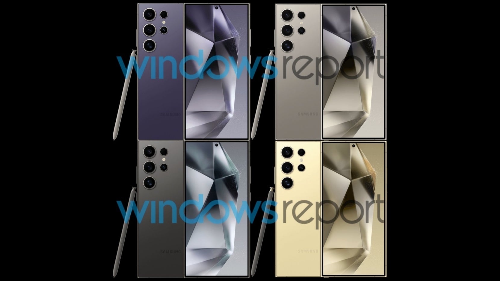
The Galaxy S24 Ultra’s leaked color selection is pretty much identical to that of last year’s iPhone 14 Pro, with a new Hero color - purple.
While it’s difficult to get excited for the design of the Galaxy S24 Ultra, which looks largely identical to that of the Galaxy S23 Ultra, which looks practically the same as the S22 Ultra, I must say that the subtle changes Samsung is going for seem very intentional, and (as I said in the intro) this makes me view them as a process of maturity…
Again, to draw a parallel to the iPhone, if you’ve ever held an iPhone 12 Pro, you’d know that holding the iPhone 15 Pro feels shockingly different (in a good way). Yet, that’s clearly a paradox, since the iPhone 15 Pro looks virtually the same as the iPhone 12 Pro. But that’s how Apple's “refinement” strategy works.
It's almost like seeing your kid grow - they learn how to use a spoon, then they learn how to tie their shoes, and then they learn to ignore you, because they are on their phone.
All Apple-style excuses aside, Samsung isn’t trying hard enough with the design of the Galaxy S24 Ultra
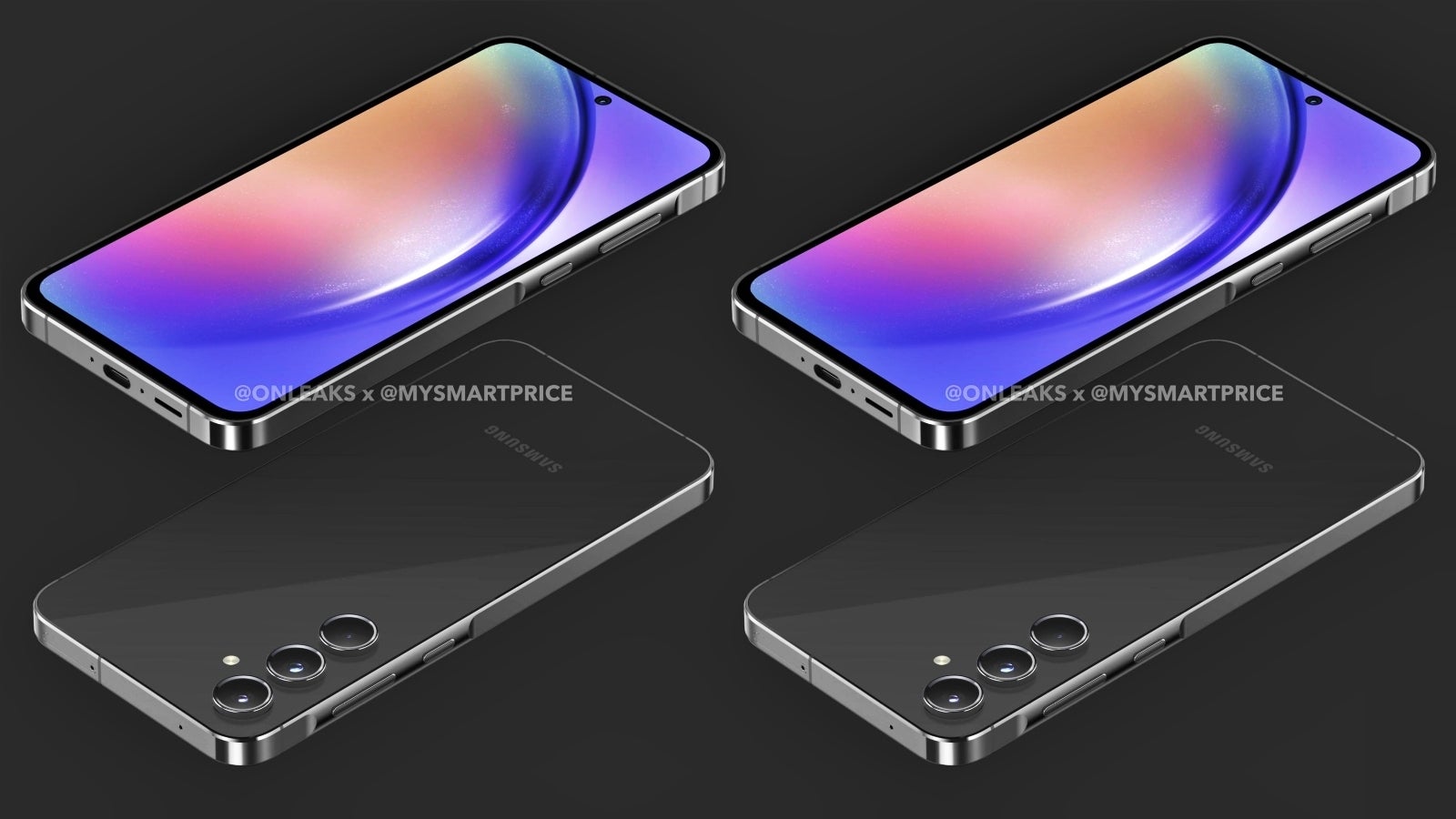
The Galaxy S24 series could’ve adopted the same button/side frame design as the cheaper Galaxy A55, which looks more modern now.
So, yes, the adoption of Apple’s “design refinement” strategy did teach Samsung (and Samsung fans) how to be patient when it comes to upgrades. But some people just… aren’t patient (you can find most of them on tech Twitter).
So, what about this more “enthusiastic” group of smartphone users (which I belong to)? Well, looking at the Galaxy S24 Ultra from this lens, the perspective changes quite a bit, bringing up some questions like the ones below:
- Why not spice things up a little by adding the same button/frame design that we saw in the leaked Galaxy A55 renders to the Galaxy S24, Samsung? Sure, it’s not a complete redesign but it could’ve made the flagship phones feel newer and a bit more… edgy
- One particular thing about the design of the Galaxy S24 Ultra (if it turns out to be true) bugs me quite a bit and this is the fact that even though Samsung is switching to a titanium frame, the Galaxy S24 Ultra isn’t expected to get lighter; let’s hope this is wrong, because the 20g Apple shaved off the iPhone 15 Pro Max make it feel much more comfortable to hold than the Galaxy S23 Ultra
- This is one I won’t get tired of repeating, and it’s the idea that the S-Pen slot and S Pen must go; I suppose smartphone styluses were intriguing some ten years ago, but it’s almost 2024 now, and I think Steve Jobs was right on this one - few will miss the S Pen, which takes up valuable space in the Galaxy S24 Ultra (also, potentially making the phone wider than it needs to be)
- Is it time to try an under-display selfie camera, Samsung? I know this has to be a very carefully calculated decision, since giving up the standard selfie camera in favor of an UD solution would certainly result in a dip in quality but someone should eventually make the ultimate all-screen phone, no? It’s not going to be Apple - at least not anytime soon…
The Galaxy S24 Ultra continues to keep the dead “Note” design alive: Will Samsung ever give up the impractical rectangle in favor of something more ergonomic?
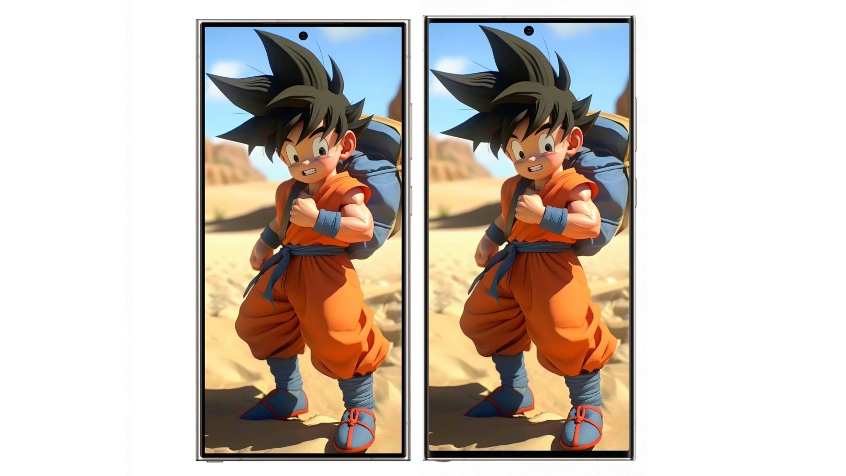
Galaxy S24 Ultra render (left) vs Galaxy S23 Ultra (right). We see a slightly wider but shorter S24 Ultra, possibly harder to use with one hand. Image courtesy of Ice Universe.
Despite “killing off” the Galaxy Note a few years ago, the Galaxy S24 Ultra very much looks like what the Galaxy Note 24 Ultra would’ve looked like, which raises the question: “Will Samsung ever give up the design of the square Galaxy Note disguised as a Galaxy S?”
In the end, I think I’m liking the Galaxy S24 Ultra design quite a bit more than the S23 Ultra despite the subtle changes to the design. But as I write above, I recognize that the only reason I like the look of the Galaxy S24 Ultra is because it appears to fix some little annoyances with the Galaxy S23 Ultra’s design, and seeing this addressed is satisfying. But this doesn’t mean I’m a fan of the Galaxy Ultra design as a whole.
And one thing has been and will be true about the Galaxy S22 Ultra, S23 Ultra, and the new S24 Ultra, and this is that the square Note design isn’t for me. Don’t get me wrong, there’s something appealing about an all-screen rectangle, and I often pick up the Galaxy S23 Ultra and just look at the screen because it’s so attractive… But from a practical standpoint, the square doesn’t simply go well with such a large phone.
If I had to rank the top dogs in terms of functional design, I’d say the Pixel 8 Pro comes out on top as the most comfortable flagship to hold and use with one hand, then the iPhone 15 Pro Max, and then the Galaxy S23 Ultra. Aesthetics are subjective, but in case you’re wondering, I’d pick the Porcelain Pixel 8 Pro over the other two once again.
But what do you think? Is Samsung doing enough to make the Galaxy S24 Ultra an attractive offer? Let’s not forget that the Galaxy S24 Ultra probably isn’t aimed at people who already have a recent flagship like the Galaxy S23 Ultra. But what about people rocking the Galaxy S22 Ultra, S21 Ultra, or something older? Are you tempted to upgrade?
Follow us on Google News


![T-Mobile is about to test the limits of customer loyalty [UPDATED]](https://m-cdn.phonearena.com/images/article/179374-wide-two_350/T-Mobile-is-about-to-test-the-limits-of-customer-loyalty-UPDATED.webp)


Things that are NOT allowed:
To help keep our community safe and free from spam, we apply temporary limits to newly created accounts: