Small change to Google Photos UI can deliver huge savings in time and effort

Sharing a photo from the Google Photos app is now easier and faster following a small, but still important, change to the app's UI made by Google. Previously, when you wanted to share an image or a video and opened the share sheet, you would see two rows of icons. On the top row were icons that allowed you to share with a group or an individual contact. On the bottom row were icons that allowed you to share via any other app that you've installed.
Before the recent change, users would have to scroll through a long list of apps on either row to find the one they were looking for. Now, with the change, there is one row marked "Share to Apps" that includes the icons of the last three most recently used apps followed by a new button marked "more." Tap on the latter and a full-screen app drawer is created that scrolls upwards. This new share sheet has some of your most favorite apps in the top row with a list of compatible apps in alphabetical order. Since there IS rhyme and reason to the listings with this new setup, it will be faster and easier to find the app you need in order to share your photographic masterpieces with others.
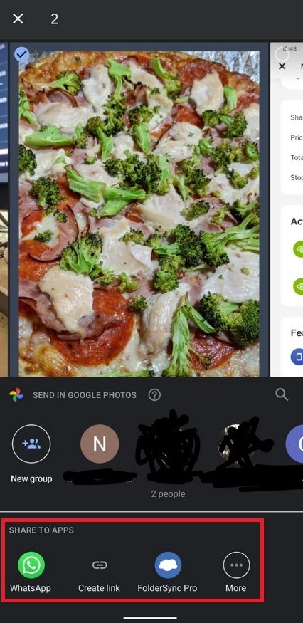
The faster share sheet available on Google Photos
The new sharing interface is already rolling out so there is a chance that you've already used it. Forbes points out that the older sharing interface is similar to the one that is still being used to share images from Google Maps if you want to remind yourself what the older interface looks like.
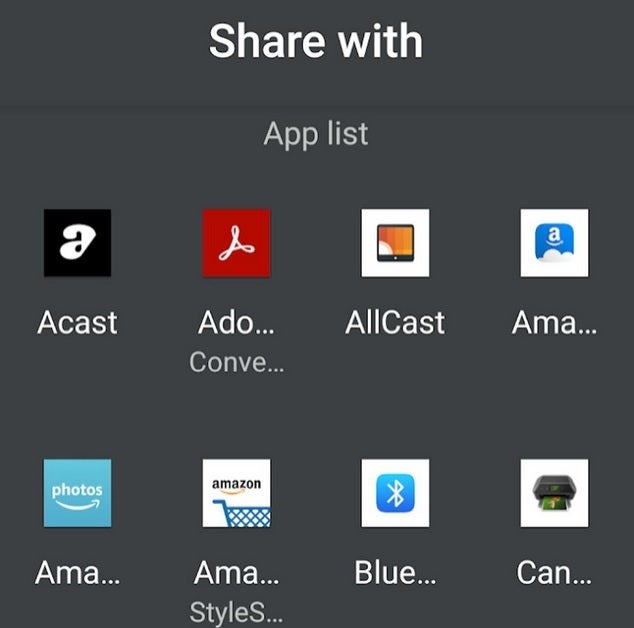
Tapping on more will bring up a full-screen app drawer in alphabetical order making it easier and quicker to find the app you need to share your images and videos
You might not consider this update to be a big deal, but anytime that you can shave some time and effort off of a task, the better life is.









Things that are NOT allowed: