New playlist UI revision coming to YouTube Music
Google is apparently looking to revise the playlist UI for the mobile version of YouTube Music. Once the new UI is downloaded on your phone or tablet (whenever that is), you will see the name of the person who created the playlist along with the day that it was created. The name of the playlist is in a larger font with the description underneath it. And navigating the app is a bit easier as icons for download, add to library, play, share, and the three-dot overflow menu are all on one line making them easier to find.
The updated UI for your playlists removes the "shuffle" button, but even if you love the new layout don't get too excited; thus far the new UI has only been seen by a single Redditor on his Samsung Galaxy Tab A7 tablet. And that was in France! The quick response from users on Reddit who viewed a screenshot of the new look was positive with one saying, "I love it. I just love it." "God it looks amazing," wrote another Reddit subscriber.
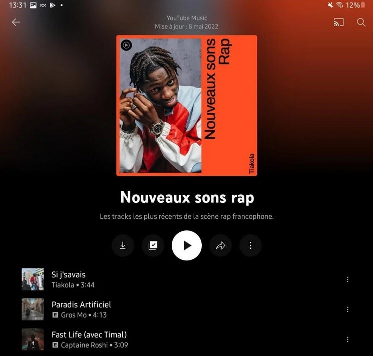
New UI being tested for the YouTube Music iOS and Android playlist
Note that the new look pops up for playlists only and not for albums. That does seem unusual since both playlists and albums have enjoyed sharing the same UI. And the new design also allows users to enjoy viewing cover art from the albums that host the tunes found in the playlists. Google isn't making these changes just for the hell of it so you can be assured that there are some reasons for the revision even if it is simply to allow users to enjoy a slightly improved experience.
By the way, the YouTube Music app can be found for iOS users in the App Store, and Android users in the Google Play Store. Again, we have no idea when the new look will start rolling out for all but we are hopeful that it will be much sooner than later.




Things that are NOT allowed: