Reddit's iOS and Android app update pushes users towards conversation

Reddit is sprucing up its iOS and Android apps with a bunch of fresh updates, all geared towards making it simpler for users to find and join discussions on the platform.
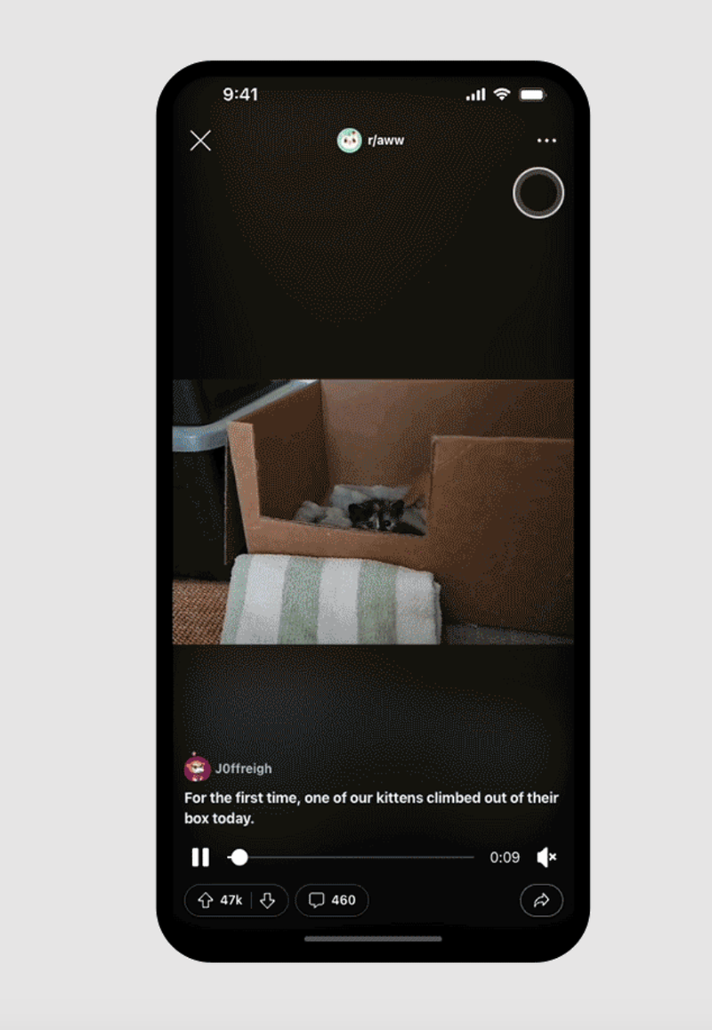
The company shared that it is introducing a new unified media player, along with instant comment loading and a direct shortcut to conversations. In a blog post, Reddit said:
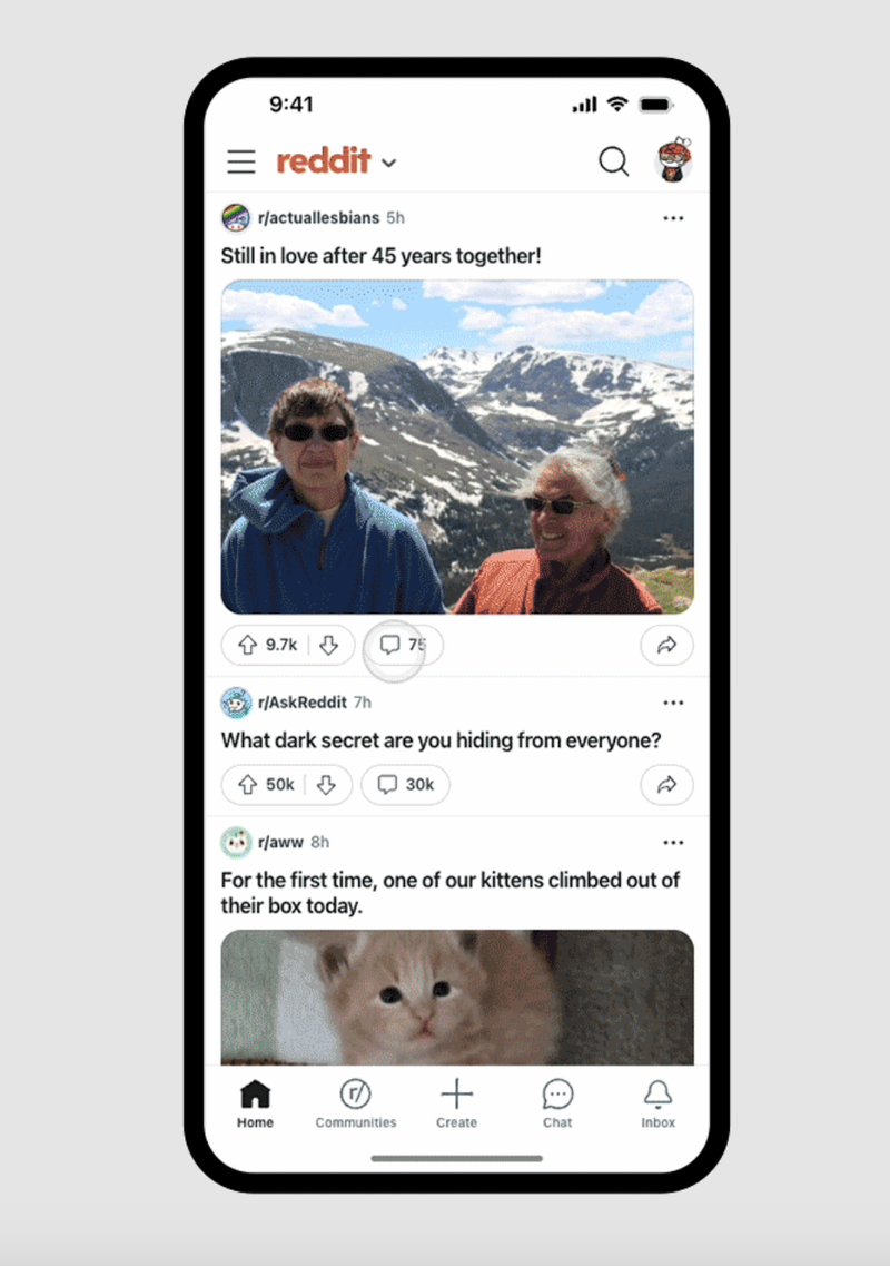
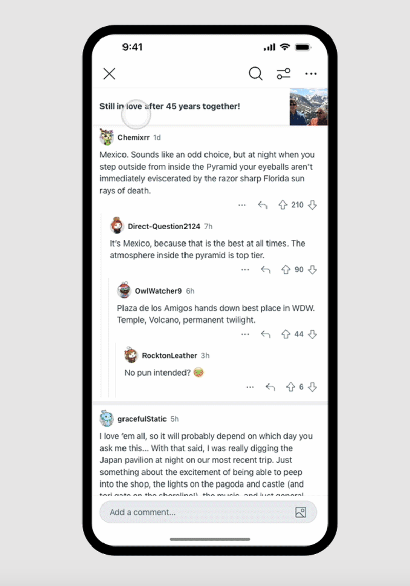
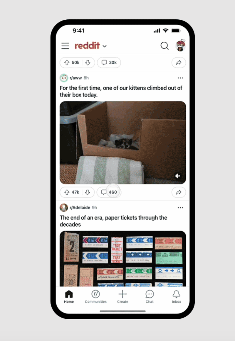
The tweaks may seem minor, but they collectively enhance the importance of comments in the user experience. Comments will now load quicker and instantly pop up when users tap on the comment icon of a post. This action directly leads users to the top comment, skipping the original post altogether.
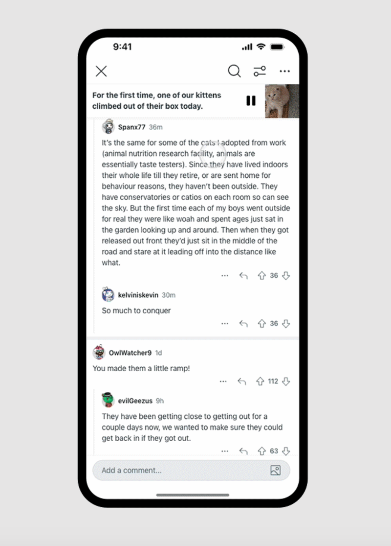
At the top of the screen, a "context bar" featuring the original post will be pinned, showcasing the text, image, or video content in a compressed format. Tapping on the thumbnail will allow users to navigate back to the original post's text or view an expanded image.
The update also simplifies the navigation process for users, ensuring consistency across various post formats (text, video, and images). Now, users can swipe left to view new posts and swipe up to directly access the comment section, regardless of the type of media in the original post.
In other news, Google and Reddit have revealed plans to expand their current partnership to make Reddit content easier to find and access across Google's platforms.
The company shared that it is introducing a new unified media player, along with instant comment loading and a direct shortcut to conversations. In a blog post, Reddit said:
Conversations are at the heart of Reddit and what sets us apart from the rest of the internet. It’s through posts and comments that redditors engage with each other and their communities.
Since Reddit's charm largely lies in its knack for nurturing discussions on a wide array of topics, it is only logical for the platform to prioritize a conversation-centric approach in its mobile apps.
The tweaks may seem minor, but they collectively enhance the importance of comments in the user experience. Comments will now load quicker and instantly pop up when users tap on the comment icon of a post. This action directly leads users to the top comment, skipping the original post altogether.
At the top of the screen, a "context bar" featuring the original post will be pinned, showcasing the text, image, or video content in a compressed format. Tapping on the thumbnail will allow users to navigate back to the original post's text or view an expanded image.
The update also simplifies the navigation process for users, ensuring consistency across various post formats (text, video, and images). Now, users can swipe left to view new posts and swipe up to directly access the comment section, regardless of the type of media in the original post.
These tweaks show that Reddit wants to encourage more interaction through comments and beyond just browsing posts. However, there is a potential downside, which is missed context. Why? Well, jumping directly to the comments might cause some users to overlook details within a post, especially if they're used to clicking on the comments icon or forget to scroll up.
In other news, Google and Reddit have revealed plans to expand their current partnership to make Reddit content easier to find and access across Google's platforms.






Things that are NOT allowed: