Pixels may soon stop cutting off app names in the launcher and search
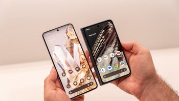
Google Pixel smartphones come with the Pixel Launcher, the default home screen experience that defines Google's vision for android. However, it has a longstanding quirk: it truncates app names in the app drawer, which can be frustrating for users who prefer to see the full name displayed. Thankfully, a solution looks to be on the horizon.
Currently, the Pixel Launcher has to shorten app names if they're too long to ensure they all fit neatly on the screen. In fact, the Pixel launcher doesn't even have an option to display the name in two lines, which would be an easier way to display the names of apps that have more than word. Instead, depending on your display and font size settings, app names such as "Play Store" can be cut off to display just "Play Sto..." which, in my case, triggers that good old OCD.
While a seemingly minor change, this new feature will be a welcome change for Pixel users who have long disliked abbreviated app names. With the ability to see the full app name, users can more easily identify the app they're looking for, saving them time and effort, not to mention, it definitely looks better.
However, according to a report by Android expert Mishaal Rahman (via Android Authority), one upcoming change in Android 15 will implement this two-line app label solution for those who like to see their app names in full. Other launchers implement this nicely, such as the Moto G's myUX and Samsung's One UI (although I hear that has changed since One UI 6).
This option was found while digging through the code of the latest Android 15 Beta, where a hidden toggle appeared in the Pixel Launcher settings: "show long app names". The description is straightforward, stating "Display long app names on two lines in search results and apps list." When you turn this on, your app names will display across two lines in search results and the app drawer, making them easier to read at a glance.
New "Show long app names" toggle and how turning it on affects app names in the home and search screens
Credit: Android Authority









Things that are NOT allowed: