Pixel 9 no longer the compact flagship of your dreams: Galaxy S24 and iPhone 15 have no competition
This article may contain personal views and opinion from the author.

Right… I have news for you!
Depending on how large your hands are (and mine are tiny), the Pixel might no longer be the best compact Android flagship for you.
In a nutshell, Google seems to have gone backwards with parts of the design of the Pixel 9, which makes the Galaxy S24, iPhone 15 (as well as the upcoming iPhone 16) the noticeably more compact, lighter flagship phones.
But how did Google get here?
Google goes backwards with Pixel 9 design; super-thick bezels make the new flagship look less premium than last year’s model
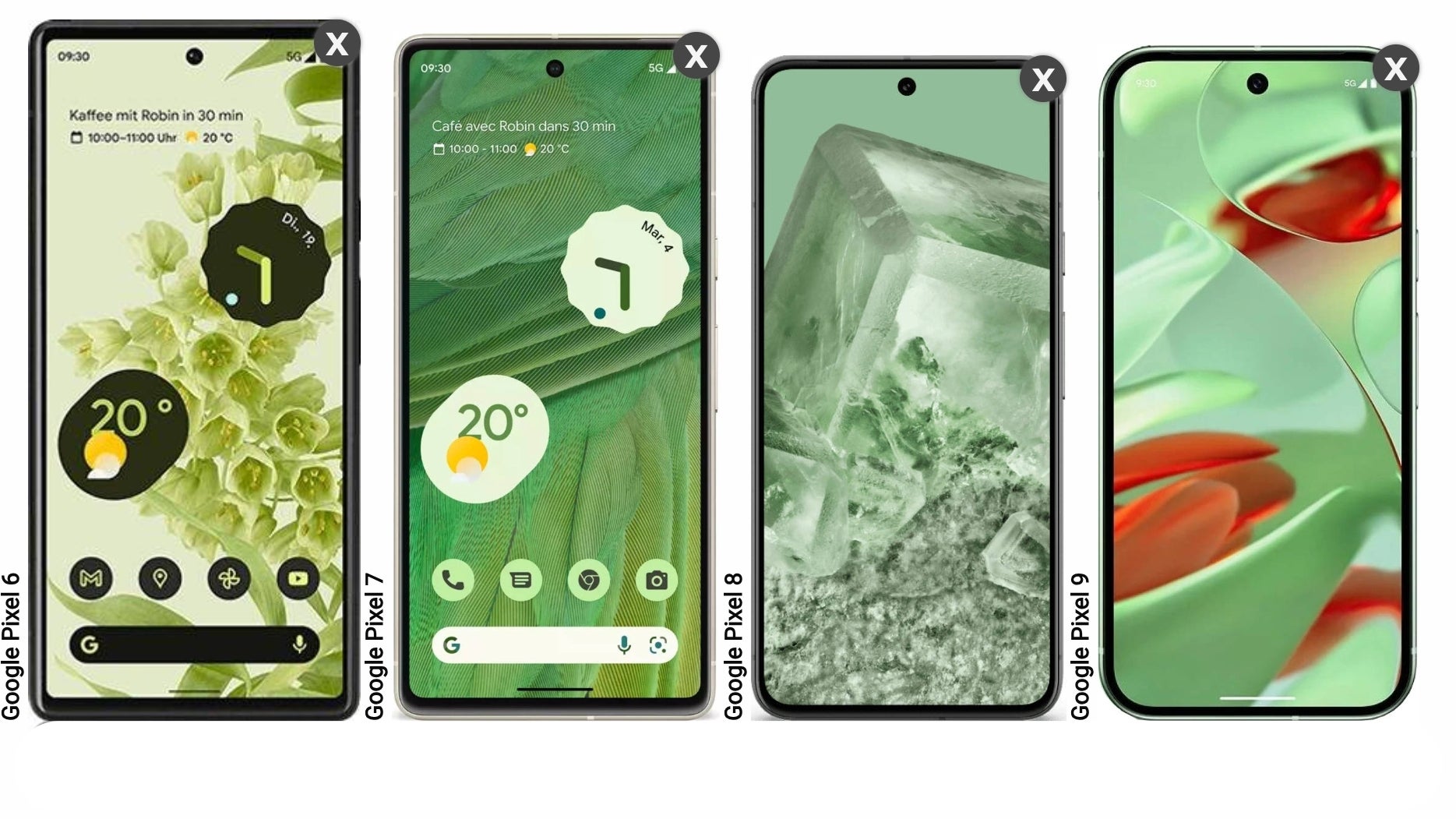
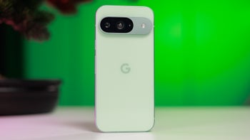
Jumping straight to the point, when you put the new Pixel 9 (which has a 6.3-inch display) next to the Pixel 8 (with its 6.2-inch screen), you immediately realize that the Pixel 9 has gotten taller and wider, which makes it less compact.
Also read: iPhone 16 vs. Pixel 9: A promising battle
The Pixel 9 now has thick-boy display borders, which are noticeably chunkier than those in last year’s phone. Because why would you do better, when you can do… whatever you want.
For the record, although I often write about this topic, I’m not someone who obsesses over display borders on my personal phone. Ironically, my iPhone 13 mini has the same bezel size as the Pixel 9. However, the point is that my iPhone 13 mini came out in 2021 - three years before the Pixel 9.
Moreover, I’m not too bothered by the way the Pixel 9’s display borders make the phone look - I’m more put off by the fact that they make the phone larger than it needs to be.
On the bright side, the Pixel 9’s screen bezel is of even proportions, which (as I’ve always said) is more important than how thick it is.
The Pixel 9 now has thick-boy display borders, which are noticeably chunkier than those in last year’s phone. Because why would you do better, when you can do… whatever you want.
Although I find the new look to be very premium and appealing, it’s undeniable that Google has gone backwards in one specific aspect of the design of the Pixel 9. The latest flagship has far thicker display borders when compared to last year’s Pixel 8. Not a great look - literally and figuratively.
Moreover, I’m not too bothered by the way the Pixel 9’s display borders make the phone look - I’m more put off by the fact that they make the phone larger than it needs to be.
On the bright side, the Pixel 9’s screen bezel is of even proportions, which (as I’ve always said) is more important than how thick it is.
Pixel and Galaxy designs downgrades once again prove Google and Samsung lack Apple’s strategic planning for the iPhone
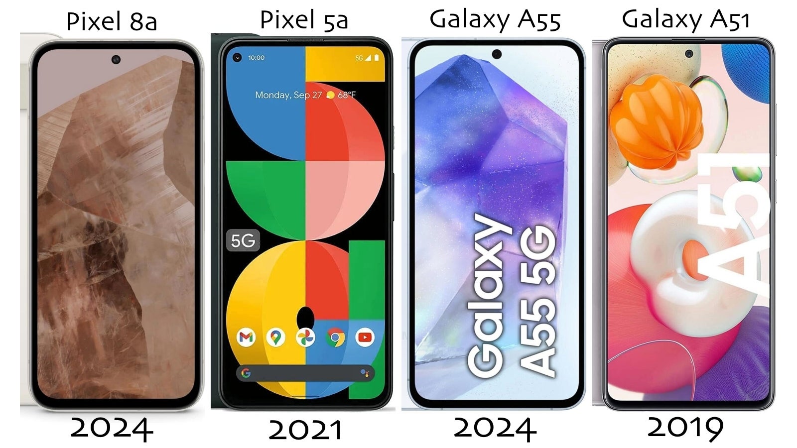
Pixel 9 joins Google and Samsung's list of downgraded designs - specifically when it comes to display borders.
Similar to the Pixel 8 - Pixel 9 display border downgrade, Samsung also went from thin display borders on their mid-range Galaxy A51 (from 2020) to thicker borders on the Galaxy A52, and even thicker bezels on the Galaxy A53, A54, and A55. It-makes-no-sense. But here we are.
However, they don’t seem to care about making the new version of the phone look less premium than the old one, which makes no sense.
On the other hand, as proven over time, Apple might take years to make progress in certain areas of the design, but one thing’s for sure - Cupertino never goes backwards. That’s highly likely thanks to the fact that Tim Cook & Co have a clearer long-term plan about future upgrades and how to balance them out.
Some food for thought there!
Galaxy S24 and iPhone 15 make the Pixel 9 feel like a large phone; Google’s flagship is super heavy now
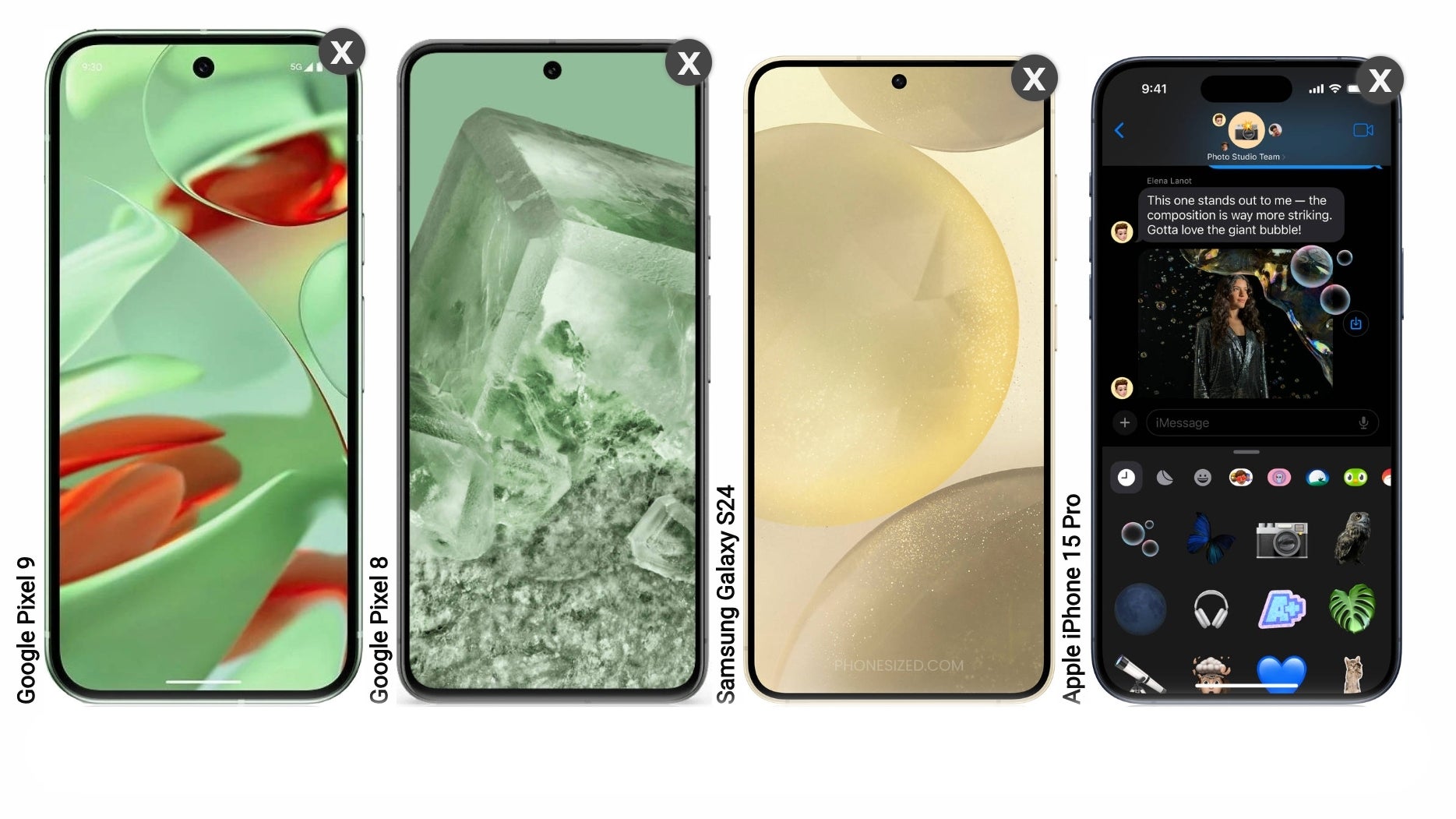
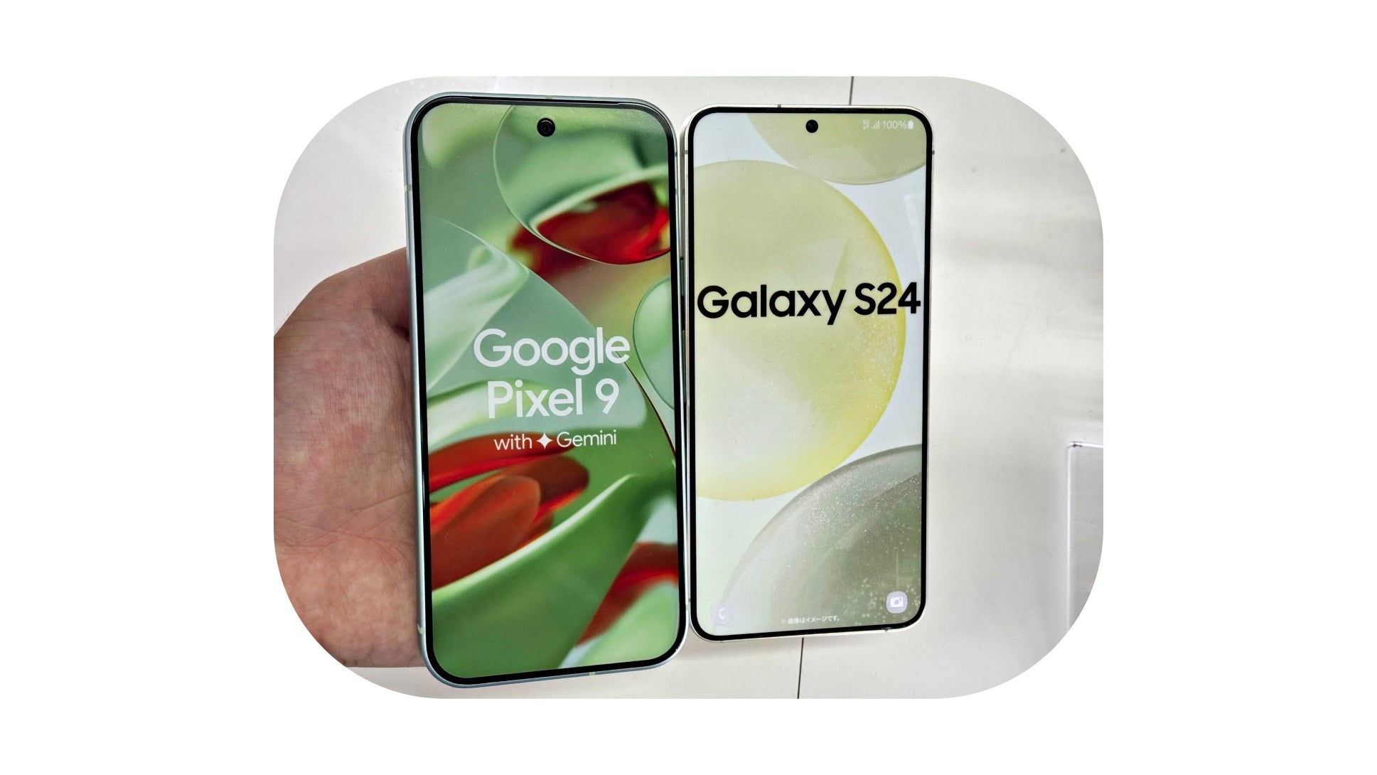
The bigger problem here is that the Pixel 9 isn’t the only (supposedly compact) flagship on the market.
The truth of the matter is that between Samsung, Apple, and Google’s compact flagships, the Pixel 9 now takes the last place in terms of pocketability.
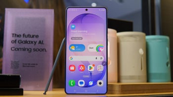
The Galaxy S24 is noticeably more compact than the Pixel 9 even if they have almost the same screen size - that’s because Samsung’s phone has far slimmer bezels.
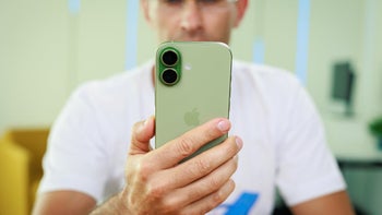
And if you don’t mind iOS, the iPhone 15 is even smaller thanks to its 6.1-inch panel, which should get slightly slimmer bezels on the upcoming iPhone 16.
Pixel 9 is super heavy for its size; weighs a whopping 31g more than the Galaxy S24
You might not be able to tell just by looking at them but the Pixel 9 is way heavier than the Galaxy S24.
With a mere 6.3-inch panel and thick display borders, the Pixel 9 weighs more than Samsung’s Galaxy S24+, a phone with a much larger 6.7-inch screen.
And here, the Pixel 9 takes a big “L”, because it feels super heavy compared to what Samsung and Apple have to offer.
Here’s a weight comparison:
- Pixel 9 - 198g
- Pixel 8 - 187g
- iPhone 15 Pro - 187
- iPhone 15 - 171
- Galaxy S24 - 167
Remember that putting a case and a glass screen protector on your phone usually makes it some 30-50g heavier, which means the 198g of the Pixel 9 can easily end up being 240g.
Sure, the Pixel 9 has a 4,700 mAh battery versus 4,000 mAh on the S24 and 3,350 on the iPhone 15. However, it remains to be seen if this increase in battery size will make a big difference and compensate for the weight of the phone.
For example, both the iPhone 15 and Galaxy S24 last at least as long as the Pixel 8 Pro during daily use, and this one has an even larger 5,000 mAh battery.
The Pixel 9 might be too chunky for some people looking for a pocketable Android flagship, but Google might’ve made the right call
In the end, Google’s latest engineering feat makes the Galaxy S24 and iPhone 15 the easiest phones to recommend to those who want a light, compact flagship phone.
That being said, Google is 100% right to think people want phones with larger displays, because… they do. We’re only talking about a 6.3-inch panel (vs 6.2-inches on the Pixel 8), but the difference is there, and it might help the Pixel 9 sell better than the Pixel 8 and Pixel 7.
Or it won’t!
Follow us on Google News






Things that are NOT allowed:
To help keep our community safe and free from spam, we apply temporary limits to newly created accounts: