Pixel 3 vs iPhone XS, Galaxy Note 9: which camera takes better portrait photos?
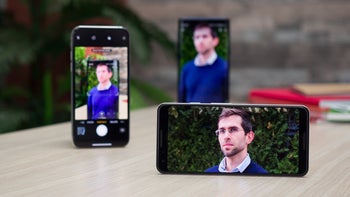
Whether you see Portrait Mode as a gimmick or as a valuable artistic tool, its popularity is hard to ignore. To customers, it is a new and exciting way to make people stand out and shine in their images. To phone makers, it is another feature highlighting the photographic and computational abilities of their devices. And to us – well, it is a priceless opportunity for a camera comparison!
The Google Pixel 3, the iPhone XS, and the Samsung Galaxy Note 9 – these are the phones running in the race. And it is a race that seems unfair in a way. After all, the iPhone and the Note 9 rely on two cameras to achieve the desired bokeh effect, while the Pixel has just one camera to work with. But in actuality, the Pixel's portrait shots are well worthy of competing, sprinkled with a healthy dose of AI magic. But are they any better? Time to find out.
Scene 1: At the Library
Out of all the photos we took for the needs of our comparison, this scene is my second favorite. Clearly, using Portrait Mode is a surefire way to make reading Tolkien's work in a library look epic!
Picking the best shot, however, is a bit tricky and greatly depends on one's personal preferences. The Galaxy Note 9 produced the brightest, most attention-grabbing photo, but detail in my face is strangely missing. The iPhone delivers pretty colors and a very realistic bokeh effect, but if you look closely, you'll see that it did a poorer job of separating the subject from the background.
And the image out of the Pixel has plenty of detail, as well as the most pronounced bokeh. But the blurring effect here is also the least realistic. By "less realistic" we mean that if we take the same shot with a proper camera, areas equally distant as the subject wouldn't have been blurry – yet they are here with the Pixel, giving the image a slightly photoshopped appearance.
Scene 2: Not at the Library
My colleague Victor agreed to help me out by posing for a set of Portrait shots, and the result is the top-quality Instagram material you see here. After looking at the three images side by side, he said that the Note 9's image was his favorite, and I can easily see why: colors are vivid, his persona is brightly exposed, and the background blur is precisely applied. In contrast, the Pixel 3's portrait shot looks dull and uninspiring. Dialing up the exposure just a bit would have probably produced a prettier picture. Though there's no denying that the bokeh effect has been applied masterfully by the Pixel 3. As for the iPhone's portrait photo, it looks overprocessed and artificial, and we can't say we're big fans of this type of look.
Scene 3: Mr Secret Agent
This particular shot is suitable for a "Caption this" contest, don't you agree? And as a Portrait Mode photo, the scene is probably the trickiest of them all – both because of the busy background and because of the objects in front of the subject.
Hardly a surprise, object separation is glitchy on all three photos, but we can't be too harsh on any camera in this situation given how difficult it would be for any software to tell one leaf or branch from the other, let alone figure out which one's closer to the camera and how much. What matters is that our handsome model is in focus on all three images, and a viewer does not zoom in too much – as would be the case if you post one of these on social media – the imperfect blur application wouldn't be ruining the scene.
Scene 4: By the Sea
Here's another case where picking the "best" photo would be greatly dictated by the viewer's subjective opinion. We have the Pixel 3 and its shot made overly dramatic by cranking up the contrast dial. Its a rather striking look – and one that many may be drawn by. The photo from the iPhone, on the other hand, looks "flat" because it has very little contrast. The Galaxy Note 9 keeps things a lot more neutral and more balanced, and the result is an overly pleasing photo. The only glaring issue is the overexposed sky in the back.
Scene 5: Downtown
We're now entering low-light territory, switching the Portrait game difficulty to "hard" for all three cameras. Impressively, the Pixel 3 and the iPhone both managed to deliver pretty good images, with only slight differences in color between the two. The Note 9 is a step behind, primarily because of the lack of detail in my face, but also because of the blown-out highlights in the background.
Scene 6: Fairy lights
This one's an easy victory for the Pixel 3. Not only is the bokeh effect applied with great accuracy, but the whole image is packed with detail and properly exposed. This may have something to do with the fact that the phone uses its main camera for its portrait shots, while the Note 9 and the iPhone rely on telephoto cameras which use smaller sensors and are less sensitive to light.
And sure enough, if you examine the images out of the Note and the iPhone, you'll see right away how fine detail is practically missing. Still, we must admit that the "bubbles" in the background, made by the out-of-focus fairy lights, look a lot prettier and realistic.
Scene 7: Final round
Much of what we said about the previous set of photos applies here in the final round. Again, the Pixel 3 produced the clearest, most detailed image, with the face of the subject pleasantly illuminated. The photo from the iPhone looks darker in comparison and is less flattering as a whole because of this, while the Note 9 lets much of the blue light in the upper corner bleed far into the frame, thus spoiling the image. But seriously, Google has to teach the Pixel's AI algorithms how to make proper bokeh bubbles.
Conclusion
First of all, we have to say that we're impressed by the quality of the portraits the Pixel 3 snaps with just a single camera. It is a step ahead of the iPhone and the Note 9 with its remarkably accurate object separation, sharp detail, and outstanding low-light performance.
Google has some next-level portrait mode skills – and it's not afraid to use them on the Pixel 3
But there's still room for improvement. Most notably, the background blur produced by the Pixel 3 tends to be more artificial, while the Note 9 and the iPhone XS apply a bokeh effect more similar to what a dedicated camera could produce with the proper lens on.
Another factor holding the Pixel back is its fixed focal length. The iPhone and the Note 9 use their dedicated telephoto cameras instead of their main ones when taking portraits. These cameras are more suitable for the purpose by bringing the subject closer – with their 2x optical zoom – and having less distortion caused by the curvature of the lenses. It's a subtle difference, but it is most definitely there. On the other hand, telephoto cameras struggle at night, as we clearly saw in scenes 6 and 7.
Ultimately, we wouldn't call any of these three phones an excellent Portrait Mode performer, but they're all well-versed in the art of bokeh. And if you choose the Pixel 3 over the iPhone or the Note 9, rest assured that you won't be disappointed.






Things that are NOT allowed: