People react to Galaxy S23 Ultra: Glad I bought the Pixel 6! This looks like iPhone, Huawei, Sony
This article may contain personal views and opinion from the author.

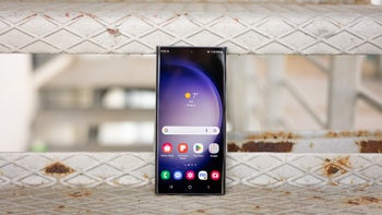
It didn't take me long to realize that the Galaxy S23 Ultra is a big phone. It doesn’t just make my iPhone 13 mini feel like a toy but also makes the Pixel 7 Pro (another device I usually find to be too big) feel “normal”...
Now, sure - phone sizes can be subjective, depending on a bunch of factors such as the size of your hands (mine are on the small side), whether you use a case (most people do), and something even more important we often ignore, which is how you use your phone - whether you use it in bed (as a tablet); if you use it with two hands (some people hold their phone in one hand and navigate the UI with the other), etc.
A phone with a large 6.8-inch screen like the Galaxy S23 Ultra (especially compared to my 5.4-inch iPhone 13 mini) tends to change your use patterns, even if you don’t realize it. Suddenly, watching YouTube videos on your phone (instead of using your TV/laptop) is something you do more often. Even scrolling through Instagram and TikTok can be more addictive, as you quite literally get a bigger “window” into the vanity of social media.
But! What can make or break a large smartphone could be the way the phone-maker chooses to handle and work around the large formfactor. And unfortunately, when it comes to the new Galaxy S23 Ultra, it’s fair to say Samsung didn’t really try to make up for the dimensions of its biggest slab phone by implementing a more functional design.
In fact, it seems like the problem here is with Samsung’s philosophy of what the top model Galaxy “S” flagship is supposed to look/feel like. So, let’s dig a little deeper…
Galaxy S23 Ultra weighs as much as the smallest iPad; giving up beloved S21 Ultra design to turn the most powerful Galaxy into a Note was selfish, Samsung
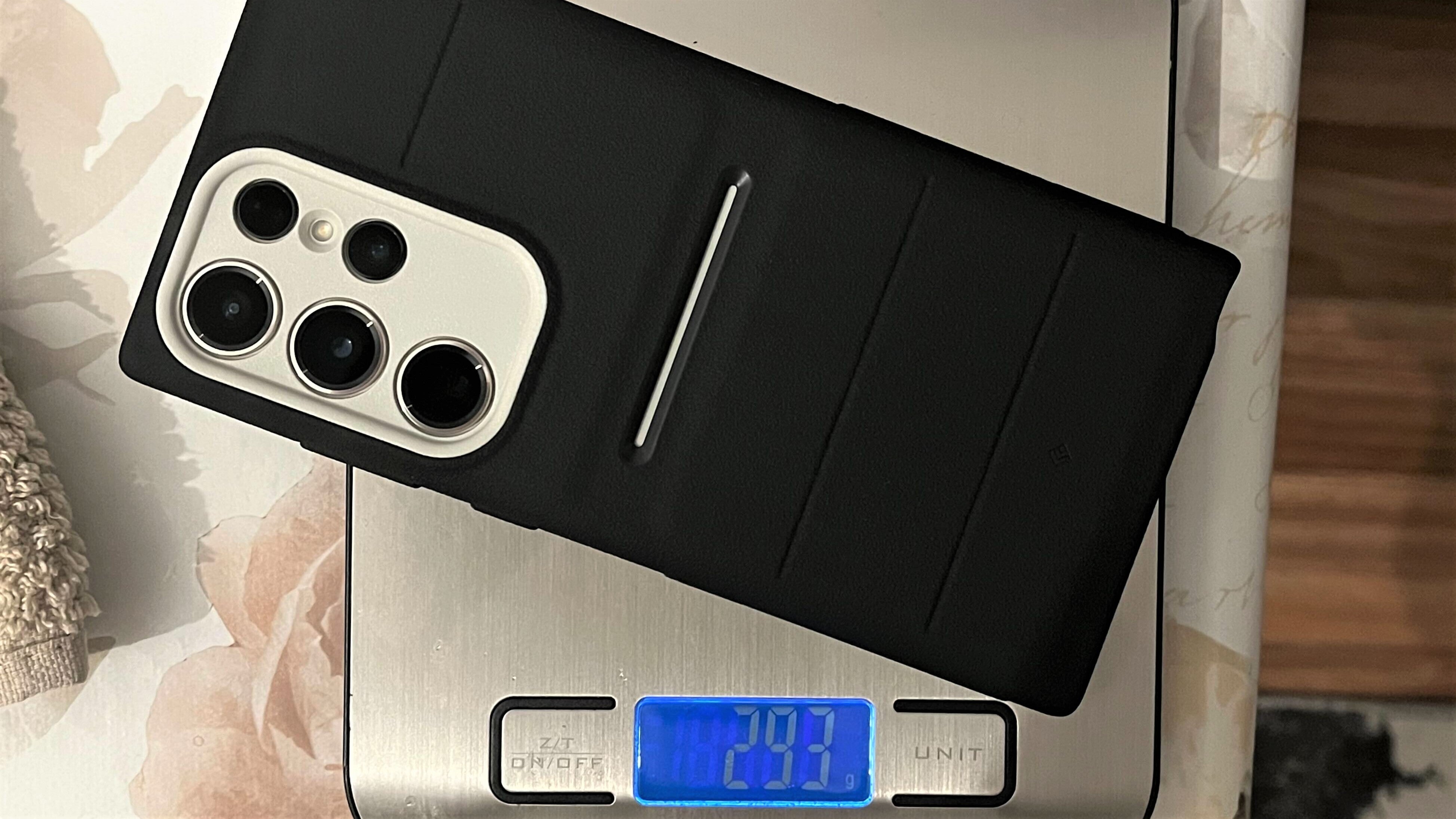
300g with a case and a screen protector, the S23 Ultra is one heavy phone. Kinda like the iPhone 14 Pro Max.
- The Galaxy S21 Ultra’s ergonomic design makes Galaxy S23 Ultra feel rough around the edges (quite literally)
- The vanilla Galaxy S23 and Galaxy S23+ also offer a better “feel in the hand” compared to the Galaxy S23 Ultra
- The otherwise large Pixel 7 Pro feels like a far smaller phone compared to Galaxy S23 Ultra
Despite being a fairly open-minded OEM that offers a diverse portfolio of products and a ton of choice when it comes to hardware (and software), Samsung quite literally forced the Galaxy Note design onto its new and existing users who want the latest and greatest Galaxy. “And that's not cool, man!”
The question I asked over a year ago still stands: Why do I need to buy a Galaxy Note in order to get the best Samsung experience? Many Samsung fans on social media agree that the Galaxy S21 Ultra was the pinnacle of the company’s flagship design.
I have now received my Galaxy S23 Ultra case, and while the grippy case helps (a lot) with the grip, it doesn’t make the S23 Ultra any lighter or more manageable. The naked Galaxy S23 Ultra weighs 234g, coming up to a whopping 293g with the case I have, which (wait for it) is basically as heavy as the iPad mini 6 (297g). I don’t have a screen protector on, which means adding one could easily bring the S23 Ultra over the 300g mark, which is a lot!
I’m preparing a story on the camera of the S23 Ultra and how it compares with the iPhone and Pixel. The biggest challenge while snapping pictures with all phones was trying not to drop the humongous Galaxy S23 Ultra. It’s nearly impossible to operate the Ultra with one hand - especially when you’re moving, taking photos.
Ordinary people react to/review the new Galaxy S23 Ultra: "It’s nice, but I expected a different design... It looks like a Huawei/Sony."
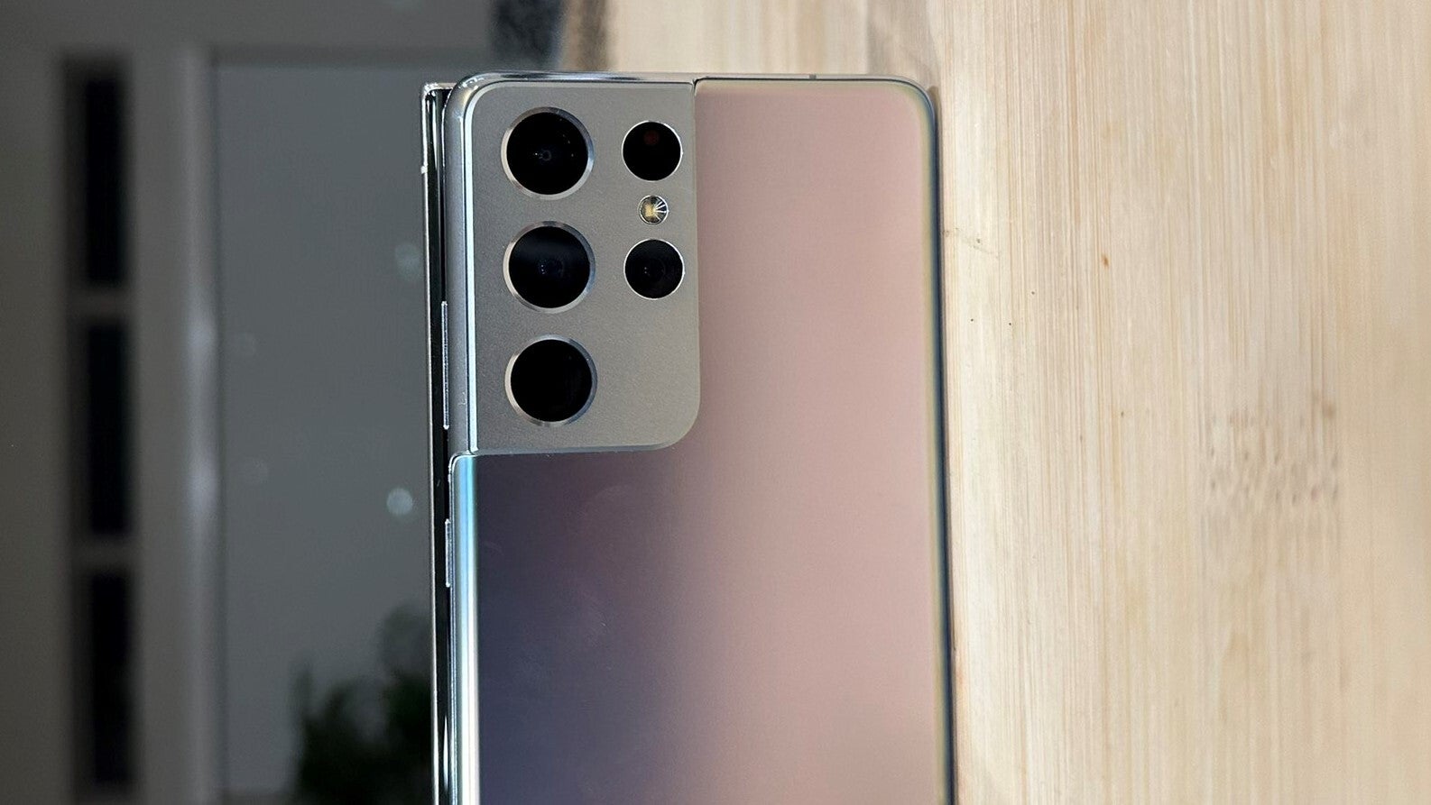
People don't understand why the S23 Ultra looks that way.
Anyway, let’s look away from my views and opinions for a minute…
A: Those Samsung people! What did they try to do? It looks like those phones… Huawei?
M: No, Sony!
A: It’s squarish. They have run away from their thing. Adding more cameras like iPhone and stuff?
U: I’m happy I bought this one! (he recently bought a Pixel 6 Pro)
A: It’s nice, but I expected a different design. If you were to hit someone on the head (with the S23 Ultra)... you’d wreck them!
- “A” smartphone history: Galaxy S6, iPhone 8, iPhone 13; the iPhone 13 was a very recent purchase; although I suggested a Pixel 6a (great price and camera), she decided to pay double and stick to iPhone as she was already used to iOS
- “M” smartphone history: Galaxy S9 - since 2019; she recently started using my old Huawei P30 Pro as the Galaxy is slowing down and struggles to make it through a full day of use; she’s willing to get the upcoming Pixel 7a as she finds Samsung’s new flagships too expensive
- “U” smartphone history: Galaxy S6, Galaxy S8, Pixel 6 Pro; I actually sold him my Pixel 6 Pro at a symbolic price after vouching he’d never pay more than $400-500 for a phone ever again; if you’re curious, I wasn’t in a hurry to sell my Pixel 6 Pro, so I pitched the Galaxy S21 FE as the best option according to the budget and the fact that he was coming from a Galaxy (S8) - he said he wanted to try something different
There’s your unbiased hands-on review of the Galaxy S23 Ultra, peeps - about as real as it gets!
I’d have to agree with the average family member here - if I had to pick a phone as a weapon, I think the S23 Ultra would be my first choice. It’s got the sharp edges, and I’m pretty sure the S-Pen could be a good torture device - like a Bluetooth eyepick! Ew.
Samsung picked the wrong time to get lazy with design upgrades; best-looking Galaxy S23 Ultra colors are hard to get
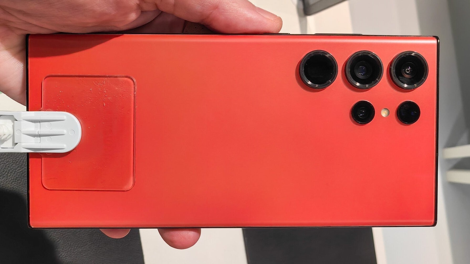
Red is the hottest new Galaxy S23 Ultra color but it's hard to come by. Thanks to Samsung.
But back to my take…
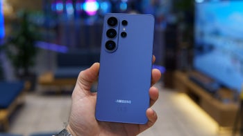
I do prefer the way phones like the Galaxy S21 Ultra and Pixel 7 Pro look. Don’t get me wrong, the Galaxy S23 Ultra is a beautiful device (more specifically the Cream color I have here), but it lacks what I call the “badass” attitude of the S21 Ultra as well as the unique flair of the Pixel 7 Pro in Hazel. On top of that, save for the Cream S23 Ultra (a fancy name for off-white), the rest of the S23 Ultra colors appear too muted and almost shy. Like, are you a color or not?!
I find the Galaxy S23 Ultra in the red-black combo particularly attractive and definitely would’ve gone for this one if the waiting time wasn’t nearly a month longer compared to the standard, more boring colors. But why, Samsung?
Galaxy S24 Ultra: Get rid of the S-pen; make it narrower and curvier; give it uniform screen borders, please... Samsung
Samsung needs to stop being selfish and get rid of the old, boxy design. The S-Pen is for the Fold 5.
As someone who has the chance to voice his POV on the latest smartphone tech on the internet, I’m rarely as strongly convinced when it comes to a single topic, but I do think that walking away from the Galaxy S21 Ultra’s ergonomic design was a big miscalculation on Samsung’s side.
So, Samsung, if you’re reading this, I wouldn’t mind giving up the S-Pen in return for a narrower phone. While you’re at it, make the Galaxy S24 Ultra curvier (not the screen but the frame and back), and for God’s sake, try getting the bezels to be symmetrical all around? Why does the $800 Galaxy S23 have uniform display borders but the $1,200 Ultra doesn’t? Oh, wait, is it due to the fact that it’s a Galaxy Note, and this design doesn’t allow flexing the display connector on the bottom? Just a guess.
Given that Samsung used the same design for its top flagship two years in a row (quite unusual for the company), I do expect the Galaxy S24 Ultra to bring something new to the table, so I remain optimistic!
2024 might also be a good time for Samsung to start looking for new materials that could make the company’s big phones lighter. For example, Appleis expected to use titanium for the casing of the recently-leaked iPhone 15 Pro, which could (in theory) reduce the weight of the phone, as it requires less materials to achieve the same durability compared to stainless steel.
As of right now, I wouldn’t buy a Galaxy S23 Ultra, as functional design (the way a phone feels) is right on top of my priority list - far more important than an S-Pen or a 200MP camera. Which is why I’m still rocking my trusty iPhone 13 mini over the iPhone 14 Pro. Priorities.
Follow us on Google News


Things that are NOT allowed:
To help keep our community safe and free from spam, we apply temporary limits to newly created accounts: