Note 20 Ultra VS Galaxy Z Fold 2 camera comparison
We may earn a commission if you make a purchase from the links on this page.
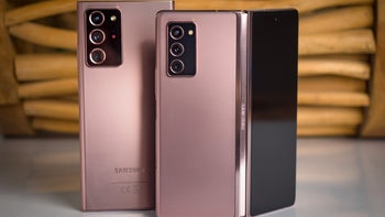
We've got the new folding smartphone from Samsung – Galaxy Z Fold 2 versus the company's flagship Galaxy Note 20 Ultra. Which is the better camera phone? You may think that with its focus on delivering a tablet experience in a pocketable form factor, the Z Fold 2 may not be on par with the Note 20 Ultra's camera capabilities. But let's see them in action first, because the Z Fold 2 may pleasantly surprise us!
On its back, the Galaxy Note 20 Ultra packs a triple camera set-up with a 108MP main camera, a 12MP telephoto and a 12MP ultra-wide shooter. The Z Fold 2 also has a triple camera rear set-up with a main, telephoto and ultra-wide cameras, but they're all 12MP. Noteworthy is also that the main camera on the Galaxy Note 20 Ultra has a 79-degree field of view (FOV) while the main camera on the Z Fold 2 has an 83-degree FOV. Similarly, the ultra-wide camera on the Z Fold 2 also has a slightly larger FOV. Therefore, we can already expect the Z Fold 2 to capture slightly more in a photograph than the Note 20 Ultra. But enough specs, let's look at the photos!
We can immediately see that the Note 20 Ultra takes pictures with more realistic colors. The Z Fold 2 has a slightly wider camera lens as mentioned earlier, but even more noticeable is its use of sharpening and brightening of the darker areas in photographs.
This brightening is especially noticeable on the trees in the background. The model's face and neck are also much brighter on the photo taken with the Z Fold 2, which could be a post-processing effect dedicated to improving facial clarity. In any case, while both photos are great for social media, if you prefer taking more realistic-looking photographs, the Note 20 Ultra is your champion here.
Here we have a tricky shot of a building that can show us a lot about how the Galaxy Z Fold 2 and Note 20 Ultra process photos. It's tricky, because the phones have a bright, cloudy sky on the top and colorful vegetation on the bottom to process, along with the subject itself – the building.
The pink flowers in particular are so vibrant on the Z Fold 2 that their clarity has suffered, while they're all clear and well distinguishable on the Note 20 Ultra photo. And again, while the Note 20 Ultra photograph looks great even when you zoom in, the Z Fold 2 has stronger sharpening going on, to make up for its lack of megapixels. It's hardly noticeable without looking for it, though, and overall – both phones tackled this scene well.
As we mentioned, there is a small, hardly-noticeable FOV difference in the two smartphones' cameras. Aside from that, again, the Z Fold 2 throws in a bit more brightening and sharpening. Because of this, the trees are brighter and clearer on its photo, while the same trees and other objects on the right side of the Note 20 Ultra photo are less distinguishable. Both phones did about an equally great job on the sky and the building in the center of the shot.
Here we get to enjoy a beautiful shot with lots of foliage. While the Note 20 Ultra again has the more realistic colors and the Z Fold 2 has slightly brighter ones, the sky itself actually appears brighter on the Note 20 Ultra. Looking at the top right corner of the photograph clearly shows the slightly wider angle of the Z Fold 2 also, but overall, nothing major in terms of differences or picture quality. If we were to nitpick, the railing on the stairs is slightly shaper on the Note 20 Ultra, while a bit jagged on the Z Fold 2.
In this scenario we can definitely see more detail on the Z Fold 2's photo over the Note 20 Ultra. When looking closely at the model's face, we notice that the facial features are much sharper on the Z Fold 2 photo, while quite soft on the Note 20 Ultra one. Thus the Galaxy Z Fold 2 wins here when it comes to the details, which is to be expected, as it has a 2X lens, unlike the Note 20 Ultra.
The rest is as usual – brighter colors on the Z Fold 2, slightly more realistic ones on the Note 20 Ultra. Both phones did a good job separating the subject from the background, where a particularly tricky area would be the space between the model's arm and torso. Less-capable smartphones would've failed to blur that area in portrait mode, while both the Z Fold 2 and Note 20 Ultra did it well enough. Although both also blurred the strap of the backpack, which they shouldn't have, as it's not in the background.
In this Live Focus shot both phones did about equally when it comes to details and sharpness. Both blurred part of the back of the chair more than needed, but the subject's body is well separated from the background. Colors aren't too different aside from the slightly stronger vibrancy we've come to expect from the Z Fold 2, especially noticeable in the blues here.
In low light, the brighter results from the Z Fold 2 actually come in handy, showing better details on the trees and other dark spots.
The Note 20 Ultra didn't need as much sharpening to still provide a good amount of detail to this photo, and subjectively, you may prefer its more realistic tones. The small text on the round light-up sign to the left is slightly more sharp and readable on the Z Fold 2, while parts of the letters are surrounded by a bit of glow on the Note 20 Ultra. This makes them less contrasting from the bright sign they're printed on, on the Ultra.
We see quite the interesting results here. Because it's very dark, with the only sources of light being street lights, both phones couldn't quite pull off a colorful shot, but it's interesting how differently they brightened the photo.
The Note 20 Ultra's processing gave us consistent brightness across most of the photograph, where the one from the Z Fold 2 almost seems like it has a vignette effect going on. As in, the center of the shot is bright enough, but the as we go towards the edges of the photo it appears to get progressively darker.
On its back, the Galaxy Note 20 Ultra packs a triple camera set-up with a 108MP main camera, a 12MP telephoto and a 12MP ultra-wide shooter. The Z Fold 2 also has a triple camera rear set-up with a main, telephoto and ultra-wide cameras, but they're all 12MP. Noteworthy is also that the main camera on the Galaxy Note 20 Ultra has a 79-degree field of view (FOV) while the main camera on the Z Fold 2 has an 83-degree FOV. Similarly, the ultra-wide camera on the Z Fold 2 also has a slightly larger FOV. Therefore, we can already expect the Z Fold 2 to capture slightly more in a photograph than the Note 20 Ultra. But enough specs, let's look at the photos!
Scene 1: Taking a picture of a friend
We can immediately see that the Note 20 Ultra takes pictures with more realistic colors. The Z Fold 2 has a slightly wider camera lens as mentioned earlier, but even more noticeable is its use of sharpening and brightening of the darker areas in photographs.
This brightening is especially noticeable on the trees in the background. The model's face and neck are also much brighter on the photo taken with the Z Fold 2, which could be a post-processing effect dedicated to improving facial clarity. In any case, while both photos are great for social media, if you prefer taking more realistic-looking photographs, the Note 20 Ultra is your champion here.
Scene 2: Quite a building
Here we have a tricky shot of a building that can show us a lot about how the Galaxy Z Fold 2 and Note 20 Ultra process photos. It's tricky, because the phones have a bright, cloudy sky on the top and colorful vegetation on the bottom to process, along with the subject itself – the building.
And both phones did great to capture everything without any overly-bright or dark areas. Again, the Note 20 Ultra gives us more realistic colors and darker shadows, while the Z Fold 2 punches the brightness and vibrancy. Because of that, the darker areas of the scene have more easily visible details on the Z Fold 2, and the flowers are more colorful.
The pink flowers in particular are so vibrant on the Z Fold 2 that their clarity has suffered, while they're all clear and well distinguishable on the Note 20 Ultra photo. And again, while the Note 20 Ultra photograph looks great even when you zoom in, the Z Fold 2 has stronger sharpening going on, to make up for its lack of megapixels. It's hardly noticeable without looking for it, though, and overall – both phones tackled this scene well.
Scene 3: Sunset
As we mentioned, there is a small, hardly-noticeable FOV difference in the two smartphones' cameras. Aside from that, again, the Z Fold 2 throws in a bit more brightening and sharpening. Because of this, the trees are brighter and clearer on its photo, while the same trees and other objects on the right side of the Note 20 Ultra photo are less distinguishable. Both phones did about an equally great job on the sky and the building in the center of the shot.
Scene 4: Lots of green
Here we get to enjoy a beautiful shot with lots of foliage. While the Note 20 Ultra again has the more realistic colors and the Z Fold 2 has slightly brighter ones, the sky itself actually appears brighter on the Note 20 Ultra. Looking at the top right corner of the photograph clearly shows the slightly wider angle of the Z Fold 2 also, but overall, nothing major in terms of differences or picture quality. If we were to nitpick, the railing on the stairs is slightly shaper on the Note 20 Ultra, while a bit jagged on the Z Fold 2.
Scene 5: 2X Live Focus mode
In this scenario we can definitely see more detail on the Z Fold 2's photo over the Note 20 Ultra. When looking closely at the model's face, we notice that the facial features are much sharper on the Z Fold 2 photo, while quite soft on the Note 20 Ultra one. Thus the Galaxy Z Fold 2 wins here when it comes to the details, which is to be expected, as it has a 2X lens, unlike the Note 20 Ultra.
The rest is as usual – brighter colors on the Z Fold 2, slightly more realistic ones on the Note 20 Ultra. Both phones did a good job separating the subject from the background, where a particularly tricky area would be the space between the model's arm and torso. Less-capable smartphones would've failed to blur that area in portrait mode, while both the Z Fold 2 and Note 20 Ultra did it well enough. Although both also blurred the strap of the backpack, which they shouldn't have, as it's not in the background.
Scene 6: Chillin' on the beach
In this Live Focus shot both phones did about equally when it comes to details and sharpness. Both blurred part of the back of the chair more than needed, but the subject's body is well separated from the background. Colors aren't too different aside from the slightly stronger vibrancy we've come to expect from the Z Fold 2, especially noticeable in the blues here.
Scene 7: A challenging low-light shot
In low light, the brighter results from the Z Fold 2 actually come in handy, showing better details on the trees and other dark spots.
The Note 20 Ultra didn't need as much sharpening to still provide a good amount of detail to this photo, and subjectively, you may prefer its more realistic tones. The small text on the round light-up sign to the left is slightly more sharp and readable on the Z Fold 2, while parts of the letters are surrounded by a bit of glow on the Note 20 Ultra. This makes them less contrasting from the bright sign they're printed on, on the Ultra.
Scene 8: Nighttime
We see quite the interesting results here. Because it's very dark, with the only sources of light being street lights, both phones couldn't quite pull off a colorful shot, but it's interesting how differently they brightened the photo.
Once again, it's subjective which shot is better, because while the one from the Note 20 Ultra shows all of the details in the scene, the one from the Z Fold 2 looks a bit more interesting. Both did a good job capturing the detail of the bricks and stairs.
In macro shots, the Z Fold 2 appears to bring the subject a bit closer, although both phones capture about the same amount of detail. Both also start blurring the background of the shot at about the same distance, and produce similar colors. If we were to nitpick, the Z Fold 2 pushes the vibrancy of certain colors a bit much, which is particularly noticeable on the red flower in the background.
For selfies, both smartphones have punch hole 10MP front cameras and the option of taking a wider shot when needed. The selfie action on both the Galaxy Z Fold 2 and Note 20 Ultra is about the same, although the Z Fold 2 adds a bit of a barrel distortion effect to the face, making it look slimmer. Normally, we want to avoid that. On both pictures we can see a great level of detail in the subject's face and even a bit of background blurring in the closer shots, especially noticeable in the statue to the right.
In this shot from both phones' ultra-wide cameras we can see the same photo processing we've come to know and love by now. Slightly more vibrant and bright picture from the Z Fold 2, but both provide about the same level of detail. If we look closely, the small details appear to be a bit sharper on the photo taken with the Z Fold 2's wide-angle camera.
And now, let's see how the Galaxy Z Fold 2 performs with zoomed-in photos against the Galaxy Note 20 Ultra. At 1X zoom there isn't much difference between the two photos.
At 2X zoom both phones are good performers, although the photo from the Z Fold 2 is visibly sharper. This is especially noticeable when focusing on the small details, such as the subject's beard. As we mentioned, the Z Fold 2 has a 2X lens, so its sharper results here aren't surprising. Its brightening makes the subject's skin a bit lighter than it should be, though.
At 5X zoom we already start seeing the Note 20 Ultra crush the Z Fold 2 in terms of colors and detail. Here the Z Fold 2's brightening of darker shades results in a flat-looking background, which is already a bit unappealing due to sharpening. In contrast, the Note 20 Ultra's 5X zoom shot looks quite detailed and realistic in color.
And finally at 10X zoom, there's no competition. The Note 20 Ultra still pulls off a good shot, although the lack of sharpness on the subject's beard is now even more apparent. The digital sharpening on the Z Fold 2 is more noticeable than ever here, as well as its lack of any background blurring.
Scene 9: Macro shot
In macro shots, the Z Fold 2 appears to bring the subject a bit closer, although both phones capture about the same amount of detail. Both also start blurring the background of the shot at about the same distance, and produce similar colors. If we were to nitpick, the Z Fold 2 pushes the vibrancy of certain colors a bit much, which is particularly noticeable on the red flower in the background.
Scene 10: Selfie cameras
Before we start comparing selfies, it's worth noting that on the Z Fold 2 you can easily take selfies with the main camera set-up, while using its outer display as a viewfinder. And with the main camera, obviously you'd also get much better-looking photos. Another fun thing about the Z Fold 2 is that it has not one but two dedicated selfie cameras, where one resides above the outer screen and the other is inside the large folding display. For the sake of this test, we'll see how the selfie camera on the Z Fold 2's main display compares to the Note 20 Ultra selfie shooter.
For selfies, both smartphones have punch hole 10MP front cameras and the option of taking a wider shot when needed. The selfie action on both the Galaxy Z Fold 2 and Note 20 Ultra is about the same, although the Z Fold 2 adds a bit of a barrel distortion effect to the face, making it look slimmer. Normally, we want to avoid that. On both pictures we can see a great level of detail in the subject's face and even a bit of background blurring in the closer shots, especially noticeable in the statue to the right.
Scene 11: A busy ultra-wide shot
In this shot from both phones' ultra-wide cameras we can see the same photo processing we've come to know and love by now. Slightly more vibrant and bright picture from the Z Fold 2, but both provide about the same level of detail. If we look closely, the small details appear to be a bit sharper on the photo taken with the Z Fold 2's wide-angle camera.
Scene 12: Let's zoom in
And now, let's see how the Galaxy Z Fold 2 performs with zoomed-in photos against the Galaxy Note 20 Ultra. At 1X zoom there isn't much difference between the two photos.
At 2X zoom both phones are good performers, although the photo from the Z Fold 2 is visibly sharper. This is especially noticeable when focusing on the small details, such as the subject's beard. As we mentioned, the Z Fold 2 has a 2X lens, so its sharper results here aren't surprising. Its brightening makes the subject's skin a bit lighter than it should be, though.
At 5X zoom we already start seeing the Note 20 Ultra crush the Z Fold 2 in terms of colors and detail. Here the Z Fold 2's brightening of darker shades results in a flat-looking background, which is already a bit unappealing due to sharpening. In contrast, the Note 20 Ultra's 5X zoom shot looks quite detailed and realistic in color.
And finally at 10X zoom, there's no competition. The Note 20 Ultra still pulls off a good shot, although the lack of sharpness on the subject's beard is now even more apparent. The digital sharpening on the Z Fold 2 is more noticeable than ever here, as well as its lack of any background blurring.







Things that are NOT allowed: