In defense of notches everywhere: the best design possible right now
This article may contain personal views and opinion from the author.
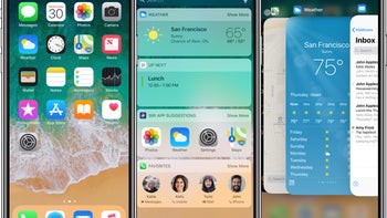
Ever since Apple popularized the notch design with the iPhone X (although it did exist before Apple, as these things often do), we've seen the design popping up everywhere in new devices and leaks. And not too surprisingly with a feature that Apple popularizes, there has been a backlash by people saying the notch is terrible, generally for aesthetic reasons. However, the argument against the notch is one that we've heard before and it wasn't very convincing then either.
The general argument against the notch is that it's ugly and I'll admit that is a hard argument to deny if you're going to stare directly at the thing constantly or have a tiny fit of rage on the occasion that you notice it. But, in normal usage, I find it hard to feel strongly as to whether the notch is ugly, beautiful, or simply something that exists. If you stare directly at it, sure, it's probably fair to call it ugly. If you stop to consider the tech hiding within it, the notch (at least on the iPhone) is kind of beautiful. At the end of the day though, it's just something that exists. Depending on your preferences there are even choices in the size and shape of the notch ranging from the uncomfortably large (iPhone X) to literally nothing more than the camera (Essential Phone).
I used an iPhone X for about one month, and I started to ignore the notch approximately 20 minutes into that time. I'm willing to bet that unless someone is dedicated to being upset by the notch, my experience is one that probably tracks to most others. That's the way humans work: we ignore things that don't much matter. In the most basic way, our senses are specially designed to do that, because otherwise the sheer amount of sensory input we experience every minute would overwhelm us. So, if there's a constant stimulus, your brain just filters it out unless you pay attention to it. That's what happens with the notch.
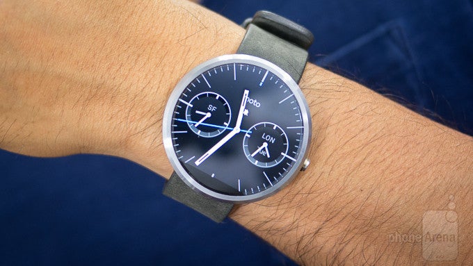
The same exact thing happened when Motorola released the original Moto 360 smartwatch. People who had never used the device constantly complained about the "flat tire" look, calling it ugly and impossible to ignore. But, the vast majority of people who used the watch regularly (I still have one) realized you start to ignore the display cutout almost immediately because there's no necessary information getting lost because of that design and even on such a small display, your attention is not that low down on the device but up where the information is on the display itself.
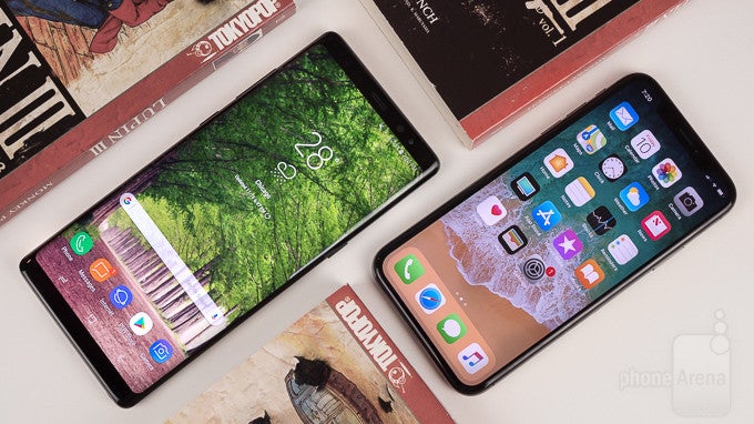
The notch is making its way to more and more devices now. Android P has modified the system bar to accommodate the notch (though one could also argue that limiting the number of notification icons in the system bar is just better design anyway; I know I personally get filled with anxiety seeing my wife's system bar overflowing with notifications). The speculation makes it seem like the Pixel 3 XL will include a notch, and there have been plenty of other phones adopting the notch, mostly in an effort to get the best screen-to-body ratio possible.
The notch appears here to stay, and frankly that seems fine to me.
Functional alternatives to the notch
These experiences with the iPhone X and Moto 360 bring an interesting question that most who decry the notch as bad design don't tend to comment on too often: what's the realistic alternative in the push to eliminating bezels?
With the Moto 360, there was a trade-off between bezels and the flat tire because of the sensors and display drivers needed to fit somewhere and Motorola decided to go for smaller bezels. The same choice for manufacturers applies to phones with one major difference: the front camera. Device makers can minimize bezels quite a lot if they don't have to worry about a camera, but the problem is that the selfie cam is one of, if not the most important hardware feature of any phone for the average user. A device maker could probably leave off the selfie cam and still sell to a base of power users, but that would be a very small base.
So, what are the options other than the notch? Obviously, one option is to have a bigger bezel on the top or bottom edge of the phone (or top and bottom if you want symmetry). We've seen this attempted with the Xiaomi Mi Mix series devices in an extreme (no top bezel and a bottom bezel only big enough to house the front-facing camera) or with the Samsung Galaxy S and Note devices in a less extreme version of the bezel-less design (symmetrical top and bottom bezels but no side bezels). If you can handle a bit of bezel, that's probably the best you can do and perfectly good options.
Another way manufacturers have gone is to use a pop-out camera like the Vivo NEX. This gets you all the way to the bezel-less dream and still includes a selfie cam, but there's one major drawback here: any mechanical feature is far more likely to break or malfunction than a non-mechanical feature. On a long enough timeline and considering the way we all tend to use our phones and drop them, a mechanical feature like the pop-out camera is the most likely item to break, so getting rid of moving parts is almost always preferable to adding new ones.
What does that leave? Current tech can't accommodate a camera under the display, so there's really just the three options: bezels, a mechanical pop-out camera, or the notch.
So, is the notch worth it?
Given those three realistic options, the only option that is unacceptable is the unofficial fourth option to complain about something you're not forced to use and/or something that you've never used.
The beauty of the smartphone ecosystem is that there are options out there regardless of what option you want. Sure, there's a possibility that at some point in the future, Apple won't offer an option outside of the notch, but at this point, if you're an Apple user who hasn't resigned yourself having the limited choice that Apple offers, I really don't know what to tell you. And, if you really don't want the notch, there will always be an option available in the Android ecosystem that doesn't have one. So whatever your personal preference, you can find something you like.
Personally, I can't accept a pop-out camera as a real option because of the fear of malfunction or breakage. So for me, the two choices are to embrace the notch or stick with top/bottom bezels. Top and bottom bezels are shrinking on most phones (though not on the non-X iPhones as yet), but having used both, I know that I'll begin ignoring the notch almost instantly and I love the feeling of holding a device that feels like nothing but display, so I'll likely choose the highest screen-to-body ratio possible on my next device purchase (and given my other preferences, that will likely be the Pixel 3 XL.)
What will you choose?









Things that are NOT allowed: