Google tests new YouTube UI for Android with a search bar on top, larger thumbnails and more

Google is testing a new UI for its extremely popular YouTube app for Android. The new look would include a search bar on top, and larger thumbnail images of other videos. Currently, if you want to search for something that you hope is in the video streamer's vast and ever growing library, you need to click on the search icon in the upper right-hand corner. The UI being tested would feature a search bar that stretches across the left-center of the top of the page. And yes, it would save you a click when you need to search for a video.
The tested UI has larger thumbnails running edge-to-edge on the home page. While we don't know for sure whether the larger images will be seen elsewhere on YouTube, there is no reason for Google not to expand the thumbnails on the Subscription and Trending pages as well. With the search icon no longer needed, the icon for uploading videos is now seen directly to the left of your avatar. We don't see the Chromecast icon, but it could be placed to the right of the search bar.
Again, as your local Emergency Broadcast System announcer says (except in Hawaii), "This is only a test." Hopefully, it passes with flying colors and is coming soon to an Android handset near you.
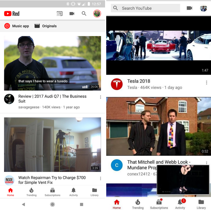
Current YouTube UI for Android on left, new UI being tested at right
source: AndroidPolice
Follow us on Google News




Things that are NOT allowed:
To help keep our community safe and free from spam, we apply temporary limits to newly created accounts: