Google tests a new look for search results in the Google app
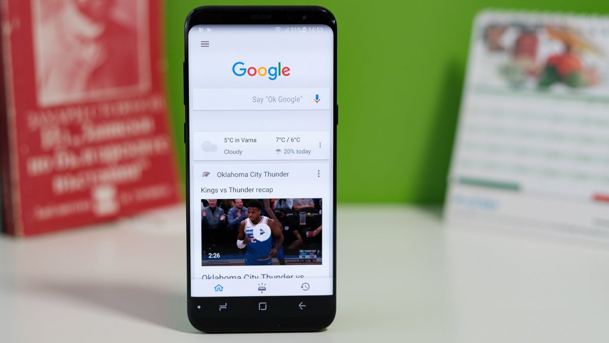
Google has been testing a new card-style UI for search results on its iconic Google app. The new UI generates a card for each search result that includes rounded corners to help you clearly see where one card ends and the next one begins. The goal is to make the app look less dated although this new look is the subject of one of Google's typical A/B tests and it isn't clear whether this look will be canceled or disseminated to one and all in due time.
Android Police discovered that the new card-style search results UI for the Google app was spotted by some users in version 14.31.19.29 of the Android version of the app. But since this is an A/B test, some of those with that version of the Google app on their Android phone may not have the updated look yet. For example, my Pixel 6 Pro is running Android 14 Beta 5 and the version of the Google app that we mentioned earlier in this paragraph. But the new UI has yet to appear on the phone.
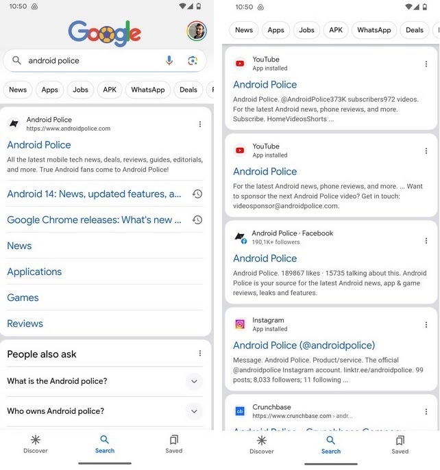
Google tests a new card style UI for search results on the Google app
Just because Google is testing the card-style UI for search results doesn't mean that it will elect to keep it after completing its testing. For example, in January of this year, the bottom bar of the Google app received a brief Material You makeover in a test that highlighted the tab that you selected from the choices on the bottom bar of the app: Discover, Search, or Collections. The tab you tapped on would be highlighted by a "blue pill" and while it was a nice touch, Google did decide to end the testing without adding the feature permanently.
Google might decide to keep the card-style UI for search results because it gives the results a more organized look. Still, as you can see from the previous paragraph, Google has no problem shutting down a test if it feels like it should.
Follow us on Google News



Things that are NOT allowed:
To help keep our community safe and free from spam, we apply temporary limits to newly created accounts: