Google testing new look for Android YouTube app

Some Android users employing the YouTube app might have noticed that a change has been made to the progress bar on the video player when in Dark mode. This is the line under the video that appears when watching streaming content in portrait orientation. The bar moves to the right as a video plays and also shows how much of a video has loaded. Typically, the progress bar is red although some Android users, including this writer, now see a white or gray progress bar instead. The change was spotted first by 9to5Google.
With the white/gray progress bar showing, you will no longer see the part of the line that shows how much of a particular video has been loaded on the app. Touching the line to move ahead or to go back (an activity known as scrubbing) will bring back the red color as will tapping on the video to get back the controls. When the progress bar returns to the original red color, it will once again show how much of the currently selected video has been loaded.
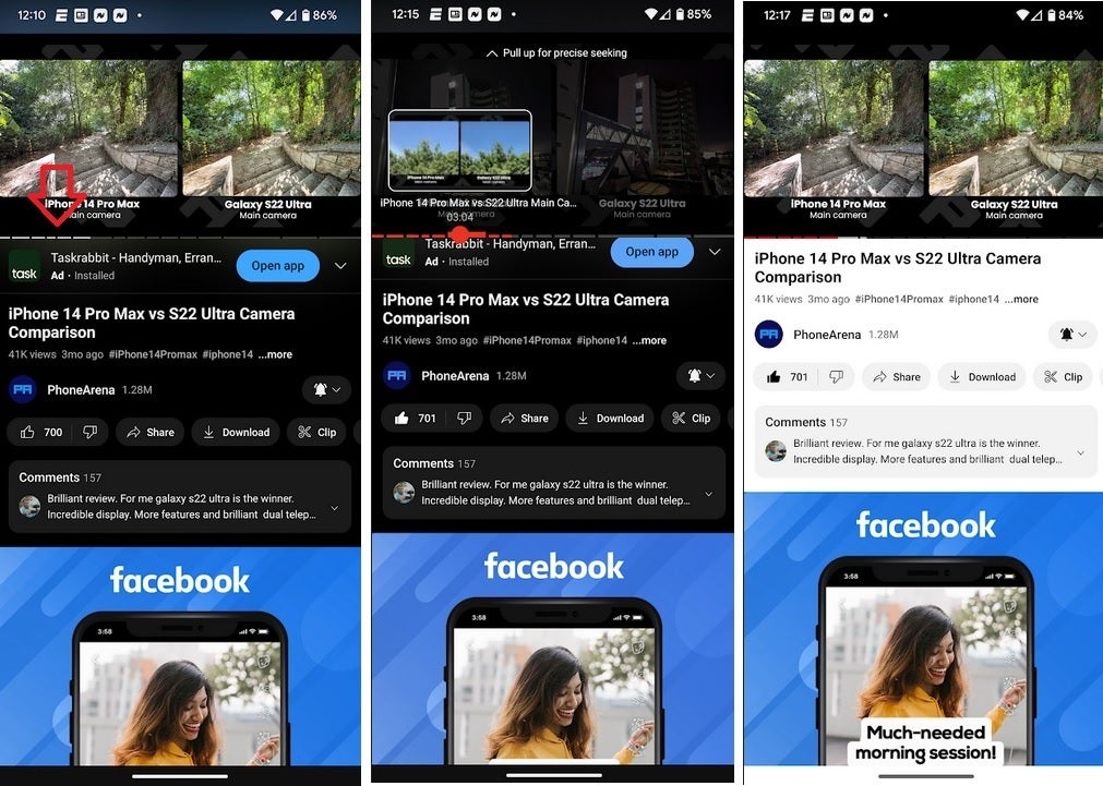
The YouTube progress bar in Dark mode is now white or gray on some Android phones
When watching in landscape orientation, you don't see the progress bar unless you tap the screen, and then it will appear for a second. The progress bar in landscape is in red and hasn't been changed-at least not yet. And we need to point out again that the change to the color of the progress bar in portrait is seen only when you are watching YouTube in Dark mode. In Light mode, the progress bar is red so it can stand out. It makes sense that a white/gray progress bar would be more easily seen with a dark background.
If your YouTube app doesn't exhibit this change, don't fret. This could be the usual A/B test that Google is famous for running. For what it's worth, the Pixel 6 Pro used by yours truly does have the white/gray progress bar but it is running Android 13 QPR2 Beta 1.







Things that are NOT allowed: