New phone dialer UI for Pixels with easier to reach icons makes surprise appearance
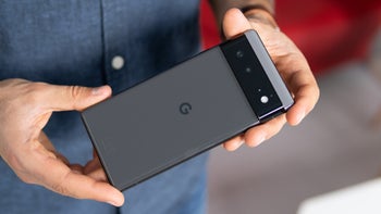
Earlier this year Google updated the Pixel's phone dialer app to give it a Material You look. The shape-shifting pill-shaped containers for the numbers had a similar feature as the Google Calculator and Lock Screens: tapping on a number to dial a call would change the shape of the pill-shaped container being tapped.
Now, over the last 24 hours or so, some Pixel users have seen a change to their phone dialer app including new ways to show the icons and list the capabilities available to be used while in the middle of a phone call. Unlike the current version of this app which shows icons for Mute, Keypad, Speaker, and Add call about halfway up from the bottom of the page, the new UI being tested shows icons like Keypad, Mute, Speaker, and More near the bottom of the page.
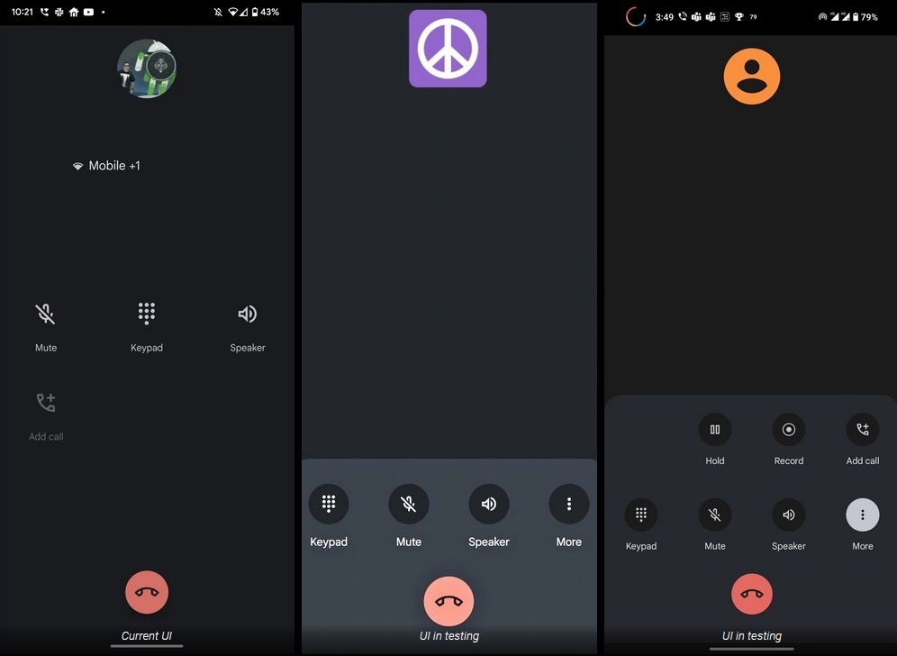
Current version of dialer app on left with the new version in the center and on right
Tapping on the More button adds icons for hold, record, and add call. The new screen is supposed to show up in version 90.0.475844574 of the Google Phone app available in public Beta. But according to 9to5Google, the new UI doesn't automatically show up on the aforementioned version number which suggests that a server-side update needs to be employed. And while the update could roll out to other Android phones that use the Google dialer, right now it has appeared only on at least one Pixel model.
We should point out that the new phone dialer UI has yet to appear on this writer's Pixel 6 Pro running the Android 13 QPR1 Beta. And my phone is running version 90.0.475844574 of the Google Phone app which pretty much confirms that a server-side update is required. But that doesn't mean that you shouldn't keep your eyes peeled looking for the new UI to appear.
Which version do you like the best? You can leave us a response in the comment section below.





Things that are NOT allowed: