The Google app and account switcher get Material You makeovers
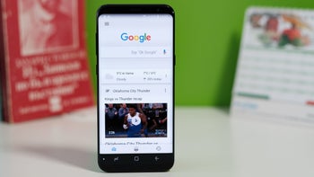
If you happen to have more than one Google account you're probably familiar with the Google account switcher page. From the page, you can switch between all of your Google accounts. For example, if you have more than one Google account, you can have multiple Gmail accounts. To switch between them you tap the profile picture or your avatar (it might just show the first letter of your name) on the right side of the search bar at the top of the screen and that will allow the account switcher to appear.
From the account switcher, you can switch which Google account you want to use to view. Keep in mind that switching the account will change what you see on all Google apps from Gmail, to the Google app, Messages, Calendar, and more. With multiple Google account you can have one for your personal life and one for work.
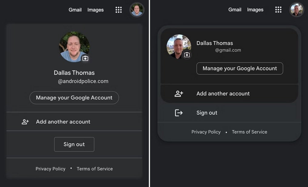
The old Account Switcher look is at left, the new look is at right. Image credit Android Police
Google has released a Material You makeover for the account switcher page that takes the rectangular box found inside the page and changes it to a rounded design. The new look has been spotted by Android Police in Google apps such as Search, Maps, Calendar, Photos, Drive, and Docs. Not everyone has the updated account switcher yet as this writer has yet to find it on a Pixel 6 Pro running Android 13 QPR2 Beta 2.1. The change to the account switcher page is purely cosmetic since it doesn't add any new features or capabilities.
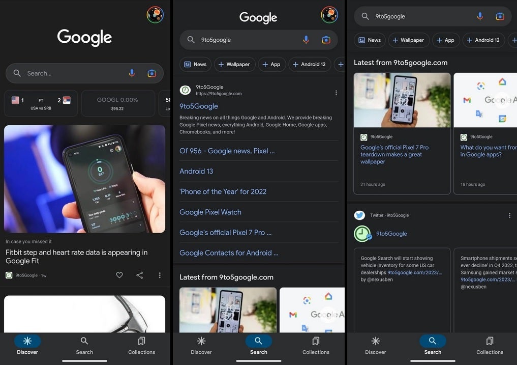
The new look for the Google app. Image credit 9to5Google
Speaking of changes, Google has also changed the iconic Google app using Material You theming. With the update, when you select a tab from the bottom bar, that choice (be it Discover, Search, or Collections) will be found inside a small blue pill-shaped enclosure. In Search, you'll see the carousel of filters near the top of the screen (matching the aforementioned pill shaped enclosure on the bottom) with a more traditional search field on top.
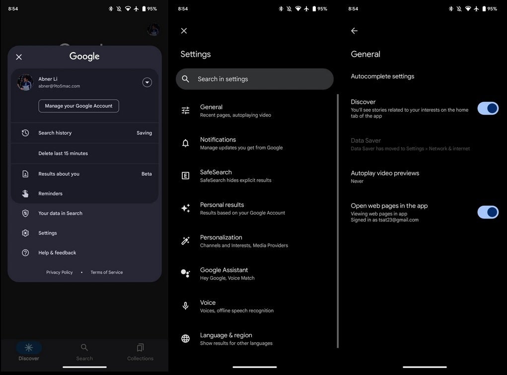
More changes for the Google app. Image credit 9to5Google
9to5 Google says that the changes appear on beta version 14.4 of the Google app. Material You is the design language used by Google. In describing what it means, Google has said that "Material You explores a more humanistic approach to design. One that celebrates the tension between design sensibility and personal preference, and does not shy away from emotion. Without compromising the functional foundations of our apps, Material You seeks to create designs that are personal for every style, accessible for every need, alive and adaptive for every screen."






Things that are NOT allowed: