Google explains the new Android 11 notification system and Bubbles feature
Here's what's new in the Android 11 notification and conversations system:
- There is a new section header for conversations that would always appear at the top of the notifications shade, holding your chat and message app updates, everything else comes down below in separate sections.
- The unread message counter is way bigger and easier to read, alerting you to the new stuff in your inbox or chat app.
- The avatars are now in the front of each conversation, making it obvious when there is more than one recipient, and the sender and chat names are larger.
- The primary action switch is way larger too, so it can be tapped easier, and long-pressing a convo paints it as important so that it goes to the top of the chain, and can pierce through your Do Not Disturb settings as well.
- There are new media and smart home controls now residing in the notification shade
Android 11, where's my Bubbles?
Perhaps the most immediately visible Android 11 notifications system feature will be chat bubbles, Facebook Messenger style. The idea is not to overlay the content of whatever it is that you are doing on the screen with a drop-down notification, but for a bubble to pop up, allowing you to easily switch between conversations instead of going places to pick and choose.
The Bubbles concept used to be a developer preview feature but is not graduating into the beta so it will definitely make it into the final Android 11 release later down the road. If developers chose to use the BubbleMetadata API, as explained by Google in the video above, Android users can snatch any talk they are participants in when it pops up, and take it to the screen via the respective chat bubble that will show.
Bubbles essentially removes the middle man, and you can open a chat or messaging app window immediately after you get a humble balloon alert, do the answering song and dance, and get on your Asphalt 9 merry way. Less annoying than reading and having a huge notification slide down, then having to go to the shade or the app, open and wait for the whole thing to load again, losing precious time and taps in the process.
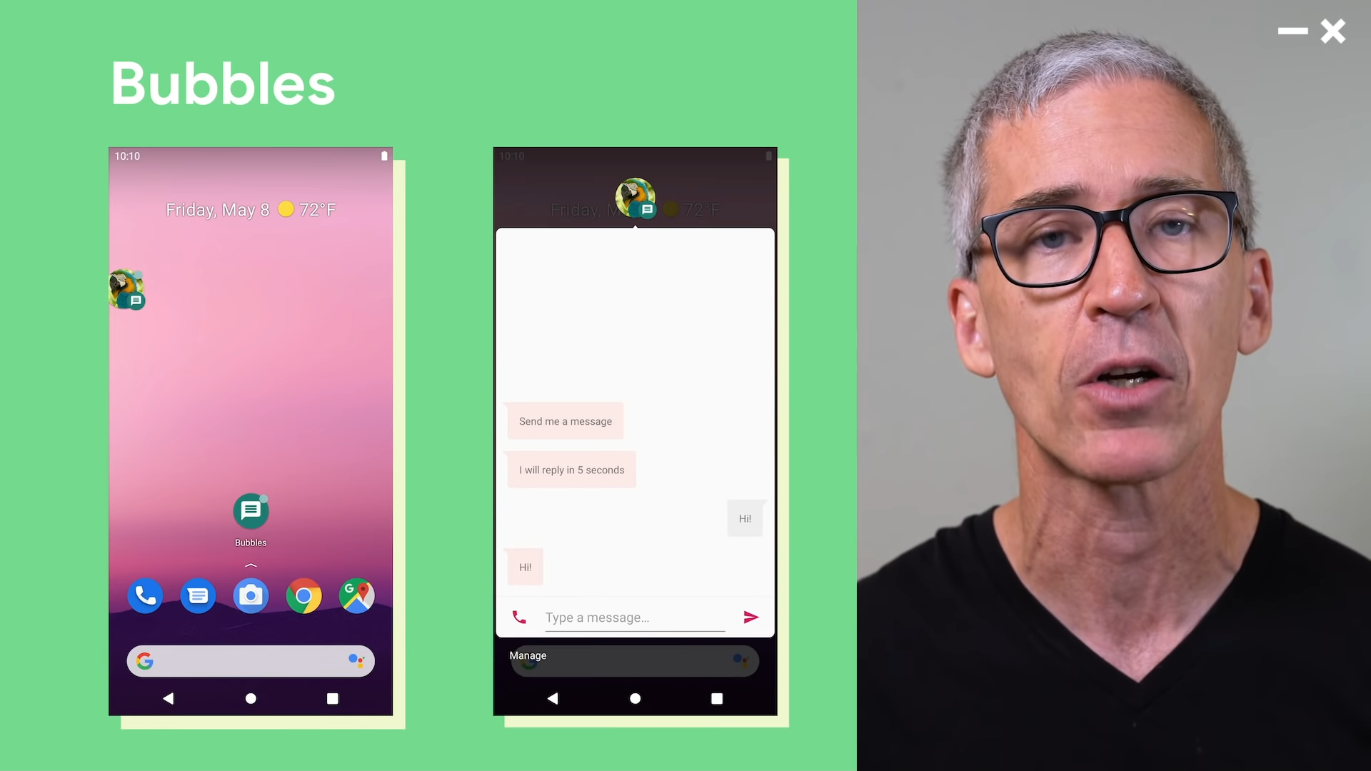
Android 11 Bubbles notification system
The whole Bubbles idea jibes with Google's new Android 11 concept for "persistent space" that will be solely dedicated for certain tasks. Google has listened to the user feedback, and concluded that conversations with people are often way more important than whatever else you may be doing on your phone at the moment.
Thus, when a chat "bubble" appears, you can immediately drag it into view as a card that is essentially a mini app which will overlay anything you have underneath so that you can participate. The floating bubbles can use adaptive icon properties to resize, but we will see how all that pop-up clutter will behave in practice when developers start using them en masse.
Follow us on Google News






Things that are NOT allowed:
To help keep our community safe and free from spam, we apply temporary limits to newly created accounts: