Netflix beta for Android gets a refreshed UI

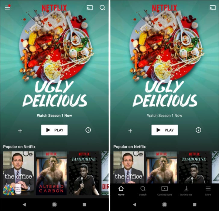
Old Netflix UI (left) vs new UI (right
image source: AndroidPolice
AndroidPolice reports that some of the changes include the removal of the hamburger menu, with all its items now listed in a bar at the bottom of the screen, and the relocation of content categories in the "Search" page. If you're rocking an 18:9 device, you'll likely appreciate that everything from the hamburger menu has been moved to the bottom of the screen, where it is easily accessible with one hand.
The UI changes are now rolling out to some beta testers, running Netflix v. 6.0.0. If you want to check out the new interface, you can join Netflix's Google Play beta program by clicking here. Keep in mind that not all beta testers are seeing all changes, as they are server-side. Some users are reporting slight differences in the UI, such as the location of the "Chromecast", which some beta testers have in the upper right corner of the screen, while others are seeing in the bottom right.
source: AndroidPolice


Things that are NOT allowed: