New iPhone 15 Pro looks more boring than a PowerPoint: Android winning the phone design war?
This article may contain personal views and opinion from the author.

The iPhone has always been a standard for design with meticulous attention to detail, as well as exceptional build quality.
Whether it’s the iconic original iPhone (notable for being… the first iPhone), the iPhone 4 (perhaps the most universally beloved iPhone design), the super-slim and durable iPhone 5 (heavy metal!), or probably the most comfortable iPhones to hold - iPhone 6, iPhone 7, iPhone 8, and iPhone X, Cupertino has had some serious hits throughout the years. Of course, the Apple logo also helps to make the designs stand out...
But that was years ago! Today, it so happens that there’s not much you can do or change with modern slab phones to make them look totally unique. Almost all of them are glass sandwiches held together by a metal frame and a ton of glue. Yet, it’s not like other (read: Android) phone-makers haven’t found ways to spice things up, making some head-turning smartphones. I won’t manage to name all of them, but here are a few blasts from the recent past:
- OnePlus 7 Pro (thanks to the pop-up selfie camera that made this phone’s display one best-looking ones ever)
- Huawei P20 Pro, P30 Pro, P40 Pro (Eye-catching colors on the P20, P30 series, ceramic glass back on the P40 Pro, including the first “overflow screen” which made it look like you’re holding a bezel-less phone)
- Galaxy S21 Ultra (this one looked like it meant business; aggressive and not for everyone, but a definite statement from Samsung’s design team)
- Xiaomi Mi 11 Ultra (potentially one of the only Android phones that manages to outbadass than the S21 Ultra, the Mi 11 Ultra had an actual display next to its already huge camera housing)
- Xiaomi Mix 4 (one of the first phones with an under-display camera, and probably the one that hides it best)
- Pixel 6 and 6 Pro (the Sorta Sunny Pixel 6 Pro remains my favorite smartphone design of all time - the camera bar is unmistakable)
Of course, design is a subjective matter, and again - this is just the designs that have made an impression on me, off the top of my head. Please, feel free to name your favorite phones down in the comments. Also, the Galaxy Z Flip 4 and Oppo Find N2 Flip are quite the lookers, but foldable phones don’t make that list because they are still considered them a different category.
iPhone 15 Pro looks different, yet very similar to iPhone 14 Pro; Google, Xiaomi, Nothing look for ways to make Android phones as unique-looking as possible; ubiquitous iPhone is missing some "personality"?
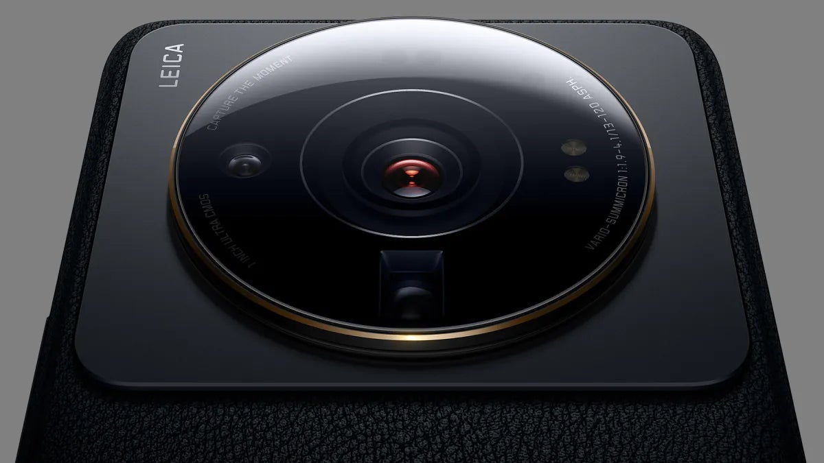
The Xiaomi 12S Ultra isn't shy to look like a camera...
And that brings us to the present day and the freshly-leaked iPhone 15 Pro, which according to recent CAD-based renders, might not look as “new” as the some rumors suggested. Speaking of which, It’s probably a good idea to establish what’s considered a “new design”?
To some people that’d be an updated look, which still has something new to it - hence it’s a "new design". To others (like me) new means new - not a tune-up, but an upgrade/redesign. So, no - I don’t really consider the iPhone 15 Pro’s slightly rounded edges and thinner bezels “new design”, as I believe it’d be difficult for a regular person to tell the iPhone 15 Pro apart from the iPhone 14 Pro. Just me?
To some people that’d be an updated look, which still has something new to it - hence it’s a "new design". To others (like me) new means new - not a tune-up, but an upgrade/redesign. So, no - I don’t really consider the iPhone 15 Pro’s slightly rounded edges and thinner bezels “new design”, as I believe it’d be difficult for a regular person to tell the iPhone 15 Pro apart from the iPhone 14 Pro. Just me?
So, what I’m saying is - there are certain ways to make slab phones look more recognizable and give them a little bit of a personality. But as per usual, Apple’s playing by its own rules here. Sure, there’s no other iPhone (like there are dozens of Android phone-makers), and if you want an iPhone, you’ll have to settle for the one and only option that Tim Cook & Co send your way, but that only makes what’s considered a phone without much personality (due to how ubiquitous iPhones are) even less exciting (I'm trying hard not to say "boring").
Here are some of the most attractive-looking Android phons of 2022-2023 that have caught my eye (in that order):
- Xiaomi 12S Ultra (I like it in green; the black is sleek too)
- Nothing Phone 1 (I like this one in black, but the white version is just as good-looking)
- Google Pixel 7 Pro (I prefer the white one)
Again, looks are subjective. However, what’s for sure is that these slab phones have one thing in common - they stand out from the crowd (as much as possible). The Xiaomi 12S Ultra looks like a camera; the Pixel 7 Pro has the only horizontal camera housing out there (the only metal one too; correct me if I’m wrong); and the Nothing Phone… Well, there’s really nothing like it.
As an iPhone 13 mini user, I’d be lying if I said, I wouldn’t take iOS and the mini size in one of one of the aforementioned packages/designs. I dig phones that aren’t shy to look like a “real camera” (Xiaomi 12S Ultra), the Pixel 7 has its own flair; while the Nothing Phone 1 is just... eye-catching (no two opinions there).
"The" Jony Ive might be gone, but that doesn't mean Apple shouldn't look for other ways/people to make new iPhones look more... exciting
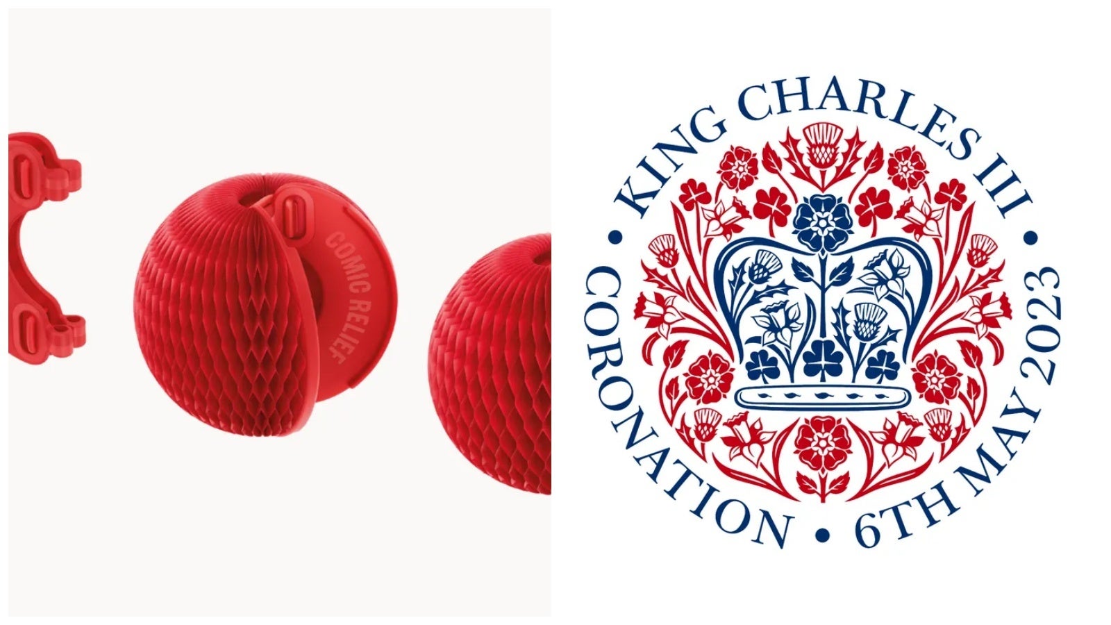
Jony Ive is still designing... stuff - just not the iPhone.
In the end, as you might know Apple’s lead hardware designer from 1997, Jony Ive, packed his $100 erasers and $500 Hemès measuring tape (must’ve been nice to get that off Apple’s bill) and left Cupertino’s headquarters in 2019... In case you’re wondering, the London-born ex-Chief Design Officer has been keeping busy. Some of his most recent designs include the emblem for King Charles’ coronation and a “magically transforming” red nose. Sorry, we don’t have purchase links.
Ironically, in Ive’s absence, Apple doesn’t seem to be ready to be taking more risks when it comes to the iPhone’s design. For starters, Ive’s role was sort of acquired by Evans Hankey, who recently announced she was departing from Apple after three years as the Industrial Design Chief. Surprising or not, Apple isn’t looking for a direct replacement, shuffling around existing hardware designers expected to fill up the empty space.
iPhone users deserve a fresh new design, Apple; iPhone 15 Ultra or iPhone 16?
With or without Ive and Hankey, Hensel and Gretel, or Don Quijote and Sancho Panza, Apple might need a little bit more “edge” soon. Take the iPhone’s camera housing which has been looking practically unchanged since 2019 (it's getting larger, if you care). The iPhone’s colors have always looked somewhat “safe”, and with the humongous Dynamic Island which isn’t exactly the most subtle display cutout around, surely Apple must be looking for ways to make the iPhone’s rear look… new.
Meanwhile, there’s a light at the end of the tunnel, as according to leaks and rumors, what we’ve seen so far are CAD-based renders of the 6.1-inch iPhone 15 Pro. According to other rumors, this year’s Pro Max/Ultra model could offer better cameras, which does leave hope for a different design. Other rumors say that's coming with iPhone 16. I guess we'll have to wait and see...
By the way, Apple, if you need inspiration, there are some exceptionally talented people on the internet who will design the 2024 iPhone 16 for free (if you stole their ideas). You can see some of them above, Tim. I know you're reading. Give me credits; cut me in on the deal; a board seat maybe?!







Things that are NOT allowed: