This article may contain personal views and opinion from the author.
The iOS 18 beta is now on my iPhone 15 Pro Max, finally catching up to what Android's been doing for years.
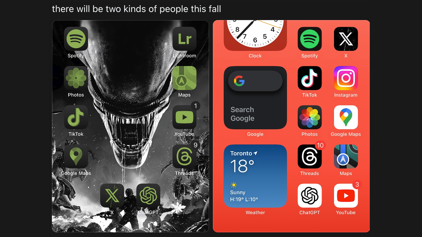
iOS 18 will let you scatter your app icons and widgets anywhere you want on the home screen! You know - like Android users have done since forever…
You can also change app icon colors and fully customize your Control Center toggles/widgets, while a more comprehensive Dark mode will darken your icons now. Aaand the Settings app is a bit easier to navigate and understand.
You know, it’s almost as if Apple just discovered users love the opportunity to make their iPhone… their own.
But is there such a thing as “too much freedom”? Especially when talking about the iPhone - the one smartphone, which (usually) likes to tell YOU how YOU like to use it. You know - “you’re holding it wrong”...
I’ll be honest… I’m a bit confused myself here. Still, let's bear in mind that iOS 18 is in beta, and the final version might (and should) bring better customization options.
Bizarre iOS 18 design reveals why Apple refused to give iPhone the same level of customization as Android for years
iOS 18 - it's never been easier to make your iPhone look truly... unique.
Recommended For You
Without a drop of doubt, the new customization features in iOS 18 make it more user-friendly and fun. But we simply can’t ignore the fact that iOS 18’s run to freedom marks a notable shift in how Apple approaches user personalization and, well… giving users the freedom to choose.
However, giving iPhone users (who’ve never had the full freedom to choose) the luxury of choice could very well turn out to be like giving your young kids the freedom to furnish and paint your brand new apartment. Or stock up your fridge. Or update your closet… You get the point! I’ve run out of analogies.
iOS 18 seems stuck half way between Apple’s love for authoritarian minimalism and Android’s liberal the-sky-is-the-limit-ism, and (right now) the result can be pretty ugly.
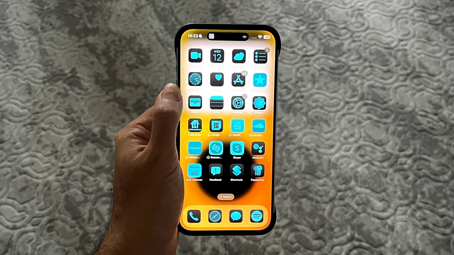
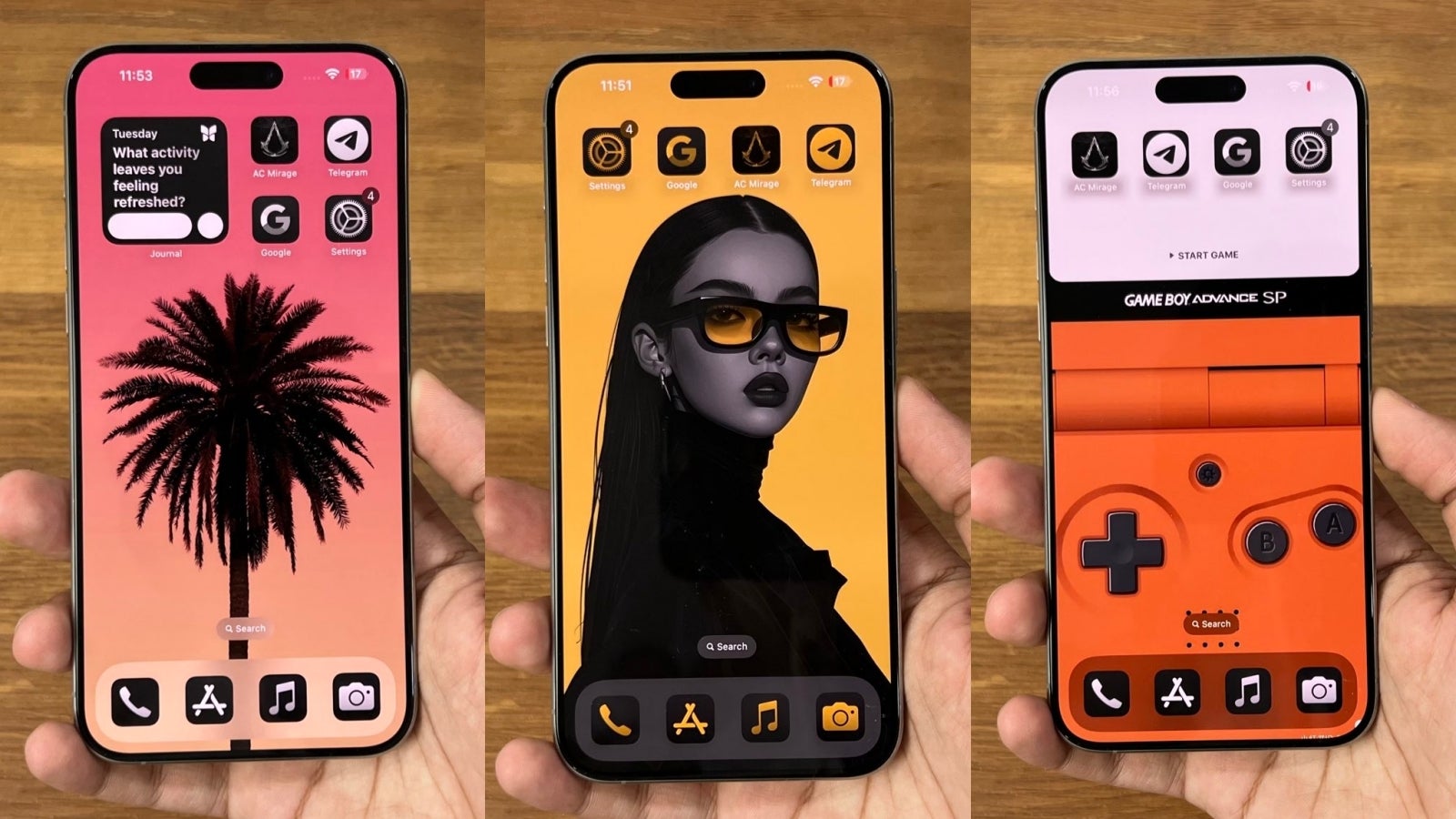
Apple’s new take on “Dark mode” is surprisingly cartoonish; colored icons lack of attention to detail; which must be addressed in the final version of iOS 18
My iOS 18 home screen with blue-tinted icons.
iOS 18’s home screen customization options can make your home screen look cartoonish and hard to read. On the bright side, you don’t have to use them if you don’t want to.
For example, while moving icons anywhere on your screen is a basic feature every phone should have, giving users the chance to make their iPhone look unique comes with the opportunity to make their iPhone home screen look… a mess.
Of course (!), I’m not gonna be the one to judge anyone’s individual taste, but that’s why we have social media! In other words, if I don’t, others will happily judge your new iPhone home screen as long as you’re willing to post it on Twitter/X.
However, what I can give my opinion on is the choices Apple’s made with the design/look of iOS 18, or at least the first beta I’ve been using for the past few days.
For example, I can’t help but notice the somewhat cartoonish app icons in when you turn on “Dark mode”; let me know if it’s just me, but the dark version of the icons looks significantly more cartoonish to me than what I see in Light mode one
The other punishable offence in my book is the ability to apply a tint to all icons; I’ll give Apple points for applying the color over every single app icon (unlike Google, for example), but the tint doesn’t pay much attention to detail - it simply applies a tint over the entire icon as if you’ve turned up the tint filter on a photo
Nope! This isn’t a bug but a feature/choice you can make in iOS 18. At least in the early beta days.
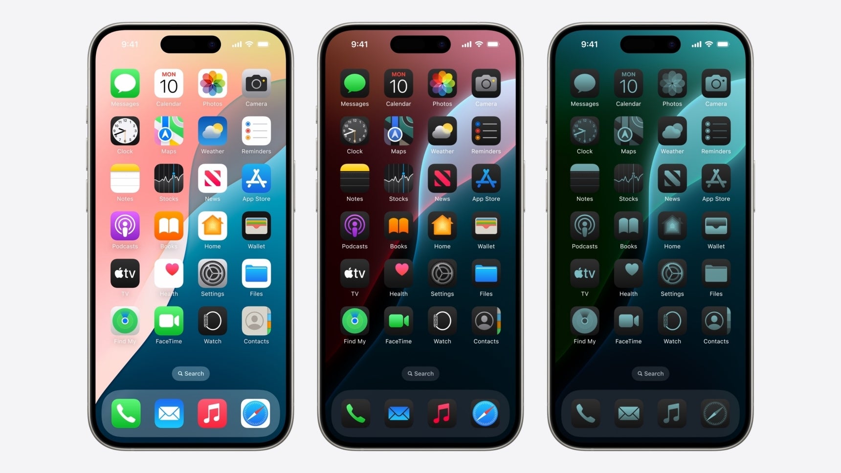
Even in the official Apple render you see above, the Dark mode and Tinted versions of the homescreen look somewhat off. I find the middle one cartoonish, while the one on the right is way too monotone, making it hard to navigate.
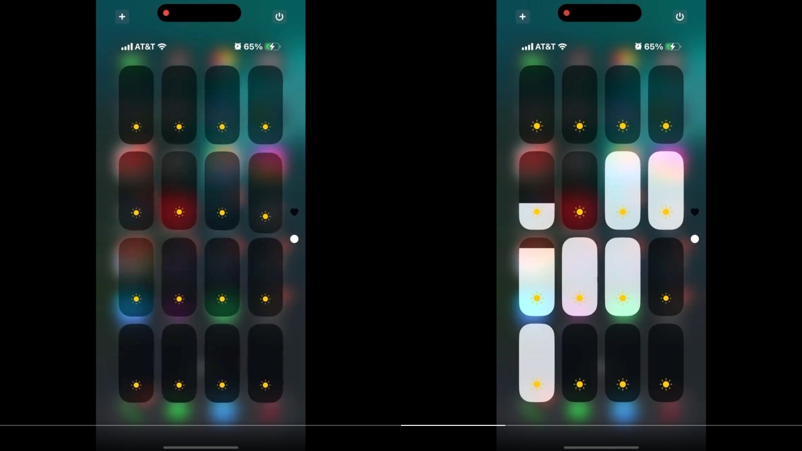
Then, there’s the new Control centre, which is a good example of what “too much” freedom to choose could look like on iPhone; in the Control centre screenshots you see, an X user is able to fill up a whole page with brightness sliders, which even seem to work individually
The hilarious Control centre example might proof as to why Apple was never keen on giving iPhone users “too much” freedom to “play” with their iPhone and potentially “ruin” Apple’s incredibly stubborn but neat aesthetic.
That being said, unlike the cartoonish icons and weird tint look, it’s probably unfair to blame Apple for the Control centre thing, which is totally up to the user. Needless to say, no one would actually have a page with 16 brightness sliders on their phone. Unless is for
Giving iPhone users more freedom to choose is the right thing to do, but iOS 18 should be 100% polished before it getes released to the public
Taste is subjective. With a bit of work and imagination, you can make your iOS 18 homescreen look pretty unique and stylish (courtesy of TechDroider on X).
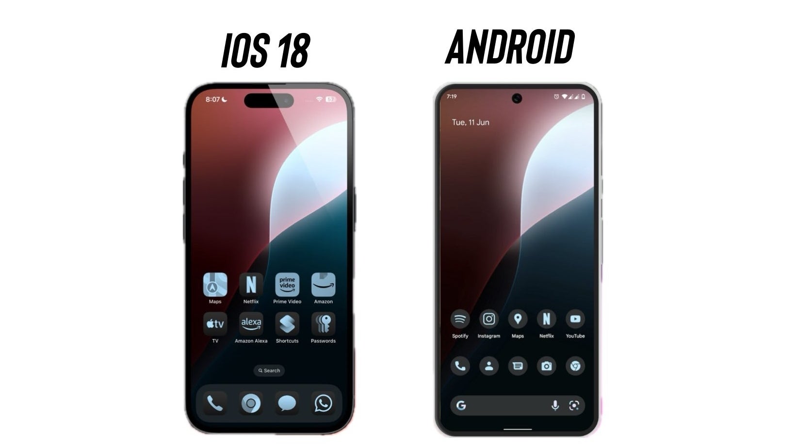
All in all, iOS 18 gives iPhone users the ability to make their iPhone unique. However, unique doesn’t necessarily mean “good”. Then again (to repeat myself), who am I to judge! I tend to stick to a basic home screen setup close to stock - whether it’s on my iPhone or my Pixel 8 Pro.
Moreover, I also think Apple got some things right. For example, I love the ability to choose “large icons” for my home screen, which also seems to remove the app labels, making my home screen look cleaner.
The ability to resize individual toggles within the Control centre is awesome since you can make your most used toggles larger and easier to click! For example, my Galaxy S24 Ultra has tiny WiFi and Bluetooth icons, whereas the Pixel 8 Pro’s Control centre is more practical thanks to its larger, tile-style toggles.
When it comes to the sheer flexibility of the new Control centre, one could argue iOS 18 gives you the best of both (Samsung and Google) worlds now! What a time to be a phone nerd…
iPhone users… You are holding it wrong; you are sitting on it wrong, and you’re customizing it wrong!
The Pixel's icons look much better, because it it's using a custom icon pack.
Apple once said “you are holding it wrong”... Now, Apple’s own grip on the iPhone is loosey-goosey. And to think I get paid in peanuts to come up with these Instagram-ready quotes…
Finally, I must say my personal preference is still leaning towards Android’s general way of handling customization but I might talk about that more in a future story.
For example, my Pixel gives me the ability to make my icons themed by forcing them into a single shape and size, which gives it a cleaner look (then again, this feature is in beta and the change doesn’t apply to every single icon you have).
Another great example of stylish UI is Nothing OS on the Nothing Phone, which has a unique and (more importantly) a very minimal aesthetic. It might seem a bit authoritarian at first but that’s what makes it pretty hard to ruin the look of your home screen.
Martin, a former tech journalist at PhoneArena, brings a unique blend of humor and insight to his work. His fascination with smartphones began with a Galaxy Young and evolved through a series of trades and upgrades, making him a self-proclaimed smartphone nerd. Martin's content often combines current analysis of market trends with historical references and future predictions. Whether it's a deep dive into technical issues or a first-person commentary on industry events, Martin's articles are designed to inform and engage. His critical perspective is driven by genuine curiosity and a desire to keep readers informed, not by any corporate sponsorship.
Recommended For You
COMMENTS (66)
COMMENTS (66)
All comments need to comply with our
Community Guidelines
PhoneArena Community Rules
A discussion is a place, where people can voice their opinion, no matter if it
is positive, neutral or negative. However, when posting, one must stay true to the topic, and not just share some
random thoughts, which are not directly related to the matter.
Things that are NOT allowed:
Off-topic talk - you must stick to the subject of discussion
Offensive, hate speech - if you want to say something, say it politely
Spam/Advertisements - these posts are deleted
Multiple accounts - one person can have only one account
Impersonations and offensive nicknames - these accounts get banned
To help keep our community safe and free from spam, we apply temporary limits to newly created accounts:
New accounts created within the last 24 hours may experience restrictions on how frequently they can
post or comment.
These limits are in place as a precaution and will automatically lift.
Moderation is done by humans. We try to be as objective as possible and moderate with zero bias. If you think a
post should be moderated - please, report it.
Have a question about the rules or why you have been moderated/limited/banned? Please,
contact us.


Things that are NOT allowed:
To help keep our community safe and free from spam, we apply temporary limits to newly created accounts: