iOS 17 review: total refinement, but it's time for a new killer feature

The wait is over, and Apple's iOS 17 software is now freely available for supported iPhones. If you have an iPhone SE 2nd gen, iPhone XR or iPhone XS, you can head over to Settings - General - Software Update, and initiate the free download.
iOS 17 is the culmination of the last few years of iOS releases - a brilliant piece of software with so many across-the-board updates that it leaves little to be desired. Just think about it: iOS 17 delivers improvements to everything from Phone, Messages, AirDrop, FaceTime, Keyboard, Widgets and Safari, to AirPlay, Look Up, Maps, Health, Fitness, Find My and Accessibility. That took a while to enumerate. It's like there's hardly a corner in the iOS universe Apple hasn't revisited and revamped in some way. In comparison, Google's Android 14, which didn't even get a proper announcement at this year's I/O conference, seems like a much more modest upgrade over last year's experience.
Then why is it that I feel like something's missing from iOS 17? Oh, wait a minute - I think I know what it is: isn't it about time for Apple to come out with a brand new killer feature in iOS? Something truly exciting and groundbreaking, like FaceTime in iOS 4, or the obliteration of skeuomorphic design in iOS 7 (I hope I spelled that one right), or homescreen widgets in iOS 14, or the lockscreen customization bonanza of iOS 16... Yet, the more I look around iOS 17, the less likely it seems that I'll find a showstopper feature.
But man, that thing is beautiful.
Design so good you want to lick it!
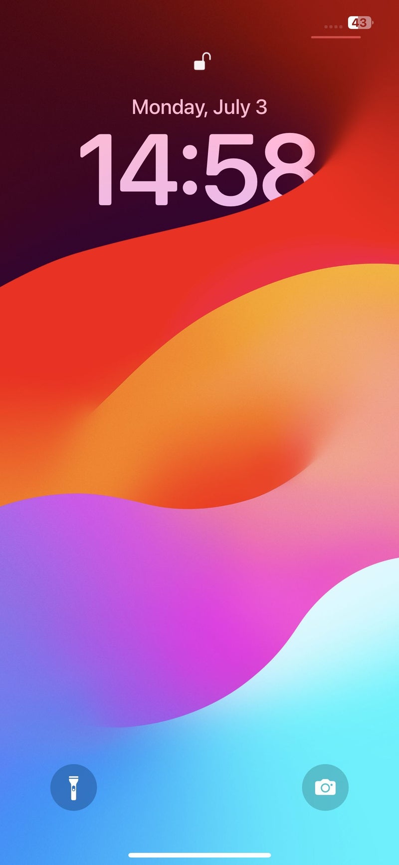
I don't know if it's the new iOS 17 wallpaper or just the result of years of polishing of what is arguably a winning design language, but iOS 17 looks breathtaking – just the right blend of simplicity and sophistication. There used to be the rare screen or menu that wouldn't exactly blend in with the rest of the interface, but now everything is so cohesive, responsive and professionally touched up, that I really can't find anything wrong with the iOS 17 UI.
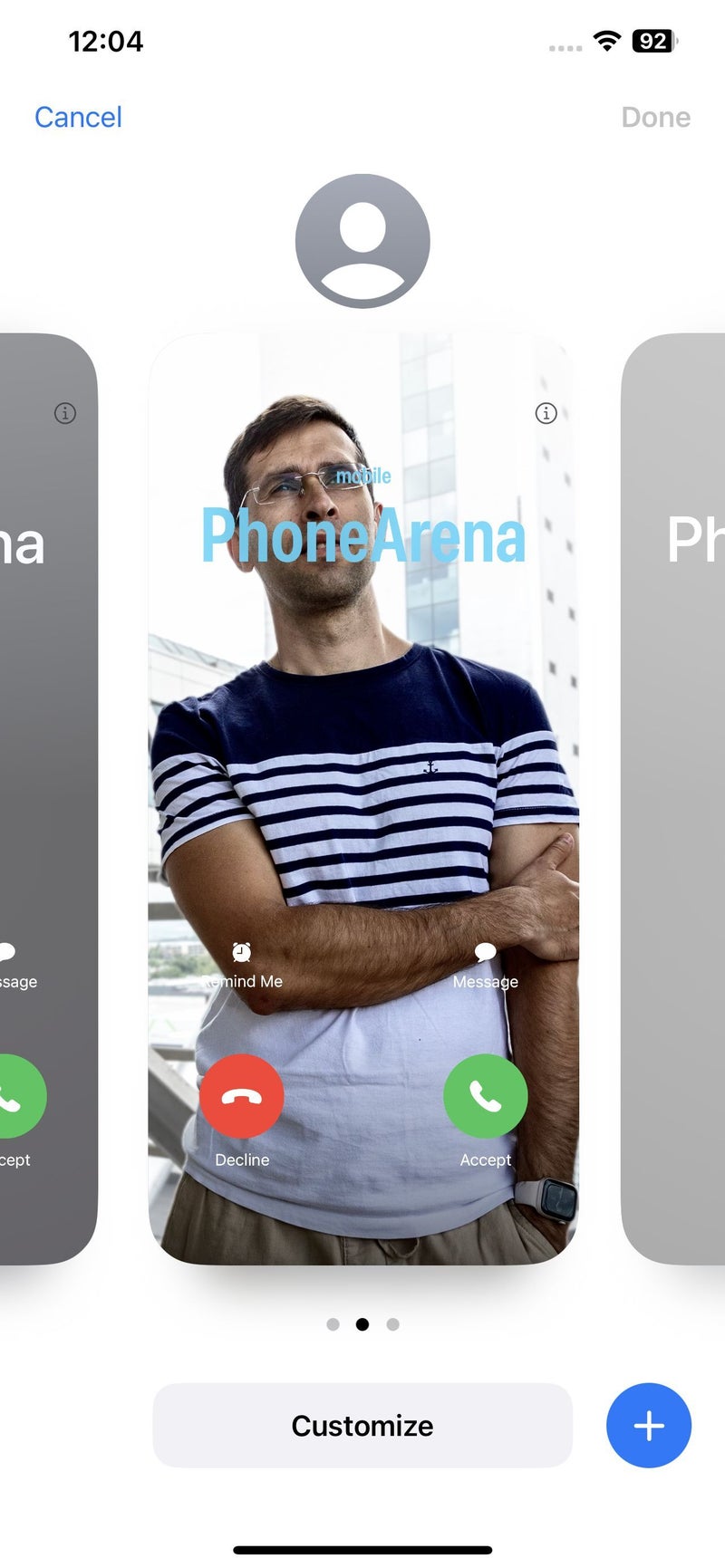
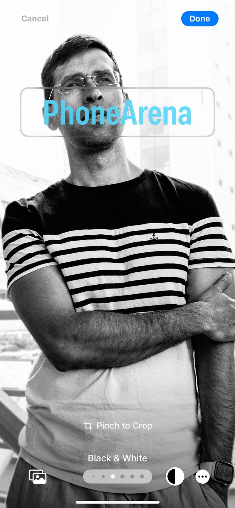
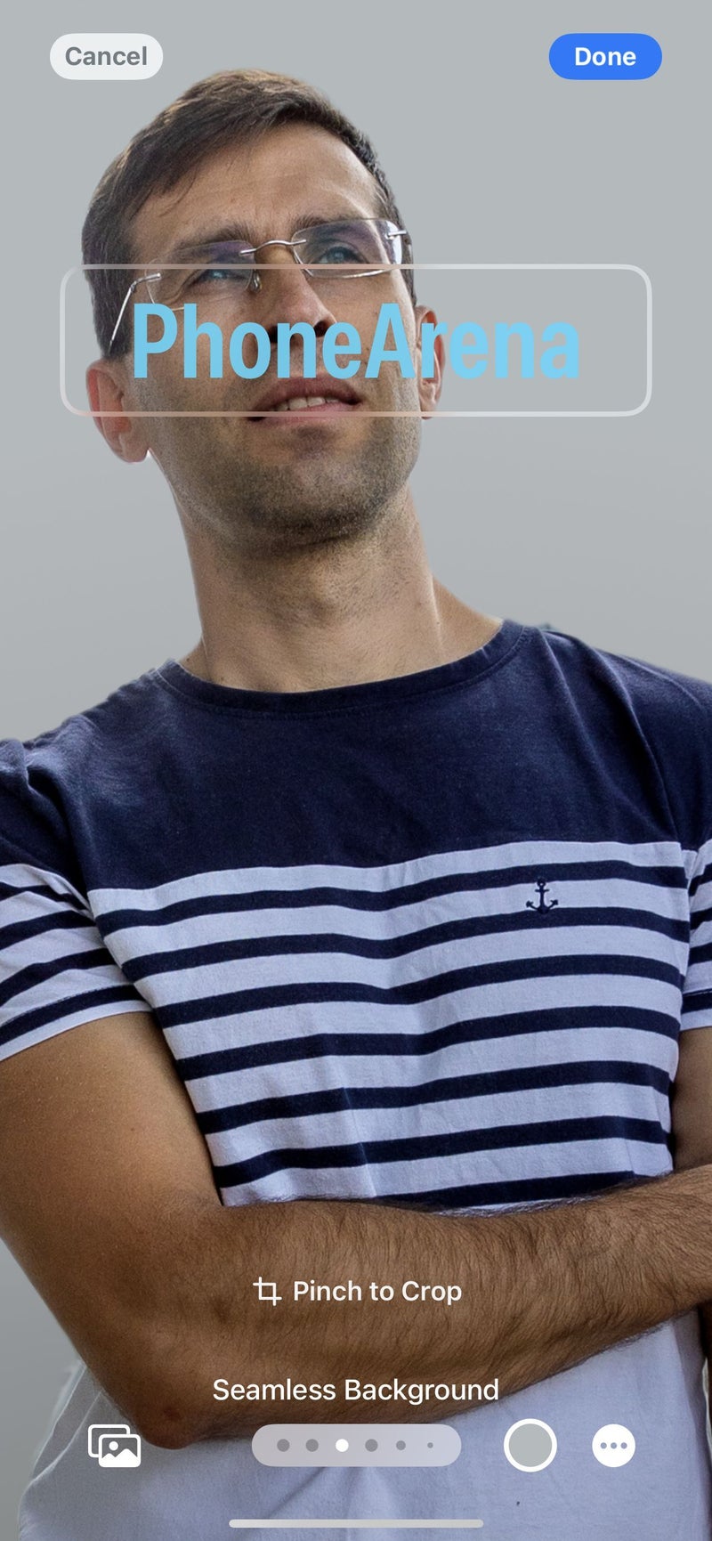
Take, for example, new iOS 17 features like Contact Posters in Phone, or Check In in Messages, which have been very delicately integrated with the existing apps. Using the same customization framework as the customizable lockscreens, it's very easy for the user to create a visually impressive Contact Poster. I think this is possible due to Apple's approach of allowing customization in a way that is supported by carefully selected options that make it easy for the user to express themselves, but in a way that doesn't allow for the system's appearance to be ruined. Aside from that, there obviously isn't anything groundbreaking about having a full-screen picture of a caller.
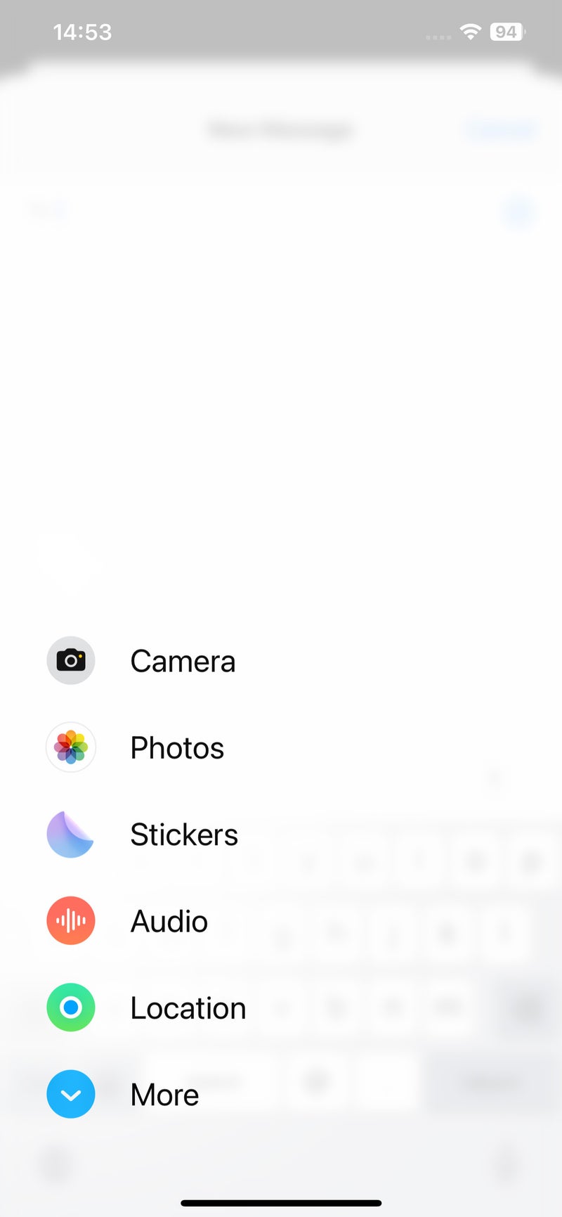
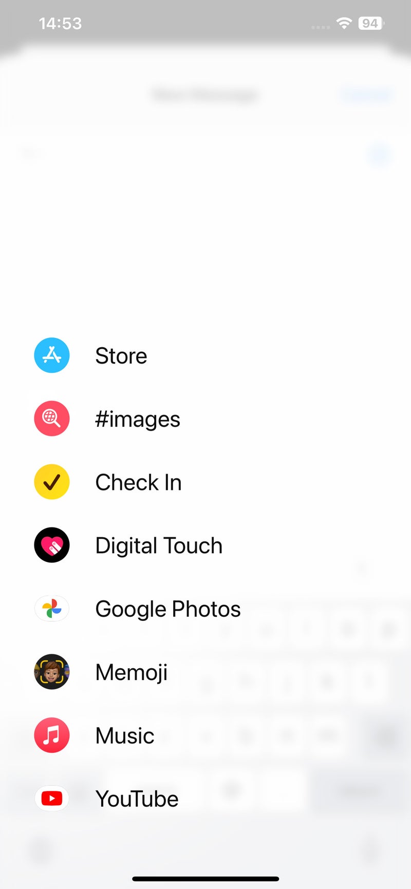
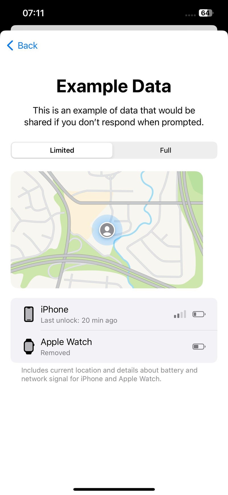
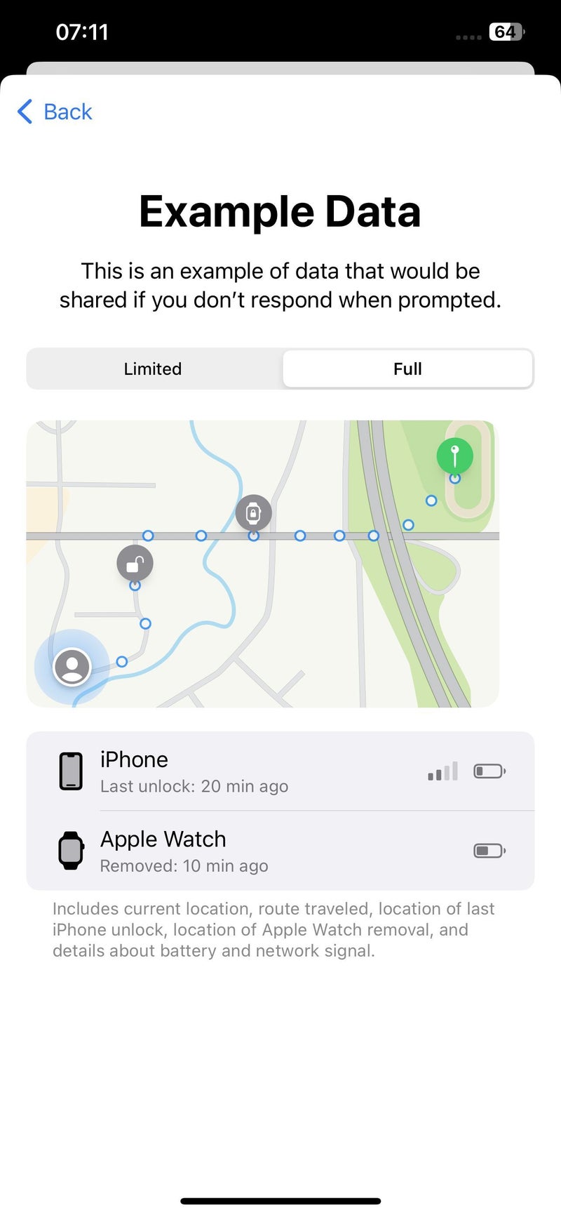
The above-mentioned Check In feature, on the other hand, lives in a brand new animated menu in Messages (behind the + icon), which now houses all special Messages features, like photo attachment, stickers, audio messaging, sharing location and so on. This type of menu is I think a first for iOS, and it integrates especially well with the standard messaging workflow as it doesn't get in the way. Check In is a very user-centric feature which brings location sharing and "text me when you get home" to a whole new level. I don't know if it'll be popular with iPhone users – some things are good enough in their most basic form (such as asking someone to send you a text when they arrive safely), but it's there and it's definitely very well thought out. I'd love to hear what you think of the Check In feature in the comments!
The visual goodness doesn't end here with iOS 17. For example, the new way to share contact information and other content via AirDrop (called NameDrop) is very impressive: you just bring your iPhone near another iPhone and you get this very fancy animation that almost makes you feel the transfer of information! It's super cool. Whether it's faster or more intuitive than the traditional way of using the share sheet – I don't know about that, but for those who prefer a more physical approach to sharing, there's now this really cool way of doing it.
Sharing contact information with NameDrop:
A mix of catching up and innovating
iOS 17 is an eclectic update that brings a lot of features which we've already seen on Android, as well as a bunch of fully original ones.
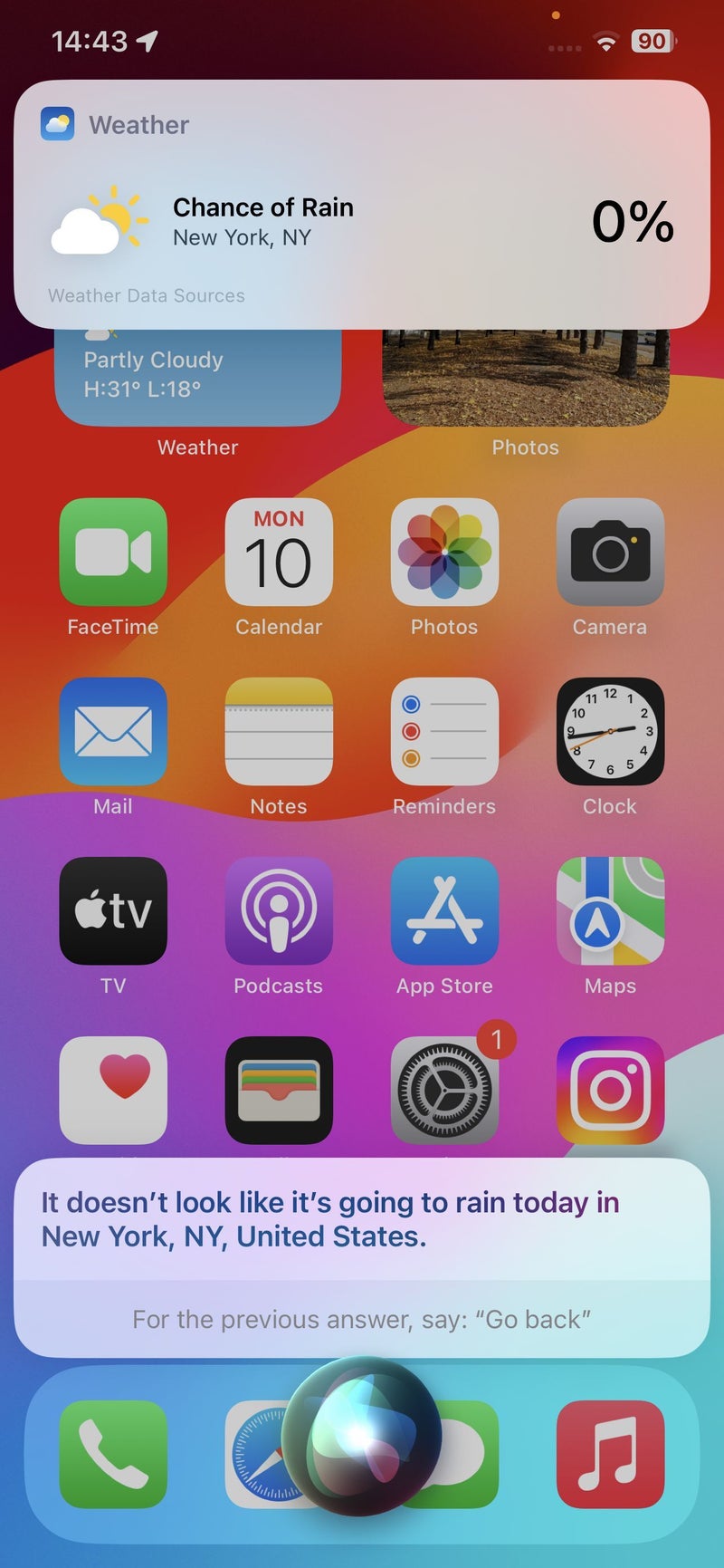
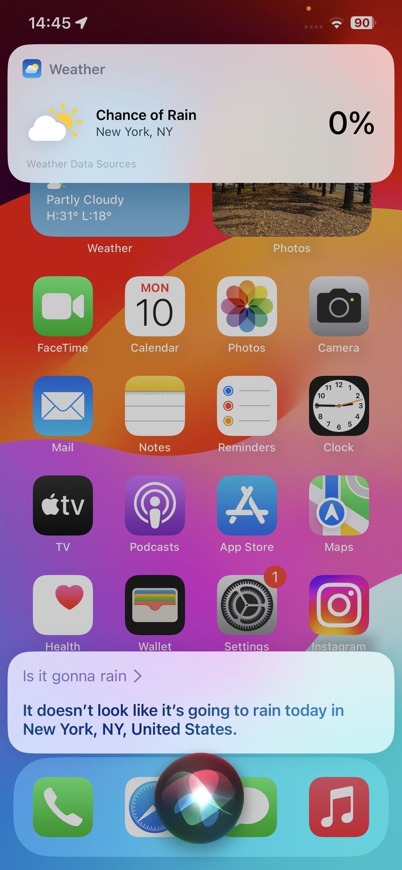
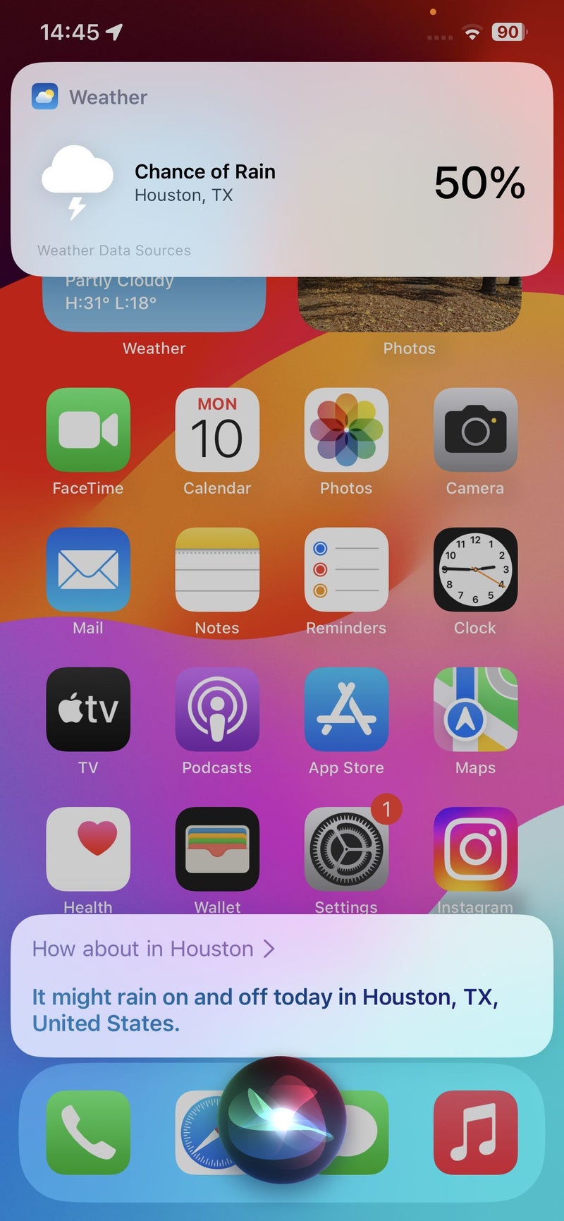
The ability to save Maps areas for offline viewing, or to get a live voicemail transcript, or to issue back-to-back requests to Siri are all very much welcome additions, and we can chalk them up under the "catching up" category.
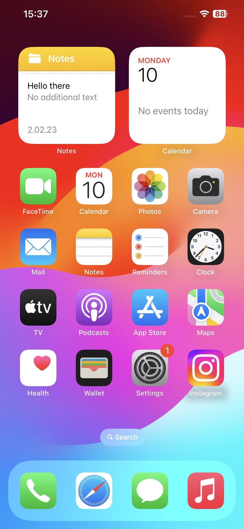
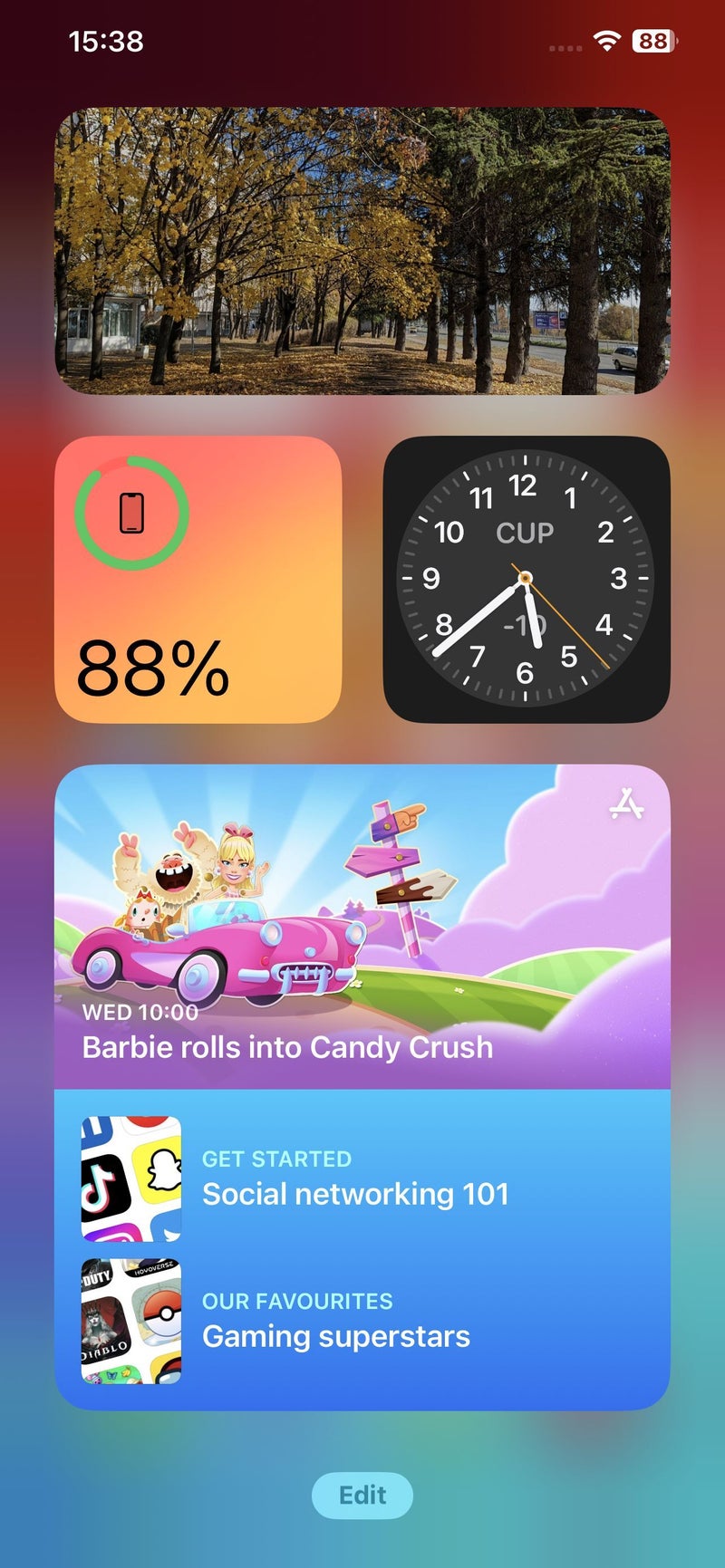
The same is true for the new interactive widgets, which aren't a new concept, but will be a tremendous upgrade if you tend to use a lot of widgets on your homescreen. As a matter of fact, the above-mentioned Contact Posters are also a "catching up" feature; however, it's great to see that for most of these new-for-iOS functions, Apple is applying its usual approach of building on top of what we've already seen and executing them in its own, stylish way.
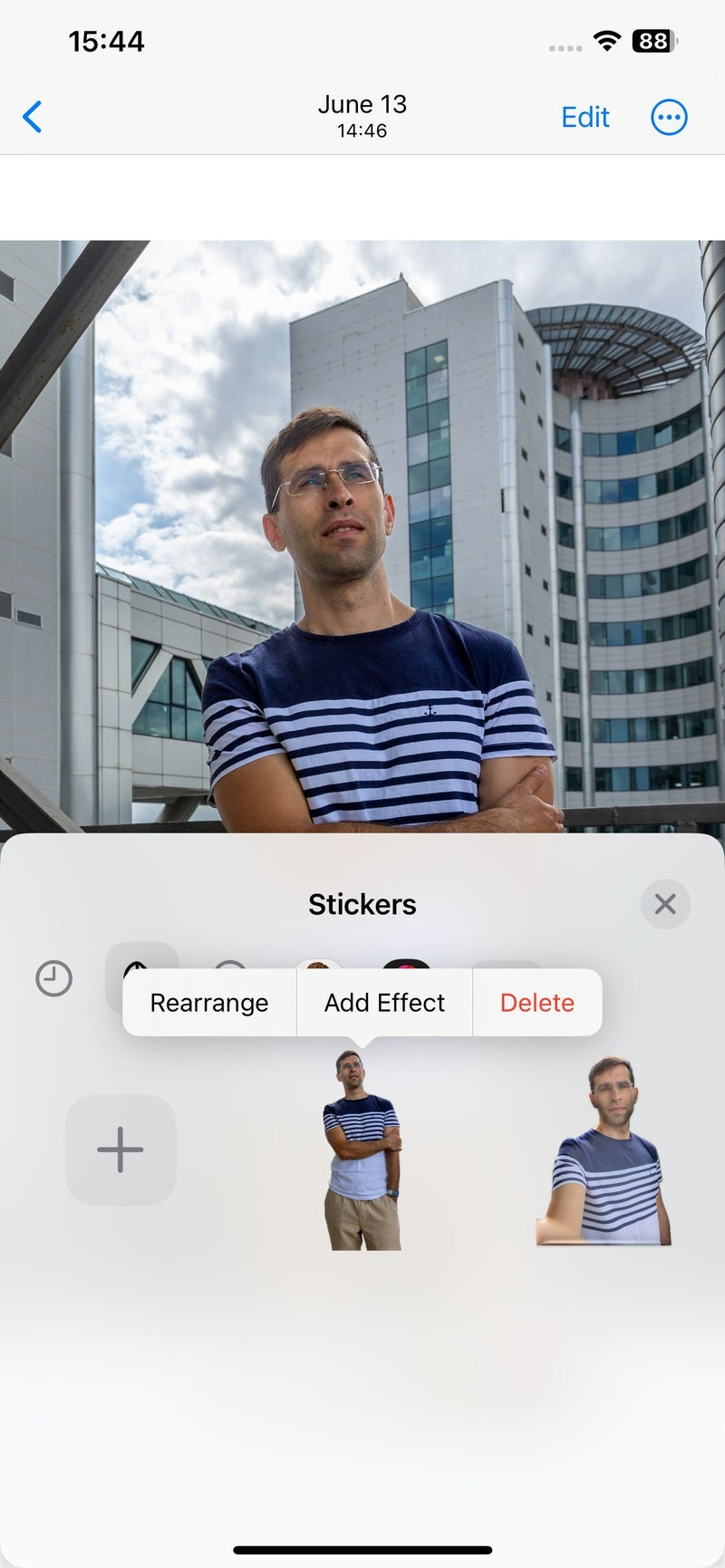
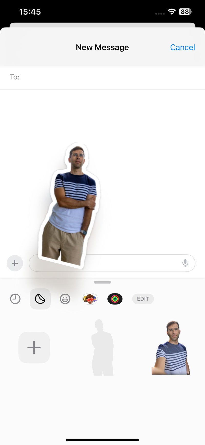
Meanwhile, Apple is really exploiting iOS's Visual Look Up capabilities in more and more creative and useful ways. Now you can not only lift objects from photos by tapping and holding on them, which is super cool in itself, but you can also create stickers out of lifted objects with one tap. Even better: you can also do so with live photos, which means you can super-easily create animated stickers this way. But wait, there's more! Visual Look Up itself is now able to recognize things from more domains, including food and recipes, storefronts and various signs and symbols, AND... it works with videos, too – you just have to pause a video on a frame where whatever you're interested in is visible. This latter feature doesn't work in streaming apps like YouTube – we're talking about videos found in your Photos library.
StandBy: the most awesome addition to iOS 17
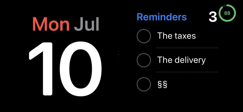
StandBy is easily my favorite new iOS 17 feature. It displays beautiful clocks, photos or widgets when your iPhone is charging while turned on its side – like a smart display. Obviously, you need MagSafe charger designed to hold your iPhone horizontally for the best StandBy experience, but getting one is absolutely worth it, especially if you have a bigger iPhone. Shout out to Belkin for setting us up with the awesome Belkin BoostCharge Pro 2-in-1 charger, which works great for the purpose.
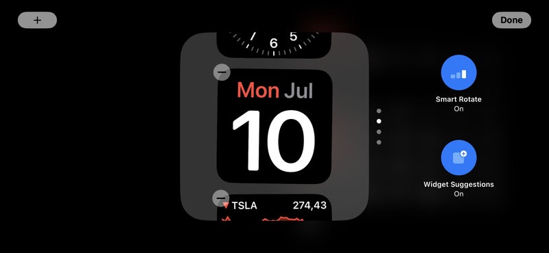
It makes your iPhone fit much better with your desk or bedside table, and adds functionality at the same time. There are three main screens in StandBy:
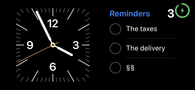
- Widgets screen: allows you to display a couple of different widgets at the same time, such as calendar, clock, stocks, music, podcasts, books, home, maps, etc. Hopefully, third-party app developers will quickly create their own widgets for StandBy.
- Photos screen: you can choose a specific album to be displayed on your iPhone's beautiful screen, so it can double as a stylish picture frame while you're not actually using it.
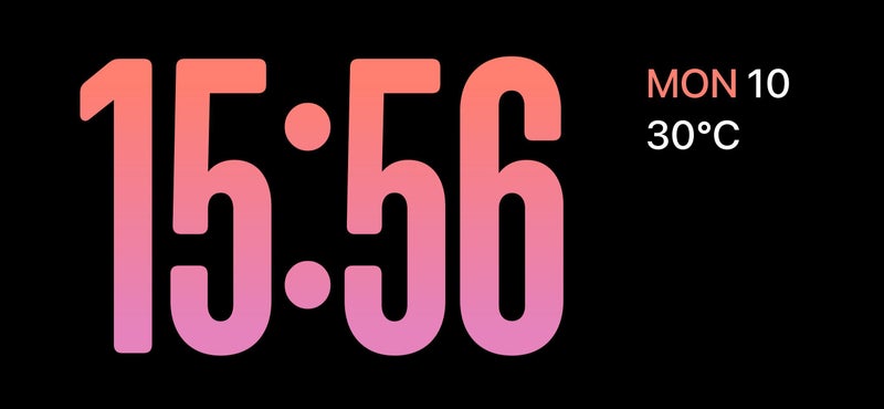
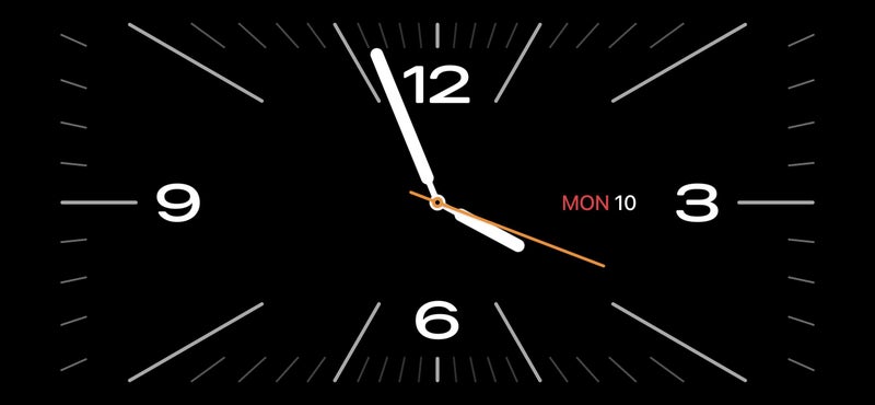
- Clock screen: you can choose between various clock styles, and there's an assortment of good-looking colors and gradients you can apply to make it your own.
What unites all StandBy functionality is how well-designed it is: fonts are big and easy to read, taking full advantage of the whole screen, while not looking too simple or basic.
Mental Wellbeing
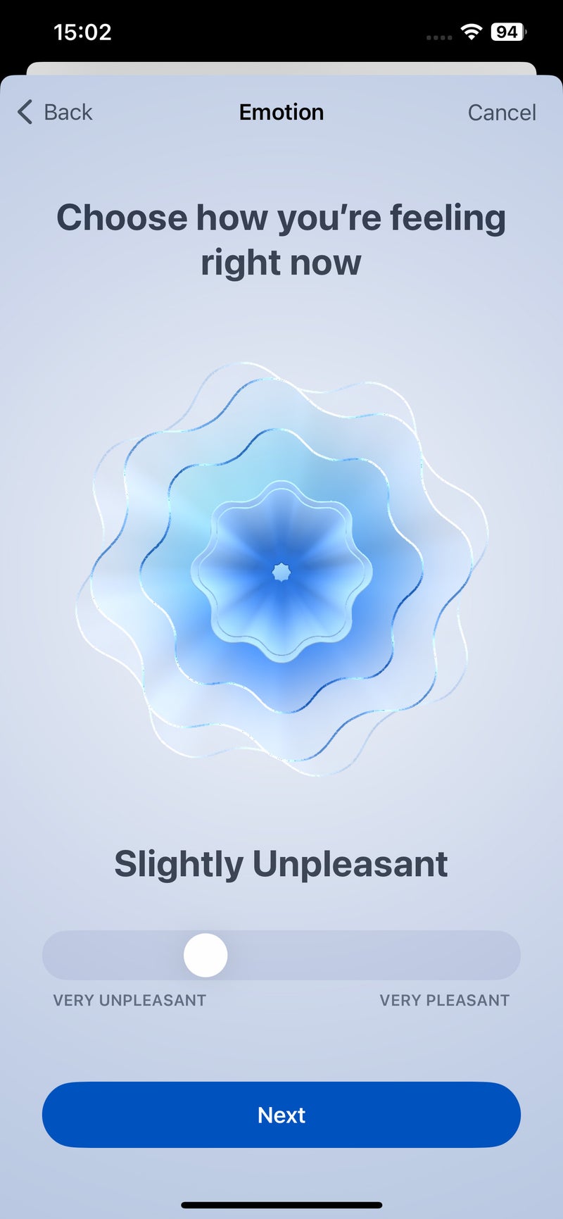
iOS 17 adds Mental Wellbeing to the host of other categories in the Health app, because, let's face it, mental health is often as important as physical health.
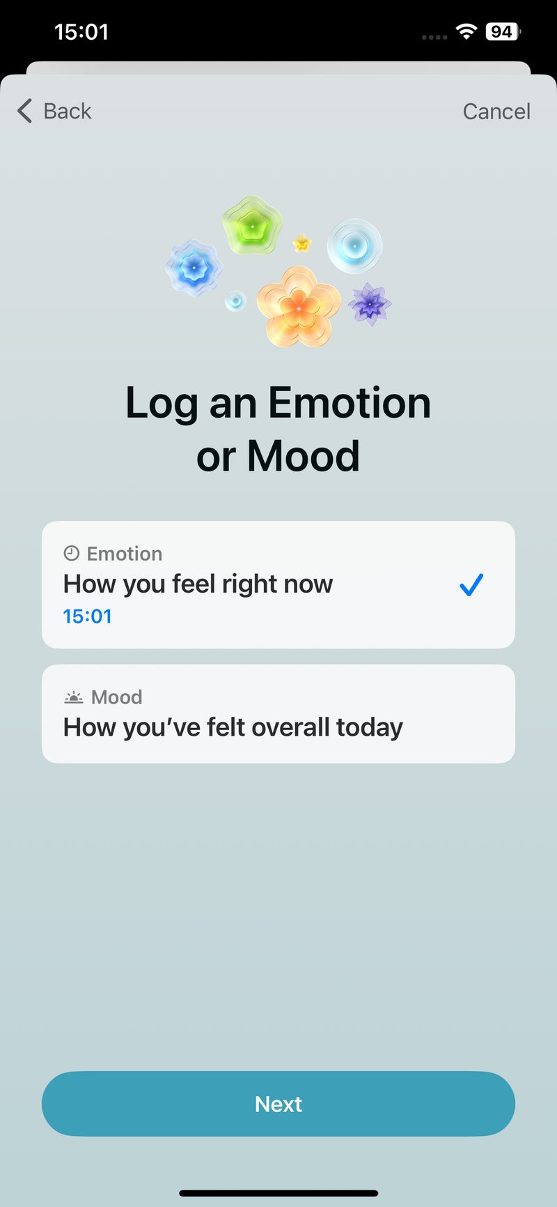
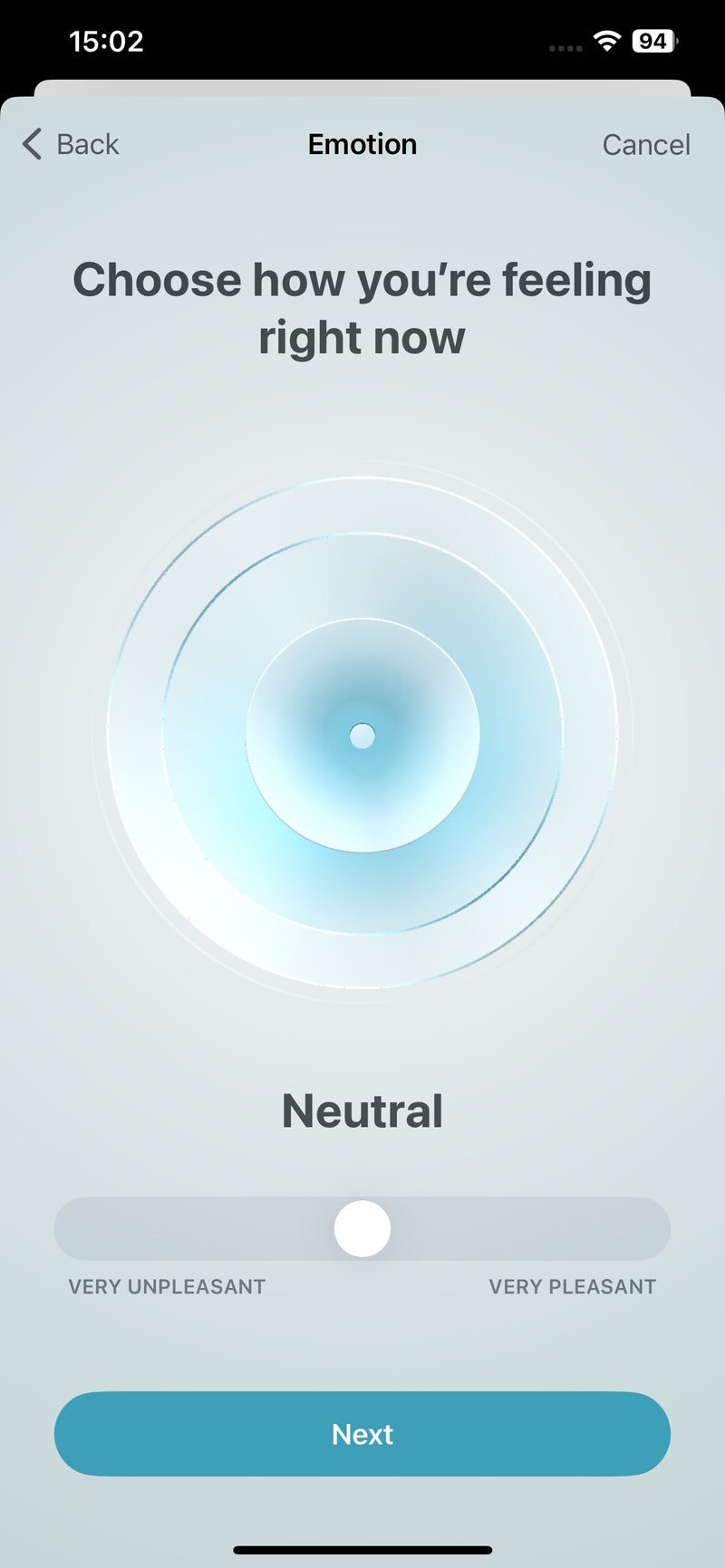
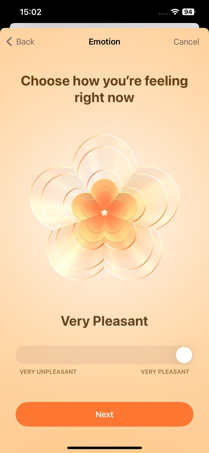
The new Mental Wellbeing feature allows you to log your current state of mind, either sporadically or at regular intervals. This happens as the user scroll through a spectrum of overall states, ranging from "Very Unpleasant" to "Very Pleasant." Then, the user is prompted to select from a list of various emotions they feel in the moment, as all as any associated factors that may be the cause of their current state, such as work, travel, family or something else.
This whole exercise is designed to aid the user in the process of working through their emotional states and developing better understanding and awareness. These processes of logging, describing and understanding are said to be beneficial for one's mental and emotional wellbeing.
With features such as Mental Wellbeing, Apple is clearly charting the path forward when it comes to our digital environments facilitating various aspects of our wellness. Because the Health app has become so compete and all-encompassing, it may be a little difficult to reach this particular feature initially, but you can set up helpful reminders to log your mental state, which will sort of bring the feature to you if you need it, rather than you having to dig through the menus to find it.
The new Journal app may turn out to be a surprise hit
The brand new Journal app will be a welcome addition to the arsenal of built-in app in iOS. It's not available yet, but Apple will release it later this year.
Journal is pretty self-explanatory – it's an integrated app that allows you to keep a journal. It comes up with smart suggestions for you to add to your day's journal, based on recent places you've been, or photos you've taken, or an album you've listened to. It'll have all the bells and whistles you'd expect from a journal app, such as reminding notifications and writing prompts. We can't take the iOS 17 Journal app for a spin yet, but it sure sounds like a great way to practice gratitude and self-reflection.
There certainly are great journal apps you can get from the App Store right now, such as Day One, Momento and Journey, but I'm sure the upcoming built-in Journal app will be very well rounded and superbly integrated with the rest of the OS.
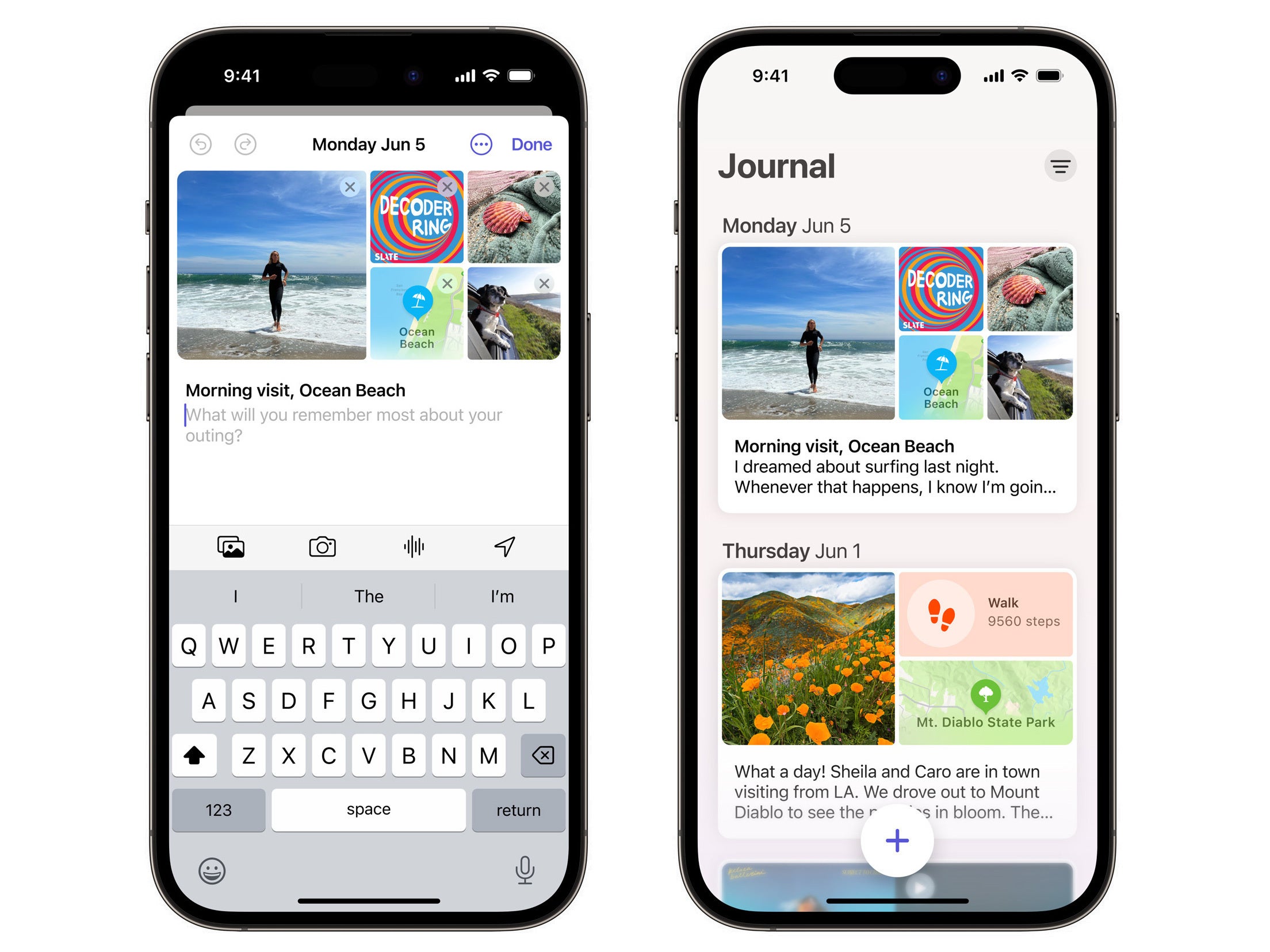
The upcoming Journal application
Privacy, privacy, privacy!
Privacy has always been a pillar of Apple product design, and with iOS 17, the company is doubling down on its promise to keep your data safe and secure as much as possible.
Locked Private Browsing in Safari is one of my favorite new features from this domain. It's exactly what it says it is: your tabs in private browsing are locked behind Face ID, Touch ID or passcode as you step away from your device. This means you no longer have to swipe away all your private tabs immediately after using them - only if you want to be extra-secure. Remember that private tabs don't get locked immediately after you switch to normal tabs. In my experience, private tabs only got locked after I locked my iPhone itself. This is smart, because very often you might happen to unlock your phone so your spouse can check something, or you may hand it to a friend for a minute, and you may have forgotten that those private tabs are there. Now, there's a second line of defense that ensures stuff that's meant to not be seen by others isn't seen by others.
On top of this improvement, Safari will also apply some next-level tricks to keep you untraceable on the web, such as modifying links you click on by removing tracking data, as well as disable known trackers from loading on webpages. Apple ensures us that any promotion- or discount-related URL modifiers will be kept, so if you happen to click on a link that comes with a special discount for a product, for example, it should still work.
Other interesting developments concern Communication Safety - the feature that can blur sensitive content (read: nudes) you may encounter in Messages and AirDrop. Originally created as a parental control feature, adults can now choose to have this filter on on their devices as well. What's more, it now works with video content as well, plus it's expanding to more places in the system, such as Contact Posters, and FaceTime messages.
Apple has also developed the Sensitive Content Analysis API, which the company says allows developers to easily integrate the on-device nudity detection tech in their communication apps. The developers behind Discord have already shared some positive feedback about the feature, but no further information is available on whether and when other major apps like Messenger or Whatsapp are to integrate the service. It'll be interesting to see if major players in the messaging industry, like Meta, decide to adopt this feature.
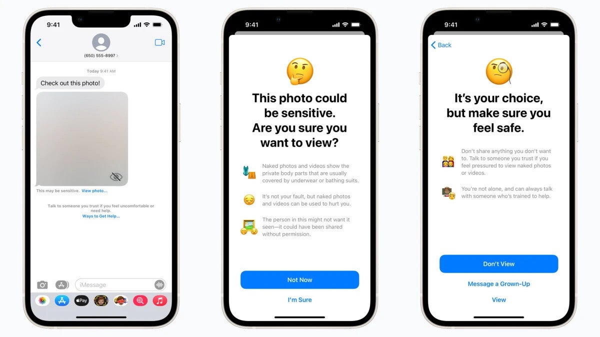
Communication Safety in iOS 17
iOS 17: yay or nay?
You don't need to pay or do anything to get iOS 17 — it's a free update for all recent iPhones, all the way back to the iPhone XS — and what's more, it's a logical continuation of iOS 16, bringing countless new refinements and features. Such kind of dedicated support by Apple should be celebrated, because there aren't too many companies out there updating their 5-year old phones with the very latest software on day 1.
Honestly, iOS 17 is not the easiest thing to get excited about, considering the lack of any groundbreaking functionality we haven't seen before, but still, we have to appreciate it for all the great across-the-board enhancements it brings. Besides, the new StandBy mode is a genuine extension of the iPhone's usefulness, while the upcoming Journal app will present users with a convenient way to get into the useful habit of gratitude and reflection, which is always a good thing.
iOS 17 is simply the next step in Apple's iOS strategy, and it feels very well calculated. You have absolutely nothing to lose if you go ahead and update you iPhone. Come back to this review after a few days as we keep testing the first official iOS 17 release and update this page with our most up-to-date impressions of the software!








Things that are NOT allowed: