iOS 15.2 brings new Notifications Summary design
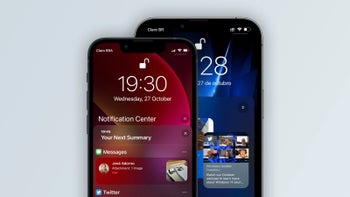
Notifications Summary was one of the brand new features introduced to iPhone with iOS 15 this September. As per Apple's minimalistic style, the primary goal of Notifications Summary was to make your life simple and easier, by clumping together all of your less important notifications into a solid block you can access any time on your Lock Screen.
That way you had much less junk to scroll through every time you pick up your phone, and you could suddenly get to your important messages a lot faster.
Now, just a month later, Apple continues to polish up the Notifications Summary feature even further, hopefully for an even better user experience. The first developer beta of iOS 15.2 was just released yesterday, barely a week after the iOS 15.1 patch—and we are seeing some new, even more minimalistic updates to the Notifications Summary feature for iPhone and iPad.
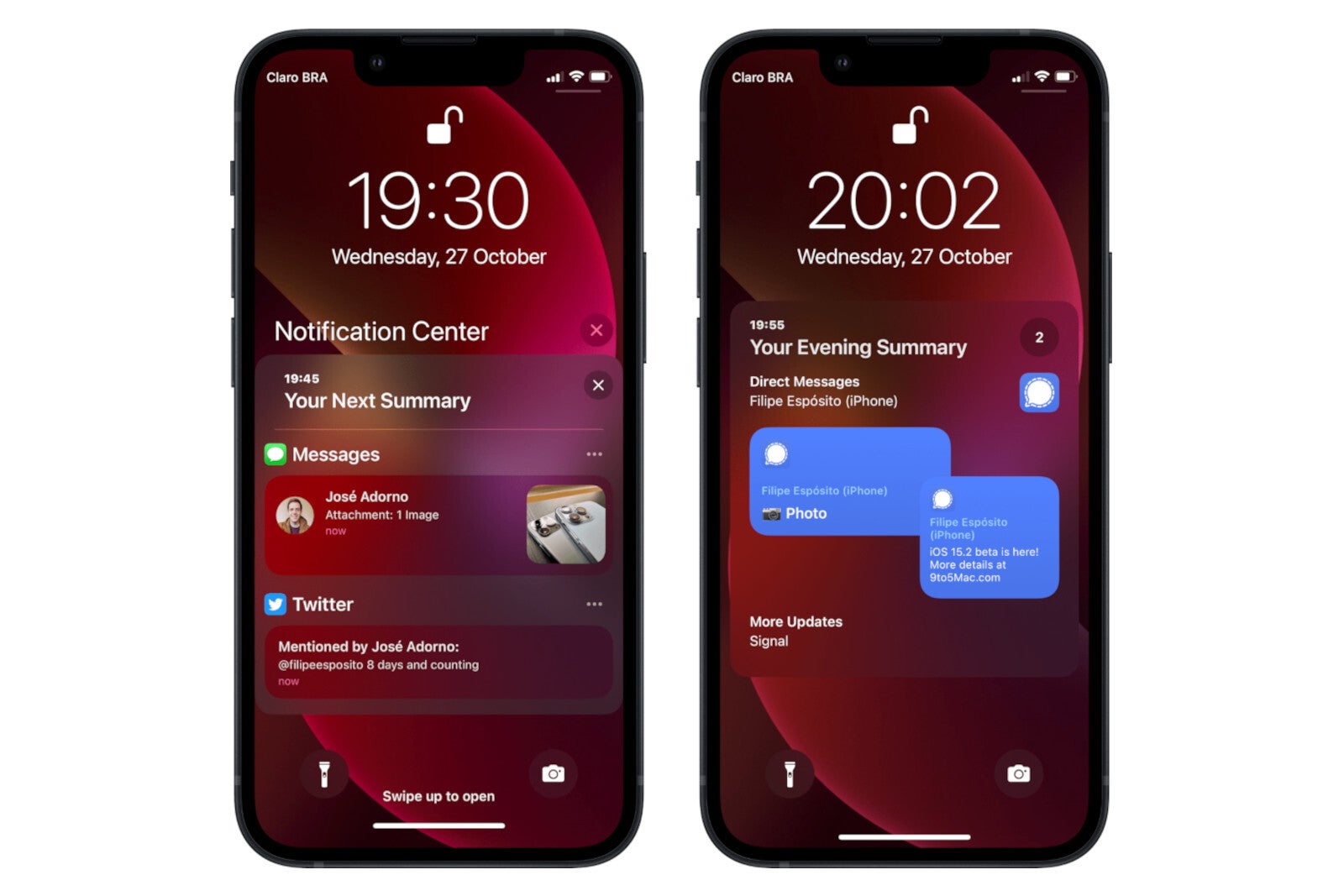
Previously in iOS 15.1, the notifications would all appear together in a solid list. But as is visible above, in the developer beta of iOS15.2, the various categories of notifications are no longer clumped together, but appear in separate blocks on your Lock Screen.
And when you click on the Messages Summary block, it expands to show you various separate floating bubbles, colored the same as their messaging app (blue for Messenger, etc.).
Other highlights of the iOS 15.2 beta are focused on privacy, which is becoming a hot topic in Apple's ecosystem following multiple successful iPhone hacks exploiting various zero-day vulnerabilities. In particular, the App Privacy Report is a new feature in the iPhone Settings where you can see exactly which applications (both native and third-party apps) are accessing what data on your device.
We'll likely have to wait for another beta or so before we have public access, without having the early-bird privileges of developers. We're still not sure when exactly that will be, but probably soon—seeing as iOS 15.2 won't be that massive of an update.








Things that are NOT allowed: