Instagram is testing three new layouts with Reels and Shopping tabs
Instagram started replacing the Activity Tab with the Shopping Tab in early July as part of a worldwide test. Now, the Facebook-owned social network has announced some more home screen tests.
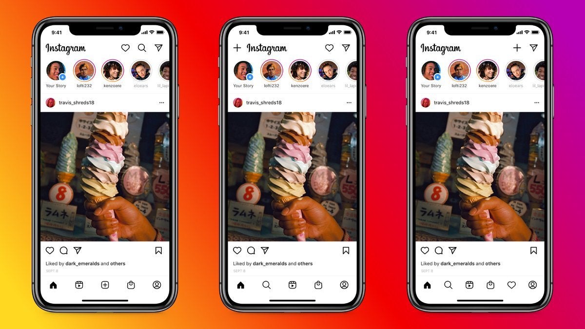
Three potential home screen layouts for Instagram
Users of Instagram will soon receive access to one of three home screen layouts. All of them focus heavily on the Shopping Tab and introduce an all-new Reels Tab to better compete with TikTok.
- Option 1: This Instagram version replaces the Explore Tab with the Reels Tab and moves the former to the top of the screen, right next to the Direct Message icon and Activity Tab.
- Option 2: In this update, the social network places the Reels Tab in the center and keeps the Explore Tab in its usual position. The Activity Tab again sits alongside Direct, although to post new content users have to tap the top-left corner.
- Option 3: Here, Instagram moves the new content button to the top-right corner. The bottom, on the other hand, houses six icons rather than the usual five, including the Activity, Explore, Shopping, and Reels Tabs.
Head of Instagram Adam Mosseri says these changes “reflect shifts” in the way users are interacting with the app and the recent “rise of creators, explosion of video, and acceleration of online shopping.”
The social network has not announced how long these tests will last, but eventually it’s expected to settle on one of the three layouts.






Things that are NOT allowed: