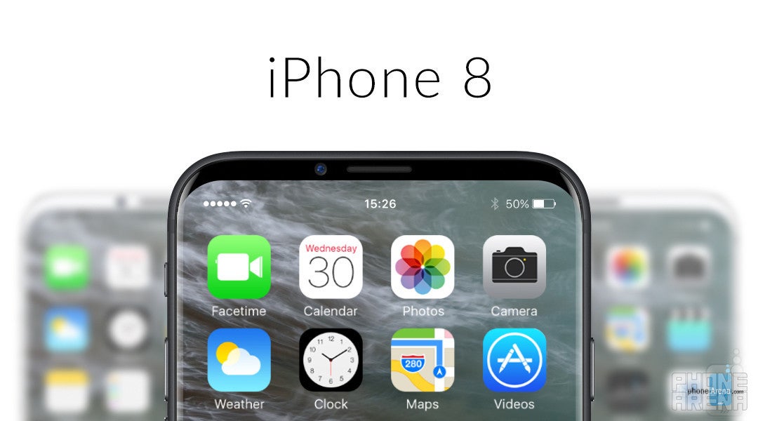
This is what the bezel-less iPhone 8 may look like: ultimate design concepts of the black and white models
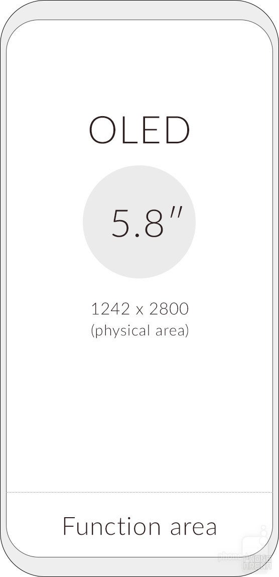
Analyst Ming-Chi Kuo of KGI Securities claims the iPhone 8 will have a 5.8-inch display, part of which will be dedicated to a "function area" that will take the place of the physical home button
There is no way around it, the industry is moving toward bigger displays, smaller bezels, and Apple has some catching to do when it comes to efficiently utilizing the frontal area of the iPhone. LG has already bit the bullet with the G6, ditching the current-standard screen aspect ratio of 9:16, in favor of a 9:18 (or 1:2) “FullVision” display that beautifully fills out the front of the G6, leaving very little in the way of bezels at the top and bottom. Samsung is doing something similar with the upcoming Galaxy S8 and S8+, although the screens on those will be even taller, with an aspect ratio of 9:18.5, while the phones themselves will not be substantially larger than their predecessors.
There are so many intriguing “if's” and “may's” surrounding the iPhone 8, that we decided to explore some of them here, through a series of beautiful conceptual images, based on information by traditionally reliable sources. The concepts we are going to take a look at try to illustrate how different facets of iOS would work on an iPhone, the physical home button of which has been replaced by a “function area”, without going into crazy territory with impossible ideas. So, what is this function area-thing you may ask? Well, that's exactly what we'll try to explain here.
The iPhone 8: an almost bezel-less device with large OLED display and no physical home button
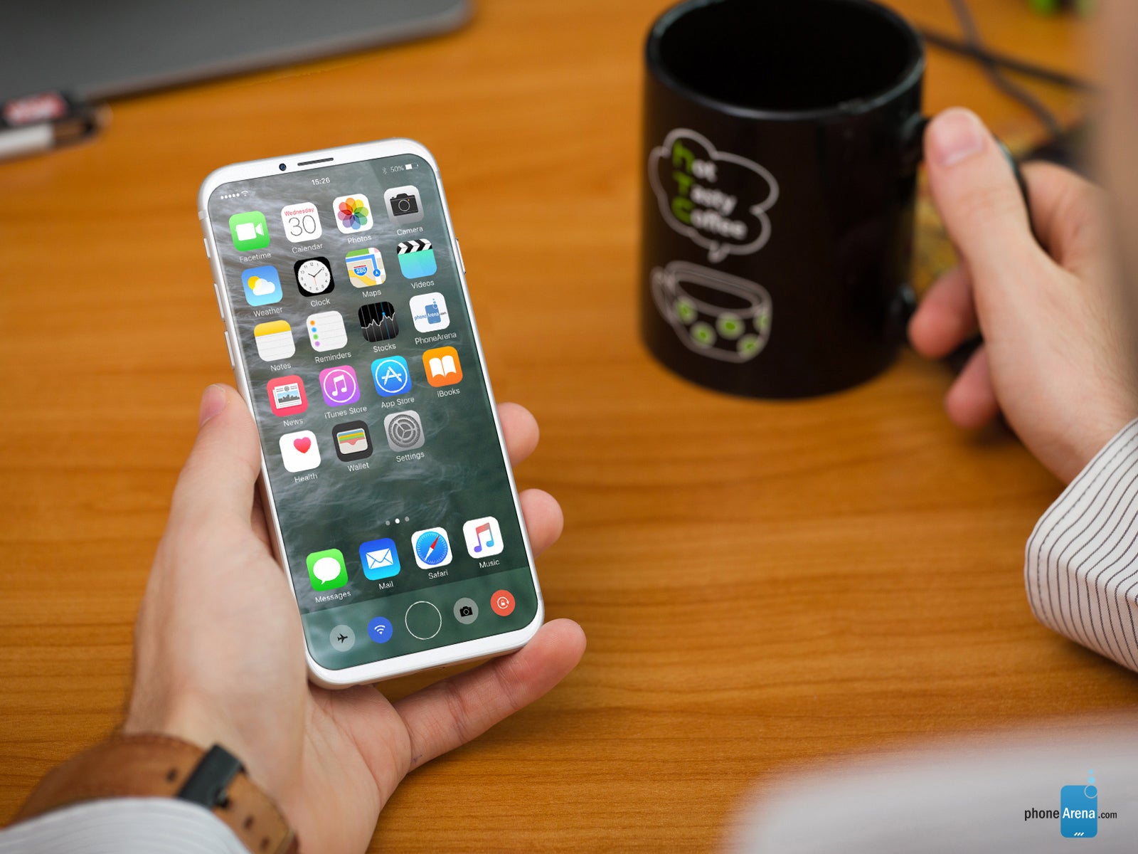
Acting in a similar way to the Touch Bar found on the latest MacBook Pro, the "function area" changes depending on the app you're using. Different interfaces can be displayed in this area, primarily swipe-based, that supplement the UI of the app that is currently running. For example, while editing a photo, a scroll bar for different effects appears in the "function area", hiding the home button while being used. In another scenario, the space below the on-screen keyboard is occupied by a scrollable wheel of emoji, granting users quick access to their frequently used emojis first, as well as all others, by swiping up and down.
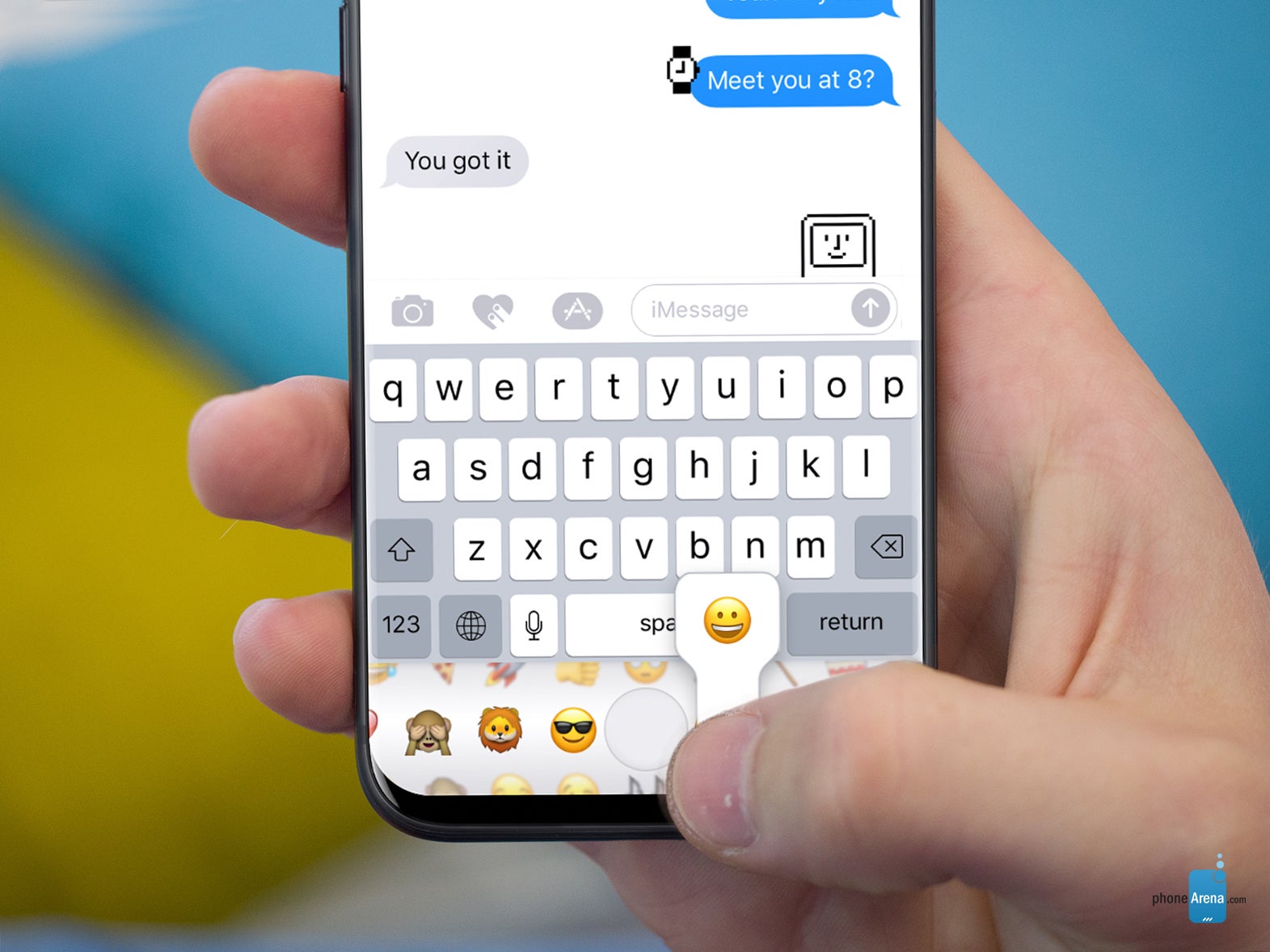
All emojis right under your keyboard
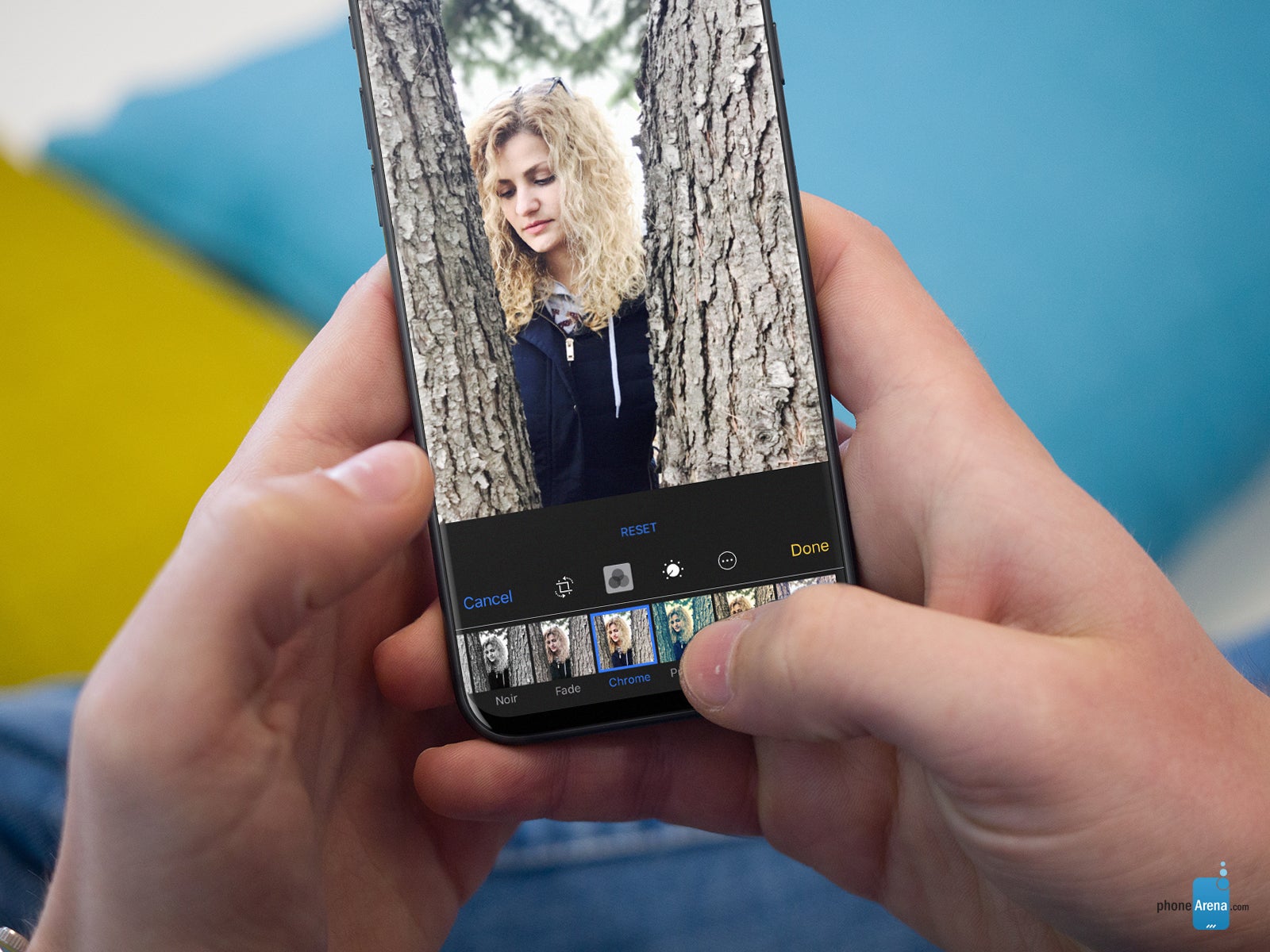
More room for your photos, dedicated area for editing controls
Once developers get the hang of it, this alleged "function area" can be used for all sorts of neat stuff, such as outsourcing various controls to it in media playback and editing apps, using it as a dedicated compartment for tabs in Safari, and a lot more. The possibilities are endless, really, and one needs to look no further than the Touch Bar on the new MacBook Pro to see how, with some guidance from Apple, developers can take advantage of one such feature and turn it into something special.
Imagine a device the size of an iPhone 7 but with a 5.8-inch display
Further, the purported new OLED display that might grace the front of the iPhone 8 won't be a standard 9:16 display. Instead, various sources claim, it will be a much taller one, akin to the likes found in the LG G6 and the upcoming Samsung Galaxy S8 models, and will use up the front portion of the iPhone 8 in a very efficient manner, without increasing the size of the device itself. Imagine an iPhone 8 with much the same footprint as the 4.7-inch iPhone 7, but with a 5.8-inch display, or an 8 Plus that is the size of the 7 Plus, but packing a 6.2-inch display.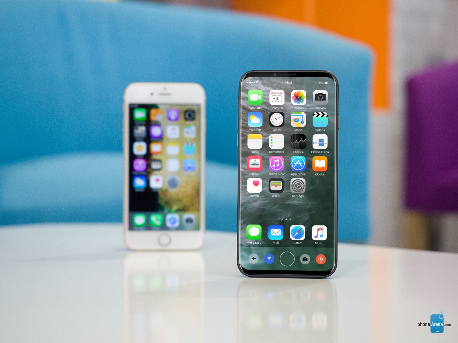
Concept iPhone 8 and an iPhone 7 -- same size, larger display
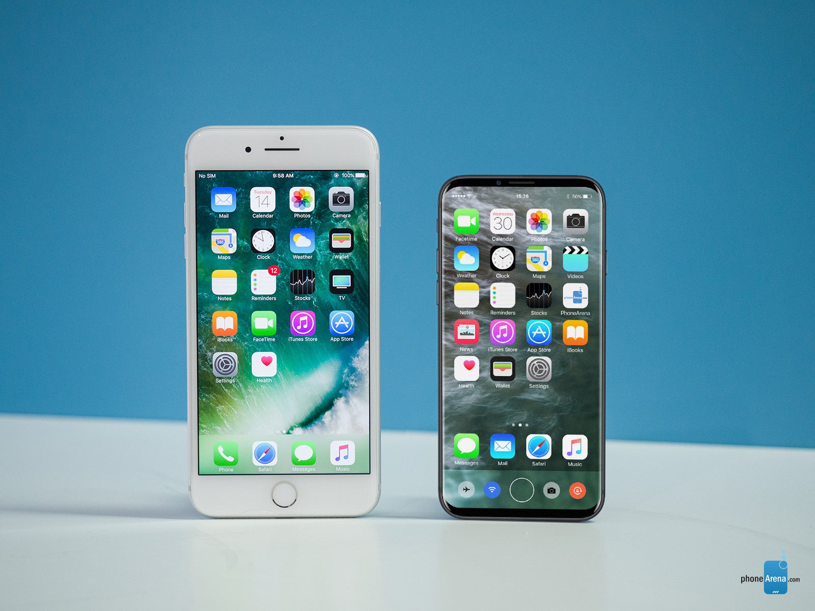
Concept iPhone 8 next to an iPhone 7 Plus
Of course, since a portion of the screen will be occupied by the "function area", the actual display area will be closer to 5.1 inches in the case of the non-Plus model. Still, when viewing media in landscape mode, the "function area" could go *poof* so that your videos and photos can take up the entire screen. On the other hand, when watching videos in portrait mode (for whatever reason), a video scrubber could occupy the space below the display, allowing users to quickly and effortlessly skip back and forth through videos.
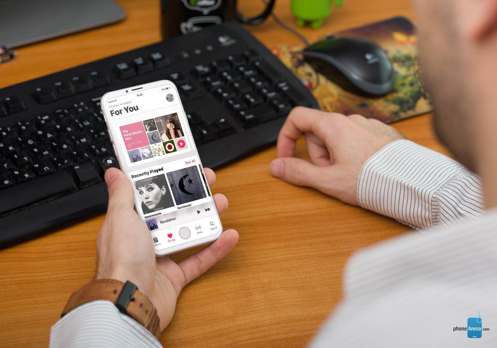
And while different apps may benefit to a different extent from the increased screen real estate and the "function area", just check out the cool mockup of Apple Music made for an all-screen iPhone below. In this scenario, the area is occupied by an on-screen home button, as well as by familiar Apple Music controls, which can be scrolled through by swiping left and right.
As we already said, a more radical iPhone redesign is coming sooner or later. Whether it will be this year or next, remains to be seen. Apple is said to be considering between 10 prototypes of the iPhone 8, all of which quite different from current models, so making a very accurate suggestion as to what the final product may look like is as good as impossible at this point. Still, going from what little reliable information we have, and taking into consideration recent developments in the smartphone industry, it wouldn't be too far fetched to make some educated assumptions about the iPhone 8.
For all we know, the iPhone 8 could be a shape-shifting apple that runs on liquified magic and casts FaceTime video straight to your brain, but we still tried to ground our concepts in research and currently available information. Whether the supposed iPhone redesign will look anything like this, or close to anything available online right now, is a question that only a handful of people can answer, but none of them will. We will have to wait the wait and see for ourselves, but in the meantime, why not check out some of these cool concept images? They may give you some food for thought as to how the interface of an all-screen iPhone could work. Besides, what's the worst thing that could happen? Get even more excited about the iPhone 8?
iPhone 8 design concept
Follow us on Google News



Things that are NOT allowed:
To help keep our community safe and free from spam, we apply temporary limits to newly created accounts: