iOS 9 multitasking explained. Split View vs Slide Over: what's the difference and should you care?

Slide Over and Split View – what are they and how are they different?
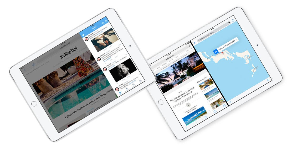
Split View and Slide Over are iOS 9's answer to the demand for multitasking on mobile devices. They both look very similar – you just swipe in from the right of the screen and you get a second overlay, which can launch a number of secondary apps, without you having to leave the app you've been working on. You may have heard, however, that Split View is only available for the iPad Air 2, iPad mini 4, and iPad Pro, while Slide Over is also supported on older devices – namely, the iPad Air, iPad mini 2, and iPad mini 3. So, is it worth getting the newest and best from Apple just for Split View, or would Slide Over do the job just fine?

Slide Over
First things first, Slide Over is merely meant as a peek-in-peek-out type function. Let's say you want to start a Facebook chat without leaving Safari. You swipe in from the right and scroll through all the apps available in the Slide Over menu. When you pick Messenger, it loads in that small patch of screen space it has been given. When done with the new app, tapping anywhere outside the Slide Over tray will close it and let you resume your work. So, the whole feature looks like an extended variant of the actionable notifications – you can check and reply to chats, have a quick peek at your schedule or add an event to the calendar, have a quick glimpse at your photo and video albums, et cetera, and then quickly return to whatever you were doing beforehand.
It's important to note that Slide Over can be pulled over any and all apps – independent of whether the developer has updated the compatibility on their app of not. This will come up again later, as we talk about Split View.
All in all, Slide Over is for quick glimpses and actions, don't expect to stream a video clip on one side of the screen, while reading forums on the other.
Split View
Split View is Apple's take on true split-screen multitasking. It allows users to run two apps in real-time, each taking up part of the screen. This means you can keep scrolling that Safari page without having to close Messenger, so you can stay engaged in that heated group conversation. It's definitely a feature that has been long-awaited on an iOS device, but it's not one that will wow you – at least not in its current state.
First of all, Split View launches in the same way that one would launch Slide Over – you just have to pull the secondary window further into the center of the display. So it inherits Slide Over's drawbacks – limited app support (at least for now), and a messy app tray.
Picture-in-picture - something every iPad user has dreamed of
This is yet another cool feature, which should theoretically allow you to consume your favorite video media, while also checking emails, or doing whatever else you enjoy doing on your iPad. Picture-in-picture is activated by a new button, which can be found in the bottom-right of the iOS video player. When you tap it, the video “pops out” of its frame and starts floating above anything you do on the screen. You can swipe it off-screen for a few seconds, if you need the real estate, close it, or pop it back in its place by pressing the reverse version of the p-i-p button.
The best thing about it? Picture-in-picture is available on iPad Air / mini 2 / mini 3!
Conclusion
If you own an iPad Air or iPad mini 3 and are worried that might be missing out by not having Split View, you can put that thought to rest. The true multitasking experience is almost here — that's a fact — but there are still a couple of bumps in functionality, and and not a lot of apps support it just yet. It could be up to a year before upgrading just for Split View becomes a legitimate reason to throw away an iPad Air / mini 3.
Picture-in-picture and Slide Over are great features, readily available for use, and available on the older tablets – they already provide the meat of the iOS 9 multitasking experience. Split View currently feels like a bonus feature on the newer models, instead of a full-blown advantage.


Things that are NOT allowed: