iOS 7 kneejerk review: adopting the best of the competition, and that's okay
This article may contain personal views and opinion from the author.

Let's get one thing out of the way right off the bat: we absolutely love the look of iOS 7. It may just be that iOS finally looks markedly different from how it has been for the past 5 years, it may be that Apple has finally left behind the hideous skeuomorphism techniques, or it may just be that it reminds us of a mashup between Windows Phone and Google Now. Whatever the reason, we think Apple has done a solid great job of adopting the best of the competition to make something decidedly Apple.
If you're an Android user, you should just accept that the design choices of Matias Duarte are making the system more and more like webOS as the days go on. If you're a BlackBerry user, you should know that BB10 is basically a mashup of Android, iOS, and Windows Phone. If you're a Windows Phone user, you should accept that minimalism existed long long before your platform. And, if you're an Apple user, just come to terms with the fact that Apple does take ideas from all of its competitors. Even the original iPhone wasn't terribly new, it was just a mashup of smartphones of the day (Windows Mobile/BlackBerry) and the various PDAs that existed (mostly Windows CE), with an improved touchscreen.
iOS 7's borrowed/unique features
The key in all of this is in making something unique. Sure, Android draws heavily on webOS these days, but it is still distinctly Android. And, with iOS 7, Apple may have used the same design philosophies that we see in Windows Phone and Google Now, but the overall effect is still a system that looks distinctly Apple. While the flatness and simplified iconography of the OS are similar to that of Windows Phone, iOS 7 also draws heavily on transparency and ambiance (which some may find has been inspired by Ubuntu) to create a completely different feel. Similarly, while the Apple app redesigns use the same minimalist white with color accents that you'll find in Google Now and other Google apps, the interaction and controls of each still looks to be uniquely iOS.
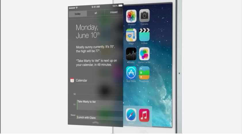
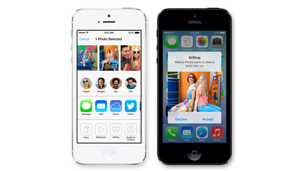
And, that Photos app has some clues that Apple isn't just drawing on other mobile platforms for inspiration, but popular apps as well. The Photos app in iOS 7 looks like it is trying its hardest to be Instagram. Obviously, the photo filters are something that Instagram made popular, although almost every photo app in existence has adopted them, including Android, Twitter, and Flickr. But, the entire stream of the iOS 7 Photos app feels very social with the inclusion of pictures shared through AirDrop, as well as comments from your friends. We had thought that after the debacle that was Ping, Apple was taking a step back from social apps, but clearly the company still thinks it can build a compelling social experience for users.
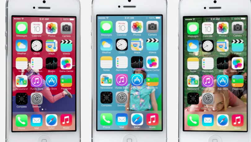
The last point we wanted to talk about is a small one that some may not have noticed in the keynote, because it was quickly moved past. The only reason it struck us as interesting was because how often will you hear the word "parallax" used in a keynote that has nothing to do with astronomy or DC Comics? There have been a small subset of users who have been calling for live wallpapers to make their way to iOS, and with the new transparent design of iOS 7, that may still be on the way in the future, but iOS 7 does have a very subtle way of making it feel like the background is more alive, which is the parallax effect. As you are swiping from screen to screen, the way the background is presented in relation to the icons now shifts to give more of a sense of movement. It's an incredibly small detail, but one that will have a small and aggregate impact on a huge amount of time spent interacting with your device. Apple certainly can be accused of sweating the small stuff.
What Apple didn't include
Of course, no overview of a new iOS update can be complete without talking about the things that still don't exist. As Apple pointed out a number of times during the keynote, the company takes longer with its products because it focuses deeply on specific features that will make the release, while leaving out completely some others.
A few of our desired features, like parallax backgrounds, bigger folders, and quick settings have made it into iOS 7. And, that just leaves two things that we hoped to see that we didn't. First, we'll tackle the easy one - vertical App Store lists. This was a hope, simply because we preferred the design. It's not impossible that Apple brings it back, but it will likely be a while, because Apple won't be pushing a major App Store redesign too soon after the last.
And, the big one of course is widgets. There is little doubt that at some point Apple will include some variation on the idea of widgets or Live Tiles. We've seen plenty of concepts that would make sense in the iOS world, including one that even took the Live Tile resize function, and one that was so compelling that Apple actually hired the designer that made the concept.
The comments by HTC that 90% of users don't care about widgets could provide some reason why Apple hasn't added the feature, or it could have other roots. Just like multitasking and automatic App Store updates sound as though they were delayed because of issues over power usage, the issue with widgets could very well have roots in data usage for all we know. Maybe if iOS 8 includes some sort of system-wide data compression technology, Apple would also use that as an opportunity to add widgets.
Conclusion
You can point to a number of the UI changes and make comparisons to other platforms or products that had those features before they were found in iOS, and you would likely be able to make your argument. But, given that you could do the same with every other platform and product on the market, it doesn't make the argument any more compelling or valid. Ultimately, it doesn't matter what other platforms have, it matters what users get. If iOS has a better way to share files, we sure hope that Android and Windows Phone find a way to copy it, so that those users benefit; and, if there are features that make sense within the iOS world, we hope that Apple adds those too. Because what features are likely to make the jump is only based on if it makes sense in for the platform and help users, not whether people in comment threads will get angry.
Follow us on Google News







Things that are NOT allowed:
To help keep our community safe and free from spam, we apply temporary limits to newly created accounts: