iOS 16 introduces ergonomic new lock screen notifications

Apple today unveiled iOS 16 at WWDC'22, and aside from the brand new customizable lock screen, we also get a refreshed notifications on the lock screen.
We will be able to change the typeface and colors of the clock, add custom widgets around it (similar to complications on the Watch), and add a Portrait Mode photo for more depth, with the watchface peeking right behind the portrait. There's also a library of pre-made clock and widget combinations, as well as animated wallpapers that add weather animations or the Astronomy watchface to your lock screen.
Those are just some of the new changes in iOS 16, but probably the biggest one are the revamped lockscreen notifications, one of the core iOS functionalities that just about every user interacts with on a daily basis.
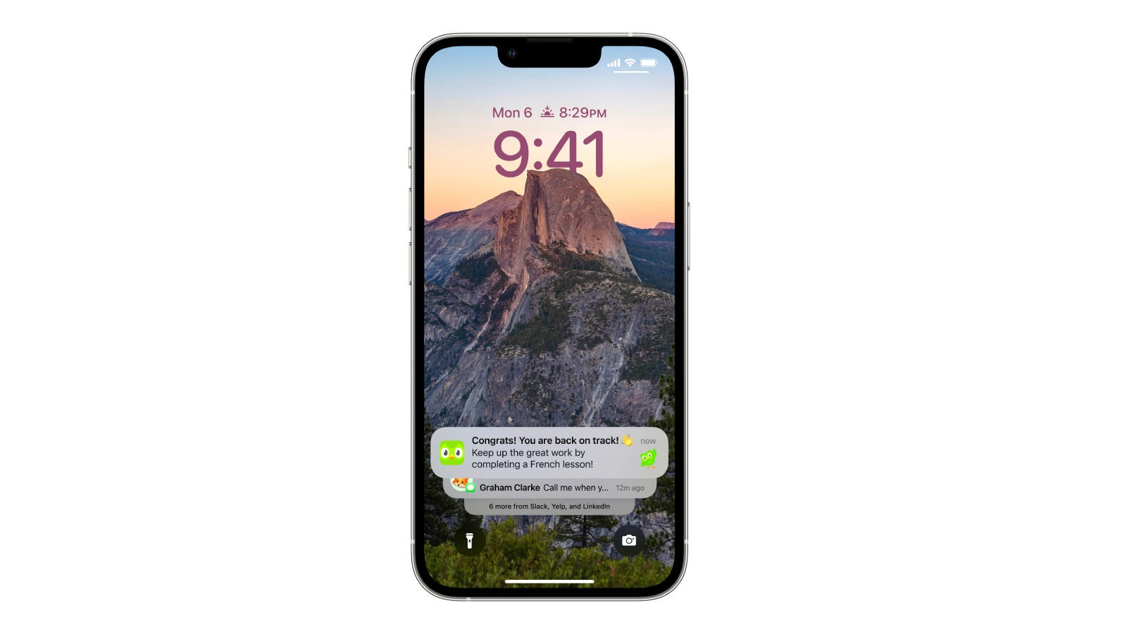
iOS 16 lock screen notifications
In iOS 16, notifications will now appear at the bottom of the screen, making them a bit easier to reach with your thumb when you're holding your phone, and thus, improving the overall ergonomics of iOS and the iPhone itself.
How do the new notifications work? Simple. Just swipe up on your homescreen and your notification list will automatically slide up. In case you've got an unread one, you will be visually notified with a message situated between the torch and camera shortcuts in the lower part of the screen. From then on, interacting with the notifications is unchanged, and everyone who has played with any of the latest iOS releases will feel right at home.
The main reason why Apple has moved the notifications to the bottom is pretty simple - you can't have all those pouring notifications to prevent you from seeing your custom lock screen! You will also be able to hide notifications altogether if you wish, so that nothing can mar your lock screen.
And aside from being a bit more ergonomic, lockscreen notifications will be scoring a handy new Live Activities feature thanks to a newly-fangled API that will allow apps to provide you with important live data. Some of the examples shown on stage demonstrated a football game score ticker and a live Uber ride locator that definitely looked useful.
Finally, you will be able to see full album arts when you're listening to your favorite artists straight from your lock screen. Speaking of the Now Playing widget, it has also been moved and now resides, you guessed it, at the bottom of the lock screen, where it's also a bit easier to use. Yet, it's now smaller overall, and it's a bit hard to seek with the progress bar, not to mention that you don't get a handy volume slider anymore.
Follow us on Google News



Things that are NOT allowed:
To help keep our community safe and free from spam, we apply temporary limits to newly created accounts: