iOS 14 vs Android 11: 2020's software darlings
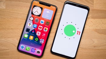
Now that both Apple's iOS 14 and Google's Android 11 are out, it's time to compare how these two software beauties fare against one another in terms of features and functionalities. iOS 14 will hits eligible devices this autumn, but it will take Android 11 a bit longer before it would be available on the majority of the popular devices out there. Still, it's worth comparing the two, even though they are still in early stages of development and certain aspects and features are certainly bound to change with subsequent builds.
iOS 14 was announced last week with lots of new quality-of-life improvements and new features that have been a long time coming. There's still a long time until iOS 14 arrives to the list of supported devices, but the wait will be worth it. Meanwhile, Android 11 is all about quality-of-life updates to the world's most popular operating system. There are no major design changes or any major new features that overhaul the whole system; instead, Google has focused on fine-tuning notifications, improving the messaging experience, toning down visual clutter, improving permission management, and so on.
For a deeper look at both iOS 14 and Android 11, feel free to read our dedicated previews to both operating systems, which have been linked below for your convenience.
iOS 14 vs Android 11: The new features
Here's a list of all the new features that the duo scored.
The essential new iOS 14 features:
- Custom Widget Stacks
- Apple Music Redesign
- Apple Music Autoplay
- Picture in Picture
- Compact Phone Calls
- App Library
- Third-Party default apps
- Search in apps
- Emoji Search
- Exposure Lock
- QuickTake Video
- HomeKit Control Center
- Pinned chats in Messages
- and many more...
Meanwhile, Android 11 comes along with:
- Chat bubbles
- Priority conversations
- App Suggestions
- Unified Device controls and payments
- One-time permissions
- Native screen recording
- Improved media controls
- Enhanced support for foldable devices
- and many more...
iOS 14 vs Android 11: Home screen
Android 11's home screen is pretty much unchanged aside from the new dock which shows some recent and suggested apps you might want to use at that exact time. With iOS 14, the home screen is pretty much reinvented with the introduction of widgets on the home screens. A staple on Android for nearly a decade, widgets are now an interesting new part of iOS 14, and iPhone fans are now experiencing the customization itch.
iOS 14 vs Android 11: Widgets
Yes, widgets are quite possibly the highlight feature of iOS 14, but let's not forget that Android 11 was the first mobile OS to implement these. Yet, due to one reason or another, Android widgets have certainly fell out of fashion with time, whereas iOS 14 unleashed the gates of creativity to the iPhone crowd. Of course, Android had these first, but Apple's implementation is fresher and more visually pleasing.
iOS 14 vs Android 11: Quick Settings
The big change in Android 11 is the music player widget in the quick settings menu, which not only saves some visual free estate, but also looks swell. iOS 14, on the other hand, is unchanged, apart from the new toggles that are available.
iOS 14 vs Android 11: Settings
No major changes here - both Settings menus are pretty much the same as usual. Both iOS 14 and Android 11 have dark modes, employing different shades of dark gray. iOS 14 has automatic wallpaper dimming for select stock wallpapers, but Android 11 doesn't.
iOS 14 vs Android 11: Apps drawers
iOS 14 now basically has an app drawer that houses all of your apps as well as those ones you don't want to delete but don't want on your home screen either. Android has had an app drawer for ages now, and Android 11 is no different in this particular regard. Which one do you like best?
iOS 14 vs Android 11: Camera
The camera interfaces remain mostly unchanged in either iOS 14 and Android 11.
So, that's pretty much it! Which one do you feel has the better overall looks?






Things that are NOT allowed: