iOS 11: exploring the awesome new dock with an iPad Pro
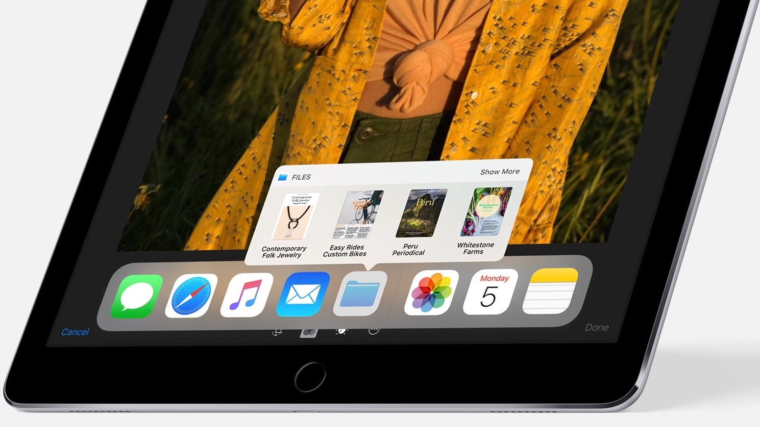
So, iOS 11 has been unveiled by Apple and a developer preview of the new operating system is available for iPhones and iPads. Now, this is not even a public beta yet and it’s a bit unfinished, with obvious flaws and bugs shining through, but we are able to get a pretty good idea of what the new features are going to be.
iPads are getting a lot of love with the new update and iPad Pro owners will definitely appreciate the multitasking capabilities that come with iOS 11. A centerpiece of the whole shebang is the new app dock. Gone is the dock that is only present on the home screen, that is severely limited in the amount of apps it can hold and feels outdated, to say the least.
The app dock is now what we can describe as a “floating stripe”. Just as before, it is ever-present when you are on the home screen, but it can now also be pulled up at any time, no matter what app you are in.
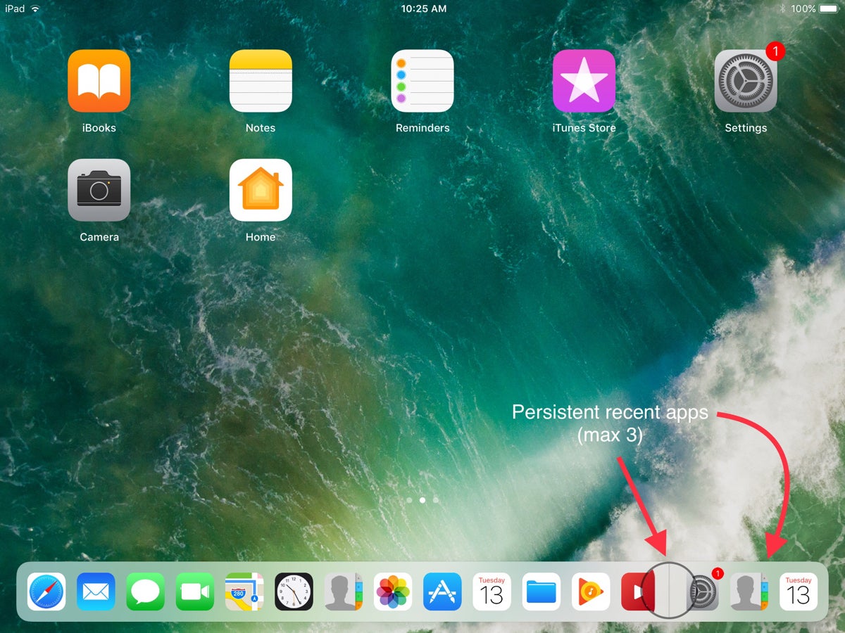
The amount of apps you can launch from it has been increased to the whopping 13 and the rightmost portion of the dock remains reserved for a “recent apps” launcher. The latter will hold the last 3 apps you have been in and you can use it to quickly swap between screens (sort of like alt-tabbing between programs). Note that recent apps also works with Handoff, meaning that it will also track the last 3 apps that you have been using on your iPhone and allow you to seamlessly proceed working on your iPad Pro.
There are a couple of ways to pull up the app dock. The first, and we imagine the one that’s going to be used most, is by just dragging up from the very bottom of the screen. The app dock will pop up over the bottom portion of your display without disrupting your work on whatever you have going on. If you continue to pull upwards, you will be taken to the multitasking screen, which shows you all of your recent apps, the app dock, and the Control Center on the right. Therefore, the second way to access the app dock is by double-pressing the home button, which instantly takes you to the recent apps screen.
So, the new app dock is ever-present and makes it super-easy to switch between your favorite and your most recently-used apps. But it also makes launching split-screen easier. In iOS 11, the slide-over menu from the right is completely gone. Now, if you wish to launch an app on top of the one you are using right now, you need to pull up the dock, tap and hold on your desired secondary app, and drag it on to the screen.
Dragging to the left or right halves of the display will launch that app in a floating mode, while dragging to the very edges will instantly split the display in the good old “split view” that was introduced with iOS 9.
Additionally, it seems the apps in the dock will be able to have their own pop-up menus. Right now, the only one that showcases this feature is the Files app – tap and hold on it and you get a menu with the most recent files you’ve viewed. From then, you can either tap on one to open it or drag it to your main screen, pasting it into your working area.
Will it improve the usability of the iPad Pro and actually make it more suitable for professional work? Well, we are testing this right now! Expect our opinion on working with the iPad Pro with iOS 11 next week!








Things that are NOT allowed: