Google Wallet app goes through another design change with the same functionality
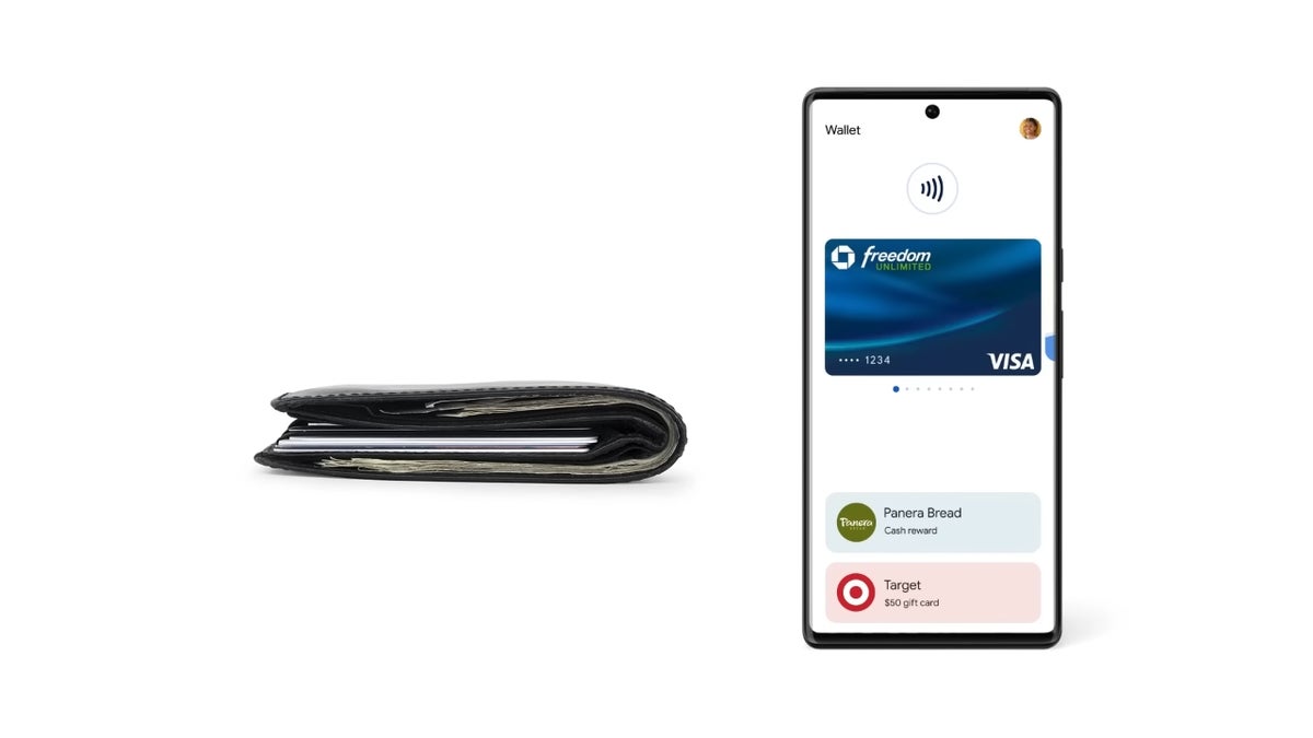
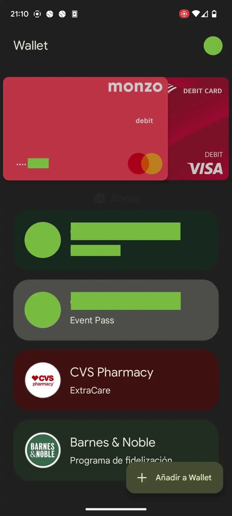
Google Wallet is getting a new, more compact design that will make it easier to navigate. The new design will do away with some unnecessary white space and images, and present payment methods and loyalty cards in a more streamlined manner.
As reported by 9to5Google, this current redesign has been spotted on version 2.193.x of the Google Wallet app, but it has not yet rolled out to everyone running this version. Although not a huge difference as far as the UI is concerned, the subtle differences can be seen when compared side by side with the old design.
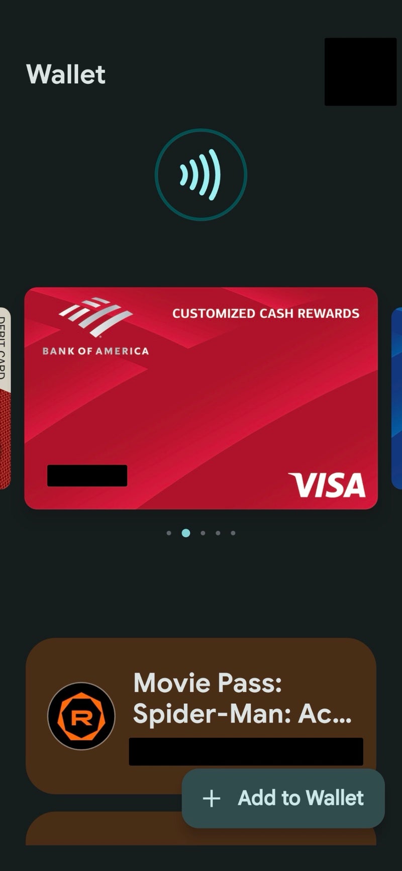
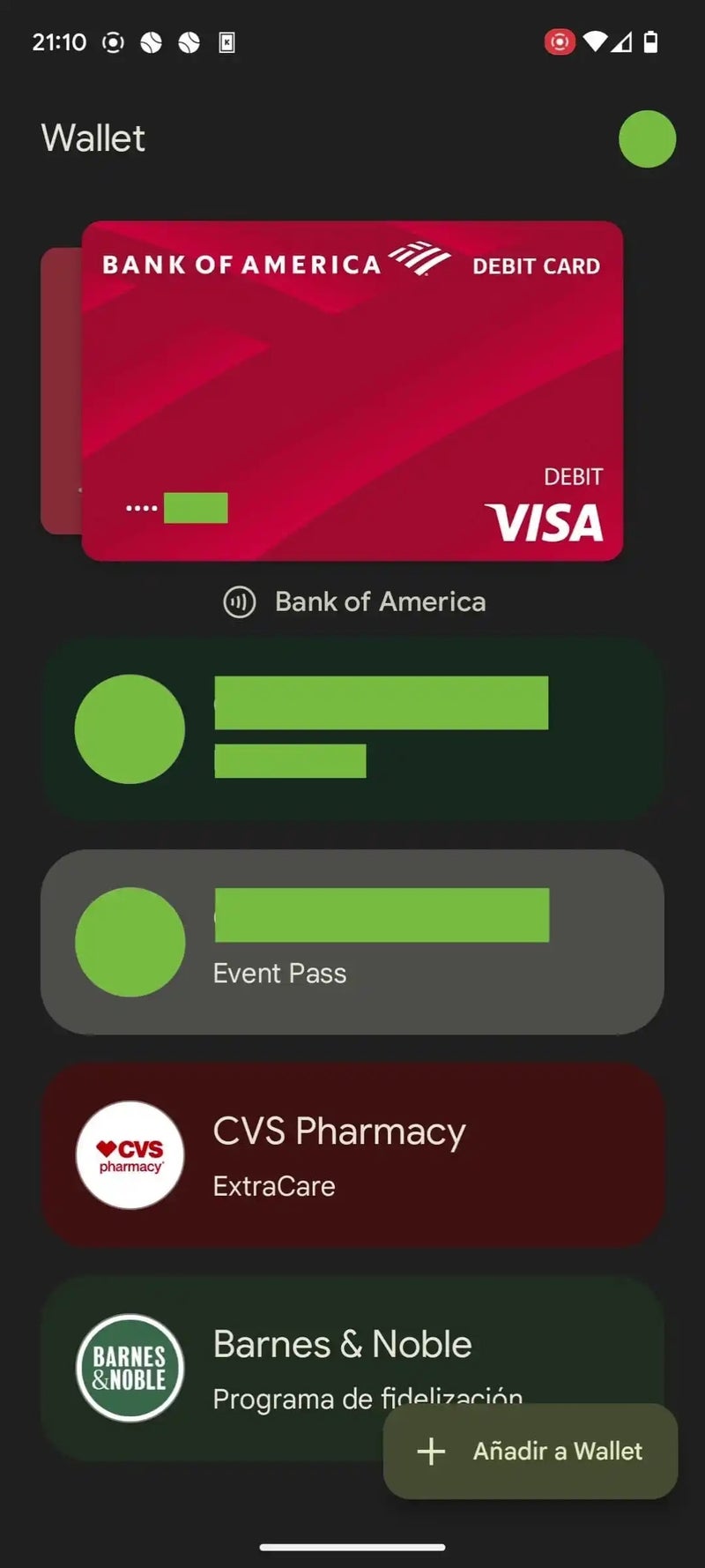
The first noticeable change is the removal of the NFC logo and animation at the top. This removal has allowed for the carrousel of payment cards to be moved up in position, showing them front and center as soon as you open the app.
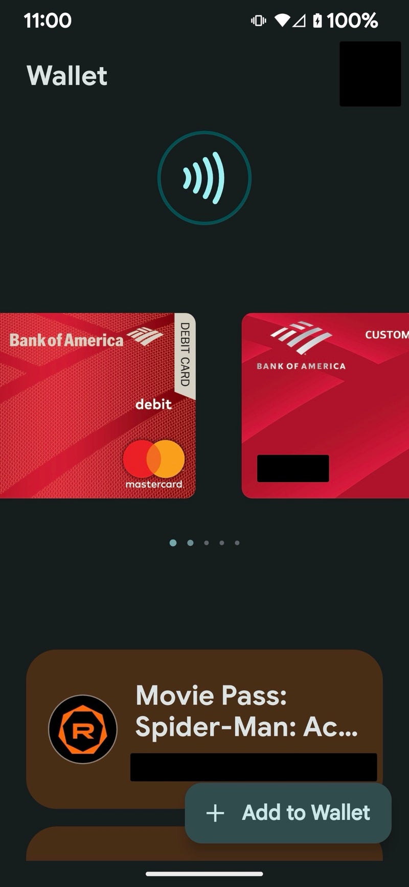
Old Design (Image via Phone Arena) vs Redesign (Image via 9to5Google)
In addition, the carrousel of payment cards now display the cards behind one another, so you can clearly see at a glance the cards you have added. This is in contrast to the old design, which had the cards shown side by side and the amount of cards left to sift through represented by dots underneath. Said dots are now also gone and replaced with the name of the cards you are currently looking at, preceded by a small NFC logo.
Old Design (Image via Phone Arena) vs Redesign (Image via 9to5Google)
Some smaller design tweaks also seen are the removal of unnecessary spacing between the payment cards carrousel and the list of loyalty cards. This will allow for more loyalty cards to be seen at a time, instead of having to do more scrolling to find them.
This isn't the first redesign, or rebranding for that matter, that Google Wallet has gone through. Google reimagined and revived Google Wallet last year, causing tons of confusion in regards to what the difference was between this app and Google Pay as we knew it. Fortunately, it looks this time like Google Wallet in its current form is here to stay (for now) but will continue evolving with more design and functional tweaks.
Follow us on Google News





Things that are NOT allowed:
To help keep our community safe and free from spam, we apply temporary limits to newly created accounts: