This app with over 10 billion downloads might change, and not in a good way
Google's Gboard is testing new and circle keys – and Reddit people are real mad.

Google's Gboard is among the few Android apps that's in the Ten Billion Downloads club: there's a big chance that some of you reading this have just used it mere seconds ago.
Are you ready for Gboard to become very different from what you're used to?
Over at Reddit, people are not that keen on the idea, as topics such as "No one asked for this Google…", "This is horrible", and "Gboard changed" clearly show.
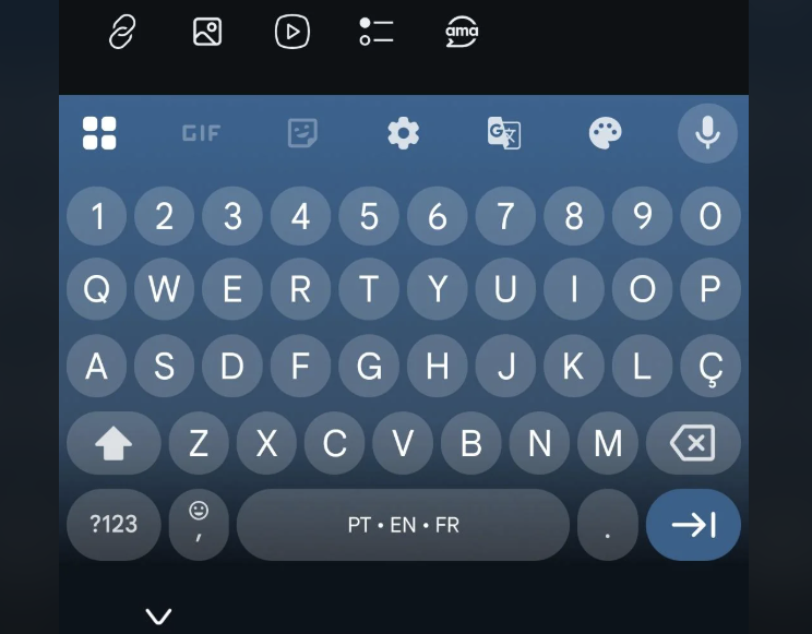
Image credit – user synergywolfie on Reddit
It's the v15.1.05.726012951-beta-arm64-v8a version that has gotten people startled.
[...] all of the sudden Google decided that the key borders will now be 'circles' what the heck… And no, you DON'T have an option to change it. It's either this or no borders at all...
– Reddit user synergywolfie, March 2025
Several people are saying they'll just add Gboard to the list of apps that they "refuse to update". One person says they're on version 15.1.105.726012951 and the keys are still square, but points out that they're using US single language, so using multiple languages and a different region might be what is causing the change to kick into effect.
A user by the nickname of Mediocre-Sundom says they're a UI designer with experience in the field and finds the new keyboard design to be a downgrade from the previous version. They believe the increased spacing between keys introduces more visual noise, making the keyboard less readable. Previously, the buttons occupied most of that space, creating a cleaner appearance. Personally, I agree.
The shift to perfectly round buttons also affects the overall balance. The uneven vertical and horizontal spacing between keys, while present in the earlier design, was less noticeable because the buttons were not strictly geometric shapes. In the new version, the implied symmetry makes the uneven spacing appear like a design flaw.
This issue is further emphasized by the slight shift in the bottom row of keys, which creates the illusion of a larger gap compared to other rows. While the circular buttons themselves are not the problem, the way they are arranged contributes to what the designer considers a weak layout. They do not view the design as completely disastrous but still regard it as a significant step back.
Image credits – Reddit
How about you? Do you fancy what Google is teasing, or not?


Things that are NOT allowed: