Google tests new UI for calls on Android that copies iOS

Google is testing a new UI for the screen that Pixel users and some Android users might see when they have an incoming phone call. The new UI was discovered hidden in the Google Phone app and is similar to the screen used on the iPhone to answer incoming calls. This isn't terribly surprising considering that many feel that the Pixel 9 series looks and feels very much like the iPhone 16. The new UI was discovered in version 145.0.672690850 of the Google Phone app.
Currently, phones with the Google Phone app installed will show a button that needs to be swiped up to answer a call or swiped down to dismiss it. The new UI being tested features a two-button layout. The red button on the left with the icon of a landline phone handset has the word "Decline" underneath. On the right side is a green button with the landline phone handset in the position it would be held if you were on a call with the earpiece by your ear and the mouthpiece by your mouth. Underneath, you see the word "Accept."
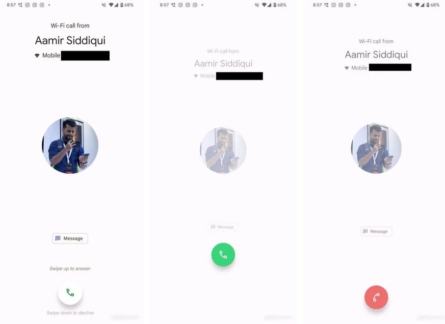
Current Pixel answer screen uses one button you slide up to accept or slide down to dismiss. | Image credit-Android Authority
Some Android manufacturers already use a two-button UI to accept or decline calls. For example, Samsung has a similar-looking layout to the one being tested except that the buttons are white and the button on the left is pressed to accept a call and the button on the right is tapped to decline a call. The iOS UI for incoming calls has the red decline button on the left and the green accept button on the right which is exactly how the screen Google is testing now appears.
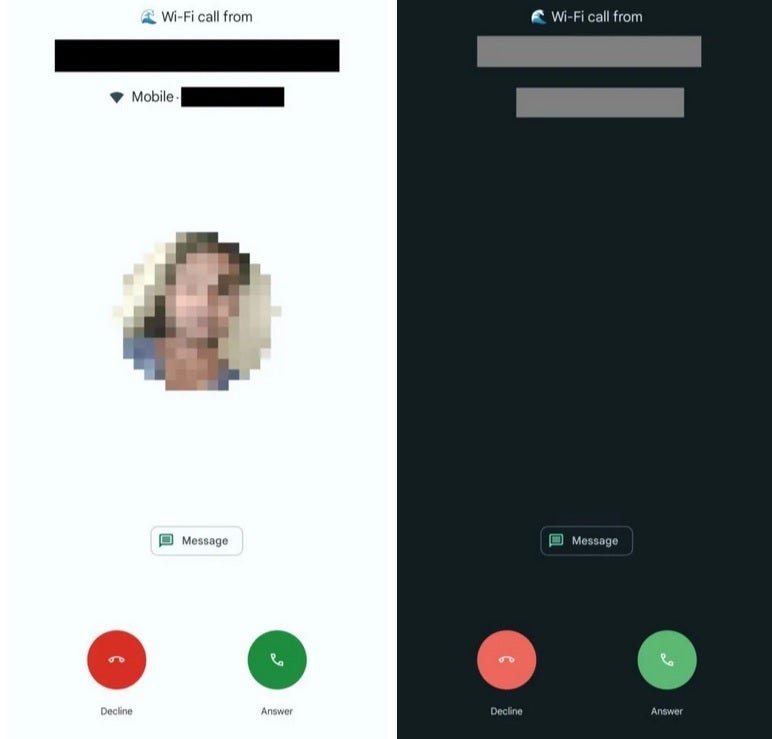
The new UI being tested by Google resembles the one used to accept/reject calls on iOS. | Image credit-Android Authority
Keep in mind that Google has yet to announce that it is making any changes to the Phone app so we can assume that the new design is merely in the testing phase. This means that Android users who are being asked for their feedback after testing the new UI might still have some say in what their Android phone might look like when a call comes in.
You might not consider this a big deal as far as software design is concerned, but every little thing adds up when trying to compute the user experience of a phone.





Things that are NOT allowed: