Google Tasks explores floating action button for Android redesign

Image credit — Google
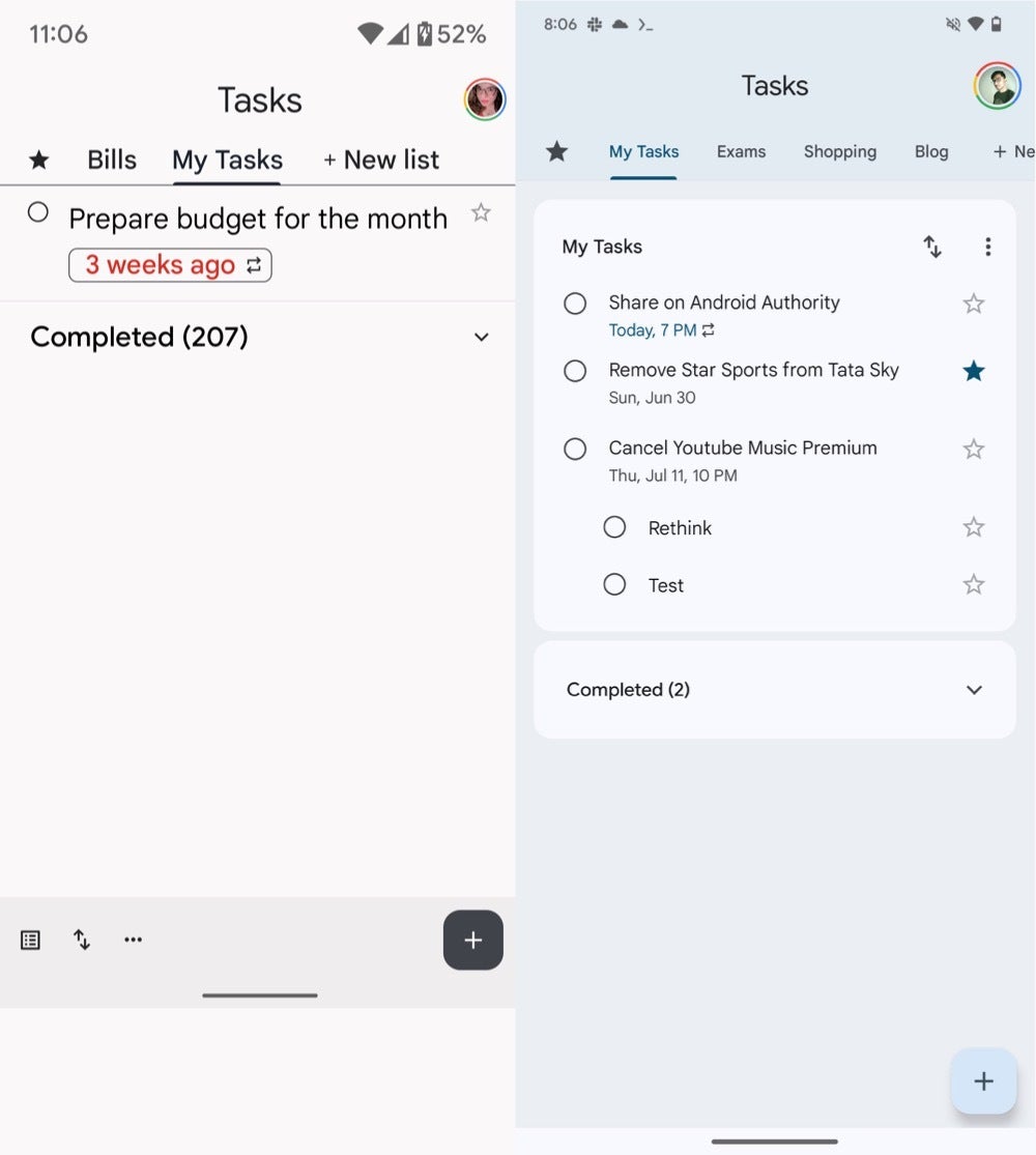
Google Tasks with bottom bar versus more minimalist FAB
| Image credits — PhoneArena (before) and Android Authority (FAB)
The FAB's presence contributes to a less cluttered visual experience, enhancing the overall aesthetic of the app. This aligns with the current design trends in mobile apps, where simplicity and ease of use are paramount.
While this redesign appears to be primarily a visual enhancement, it's worth noting that such changes often go hand-in-hand with improving user experience. By consolidating key functions and decluttering the interface, Google may be aiming to make task management more intuitive and efficient for its users.
It's important to remember that this is still an experimental feature, thus Google has not officially announced a timeline for rolling out the new FAB to all users. It's possible that the company is still gathering feedback and making adjustments before a wider release.
For Google Tasks users eager to see this change in action, keep an eye on future app updates. If the FAB proves successful in testing, it could become a standard feature.








Things that are NOT allowed: