Google Search widget for Android ditches customization options in favor of device theming

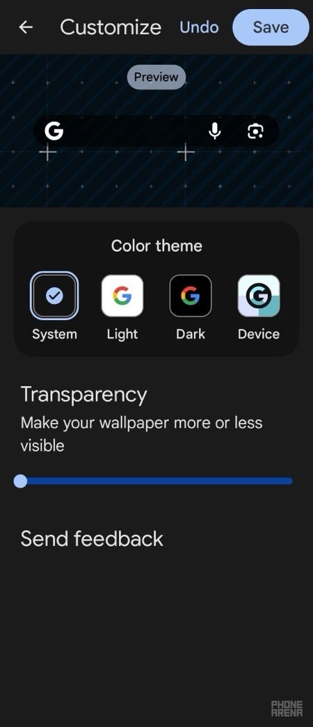
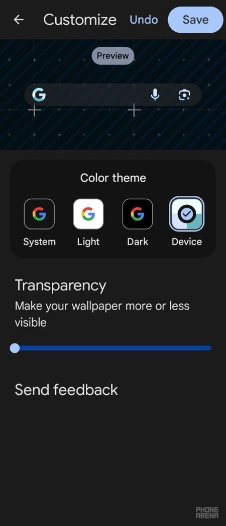
The Google Search widget for Android is getting a fresh look with a redesign that will automatically match the widget's color to your device's theme. This new feature, called Device color theme, will replace the previous hue and saturation adjustments, simplifying the customization process.
The updated customization settings for the Search widget will still include the System, Light, and Dark color themes, along with a slider to adjust transparency. However, Google has removed the options to change the logo and bar shape, meaning the widget will now default to the G logo and pill shape.
This redesign was first spotted in the latest Google app beta update (version 15.30.x). While it's still in beta, there's a chance that Google may bring back the logo and bar shape options before the stable rollout, but judging by how polished the update looks, it's highly unlikely.
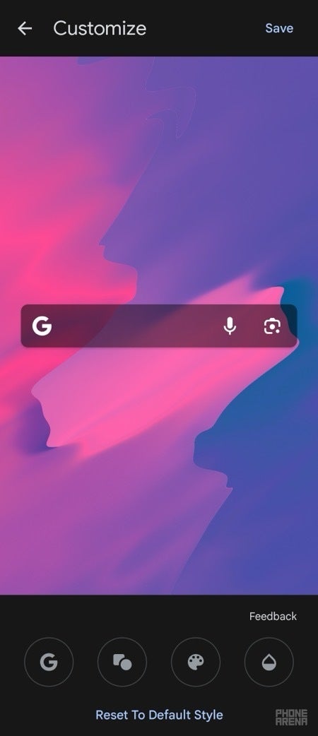
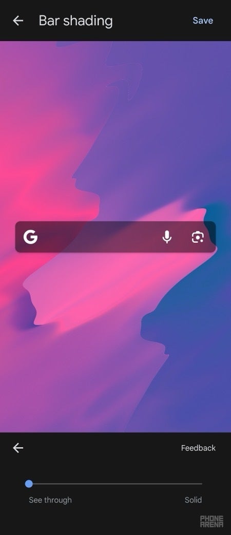
Unless you're using a Pixel device, where the Google Search widget cannot be moved or manually customized, the widget had always offered a few customization options. These included the ability to change the Google logo, adjust the search bar shape and transparency, and manually change the widget's color with hue and saturation adjustments. However, it lacked support for Dynamic Color, which automatically matches the widget's colors to your system theme.
While the removal of the logo and bar shape options may disappoint some users, the new Device color theme could be a welcome addition for those who prefer a more seamless and integrated look. It remains to be seen whether Google will reinstate the removed customization options, or if the new redesign will become the standard for the Google Search widget on Android. As a Pixel user, I would also love to see these options on Pixel devices, as there is currently no way to choose the light or dark version without changing the entire OS to dark mode.
The updated customization settings for the Search widget will still include the System, Light, and Dark color themes, along with a slider to adjust transparency. However, Google has removed the options to change the logo and bar shape, meaning the widget will now default to the G logo and pill shape.
Old Google Search widget customization options | Image credit — PhoneArena
New Google Search widget customization options | Image credit — PhoneArena
Unless you're using a Pixel device, where the Google Search widget cannot be moved or manually customized, the widget had always offered a few customization options. These included the ability to change the Google logo, adjust the search bar shape and transparency, and manually change the widget's color with hue and saturation adjustments. However, it lacked support for Dynamic Color, which automatically matches the widget's colors to your system theme.
The upcoming redesign addresses this by introducing the Device color theme, which will automatically adjust the widget's color to your device's current theme. This will streamline the customization process and make the widget more visually cohesive with your device's overall look.
While the removal of the logo and bar shape options may disappoint some users, the new Device color theme could be a welcome addition for those who prefer a more seamless and integrated look. It remains to be seen whether Google will reinstate the removed customization options, or if the new redesign will become the standard for the Google Search widget on Android. As a Pixel user, I would also love to see these options on Pixel devices, as there is currently no way to choose the light or dark version without changing the entire OS to dark mode.





Things that are NOT allowed: