Google redesigns Favorite contacts widget to look simpler but more info-rich

Google Contacts has been undergoing some interesting design tweaks and updates recently. It recently updated the Individual variant with message and call notifications and shared location. Now, Google Contacts is rolling out a redesign of the Favorite Contacts widget.
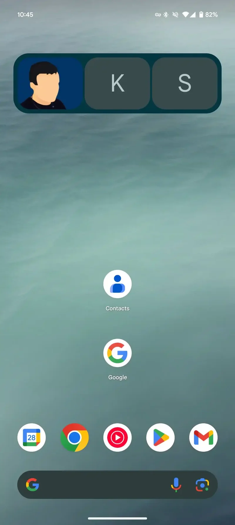
The previous design showed large rectangular profile images. You could create a shortcut for up to 7 of your top-starred contacts to use in the widget.
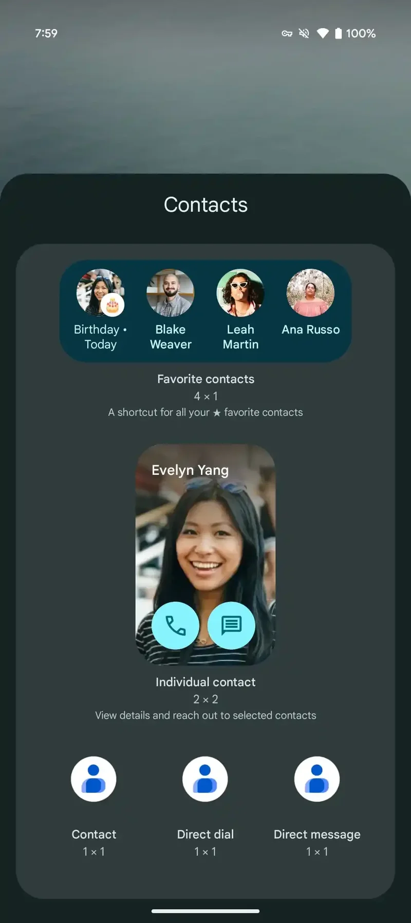
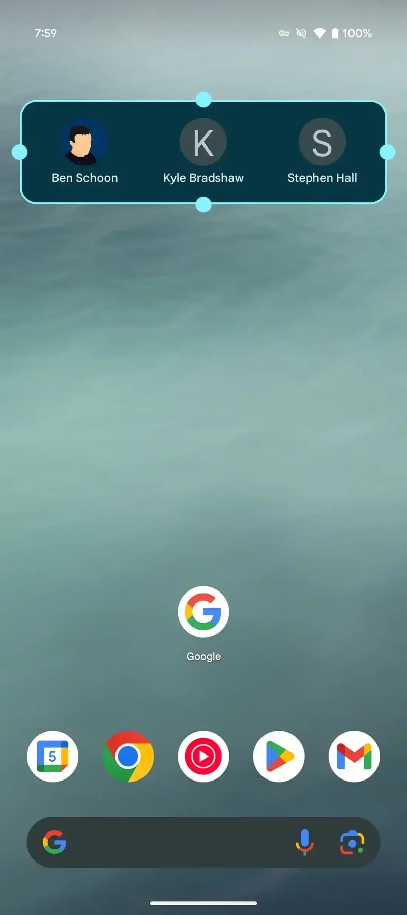
Now, a new update switches to circular avatars with the person's first and last name listed below. Instead of a tiled layout, the widget now offers a simple and straightforward-looking grid layout. This new layout helps you have a lot of favorites in there. It may be less visually interesting, but it's more consistent and looks quite like the version that appears in the Highlights tab.
The new design of the Google Contacts Favorite contacts widget is now rolling out. It is available as a server-side update and comes with version 4.45 of Google Contacts for Android.
All in all, although Google Contacts is a pretty basic app that doesn't need too much flashiness, it's still good when attention is paid to details, especially when it comes to design. The new look that the Favorite contacts widget sports may be simple, but it's more convenient especially if you want to fit more people in it, and overall looks more cohesive with the rest of the app.
The previous design showed large rectangular profile images. You could create a shortcut for up to 7 of your top-starred contacts to use in the widget.
On top of that, the widget can note birthdays with a badged icon. Now, it's more glanceable and info-rich, so you can get more information from it more easily. The themed Dynamic Color background remains unchanged and the widget is still resizable.
The new design of the Google Contacts Favorite contacts widget is now rolling out. It is available as a server-side update and comes with version 4.45 of Google Contacts for Android.
Google Contacts has been getting some update love from Google recently. Just a couple of months ago, the app redesigned its scroll bar to no longer look blocky and outdated. The new scroll bar now matches the modern Material You look that the app sports.
All in all, although Google Contacts is a pretty basic app that doesn't need too much flashiness, it's still good when attention is paid to details, especially when it comes to design. The new look that the Favorite contacts widget sports may be simple, but it's more convenient especially if you want to fit more people in it, and overall looks more cohesive with the rest of the app.





Things that are NOT allowed: