Google Play Store search gets a new location on Android tablets and foldables
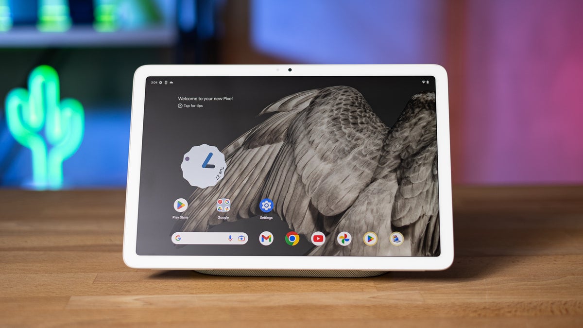
Google Pixel Tablet. | Image credit — PhoneArena
Google has redesigned the Play Store for Android tablets and foldables, relocating the search bar to a new Search tab. This change, mirroring a similar update on Android phones, aims to unify the search experience across Google's products. However, this modification introduces an extra step for users who want to find and install apps, potentially slowing down the process.
Previously, the search bar was prominently displayed at the top of the Play Store's main page, allowing users to quickly search for apps. Now, users must first navigate to the Search tab, which is located in the bottom navigation bar. While this may seem like a minor change, it adds an extra layer of navigation that could be inconvenient for some users.
The new location for search in the Google Play Store on larger screen devices. | Images credit — PhoneArena
Google's decision to remove the search bar from the main page has left some users puzzled. The company could have retained the search bar in its original position or replaced it with a smaller search button to maintain quick access to search functionality. Instead, they chose to remove it entirely, which may not be the most user-friendly choice.
This change raises questions about Google's design philosophy for the Play Store. Is the company prioritizing app discovery over quick access to search? Are they trying to declutter the interface at the expense of user convenience? Only time will tell how users will adapt to this new design and whether Google will make any further changes based on user feedback.
Personally, I find this change a bit frustrating. As someone who frequently uses the Play Store to find and install new apps, I appreciate the convenience of having the search bar readily available. Having to navigate to a separate tab just to search for an app seems unnecessary. I understand that Google may be trying to promote app discovery through the new Search tab's features, but I believe they could have achieved this without sacrificing the accessibility of the search bar. I hope Google will consider user feedback and make adjustments to the Play Store's design in the future.





Things that are NOT allowed:
To help keep our community safe and free from spam, we apply temporary limits to newly created accounts: