New Google Play in-app purchase UI is rolling out now
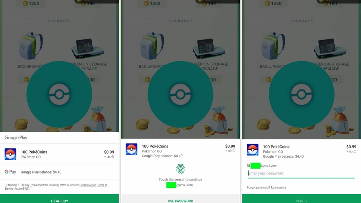
Image source: 9to5Google
Google has started rolling out a redesigned and more streamlined interface for in-app purchases, 9to5Google reports.
Up until now, initiating an in-app purchase would open a new window, smack-dab in the middle of the screen, where you would select payment options, input your password, or authenticate the transaction with your fingerprint. The updated UI, however, streamlines things by presenting users with a payment window that slides up from the bottom of the screen and is less obtrusive.
As with most things Google, the redesigned in-app purchase screen is rolling out gradually, so your device may not have it right now, but it should pop up in the next couple of days.
source: 9to5Google
Follow us on Google News





Things that are NOT allowed:
To help keep our community safe and free from spam, we apply temporary limits to newly created accounts: