Can Google finally kill tired camera islands with the Pixel 6?
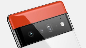
Google is gearing up to introduce the "deep technological investments" it has concocted for its upcoming Pixel 6 line in the fall but the custom Whitechapel processor that is meant by those will be just a side show for the Pixel 6's most defining feature - its camera set.
For the first time, Google will be listing a modern camera set in the Pixel 6 XL specs - a primary 50MP sensor, an ultra-wide-angle unit, and an 8MP periscope telephoto lens with support for 5x optical zoom - which might have warranted an in-house image processor development, hence Whitechapel.
We've little doubt that the resulting Pixel 6 photography will be a sight to behold. After all, Google already does unsurpassed photos from an off-the-shelf 12MP camera and processor by sprucing them up with just its unsurpassed computational photography algorithms. There is something more about the upcoming Google Pixel camera set, though.
Current phone camera islands are a looks and ergonomics fail
Ever since manufacturers began employing the holy trinity of camera features in their phones - main, ultrawide, and telephoto shooters - they started tucking them where there were only one or two sensors before.
Yes, we are talking about the upper left corner of the back which with time started accommodating more and more sensors, lenses, flashes, periscopes, lasers, and infrared or even LiDAR cameras. This smorgasbord of components prompted the advent of the camera island on the back - an elevation that had to house all of a phone's camera prowess while at the same time protruding significantly from the rear in order to keep the phone thin in the specs listings.
After Apple started employing those unsightly camera islands en masse even in midrangers that only had two cameras to speak of, other phone makers stopped having qualms about slapping one on the back, too, and now we are awash in a sea of lookalike handsets.
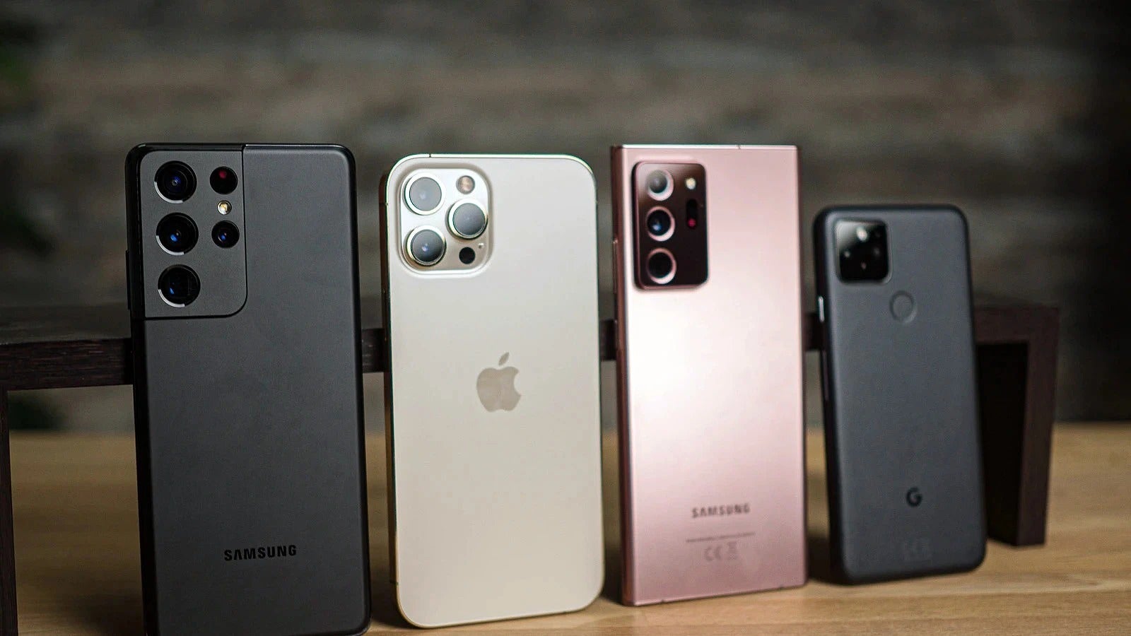
Top-left ubiquity
Aesthetics aside, the camera island in the top left corner is so ubiquitous, that people have gotten used to its bad ergonomics, always keeping their finger placement on the back of their minds when taking a shot, so as not to inadvertently snap a protruding phalange or two. That's not to mention the framing perspective gymnastics one has to do with cameras tucked there, especially the ultrawide shots, or the wobbling when the phone is lying on a table.
The freshness of the Google Pixel 6 camera design
This ergonomics fail is rarely an issue with a camera kit placed in the middle, and the argument that this is technologically impossible is moot. While interviewing Huawei about a phone launch we asked why aren't the P series cameras symmetrical like on the Mate line.
They answered that, even though the Mates are their technological and design playground, placing their rich camera kit in the middle of the rear is no harder than relegating it to the top left from an engineering perspective.
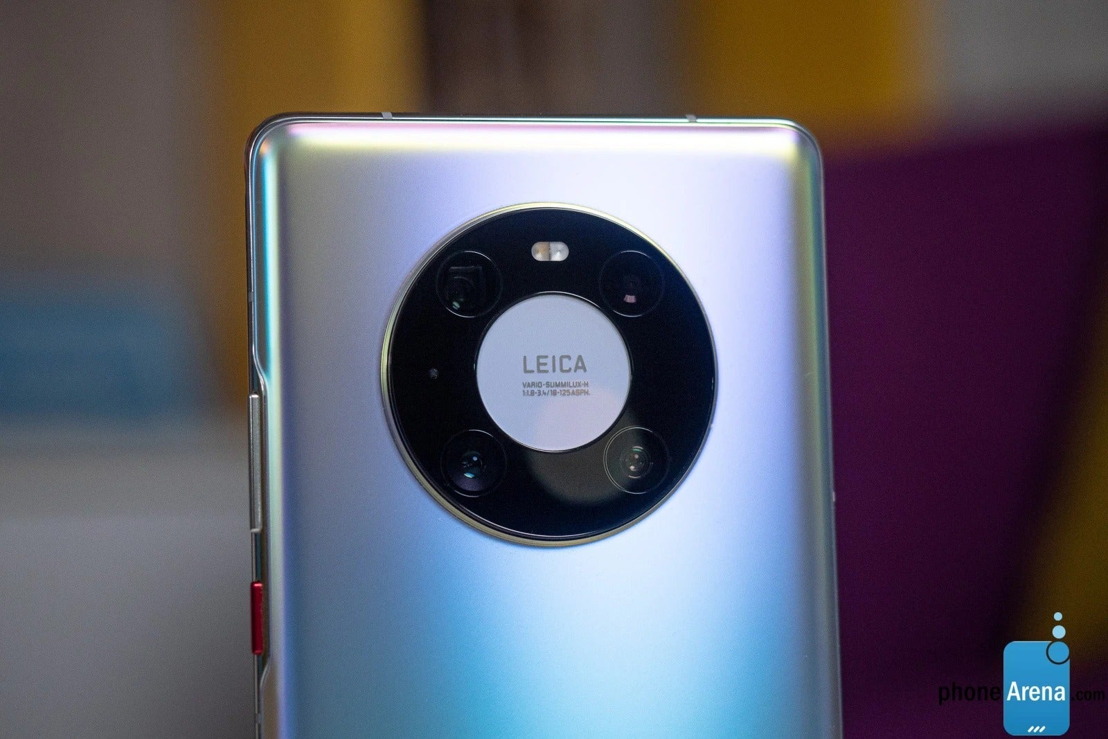
Symmetry ain't hard, you just have to want it
They just wanted to differentiate the Mates as something unique by using the signature circular lot for the cameras which is as beautiful to look at for its symmetry, as it is more practical from an everyday usage perspective. Goal achieved.
Well, the leaked Pixel 6 renders say that Google is attempting something signature in its turn, a design that will be immediately recognizable and carry the brand with it like an iPhone notch. We kid, as the notch is another haphazard design abomination from the ranks of a giant top-left camera island, but Google is attempting something totally different.
All of the Pixel 6 cameras and accompanying paraphernalia will evidently be placed in a strip across the back that asymmetrically splits the two-tone body. We can't say that we have welcomed a phone design more in recent memory.
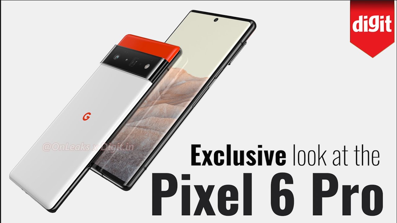
First, it is not just different for the sake of it. The neatly arranged sensor and lens combos can't easily snap photos of your fingers or butcher the ultrawide perspective as a corner camera island would. Plus, there will be ample strip space for our index finger to press against while we use the phone with one hand.
Second, the stripe is unique to look at and blends with the back without sticking out like a sore, erm, thumb, even though it IS elevated. Third, it's a design playground, as there can be numerous two- and three-color combos of the Pixel 6 now to keep its looks fresh and us entertained, as you can see from Waqar Khan's renders below.
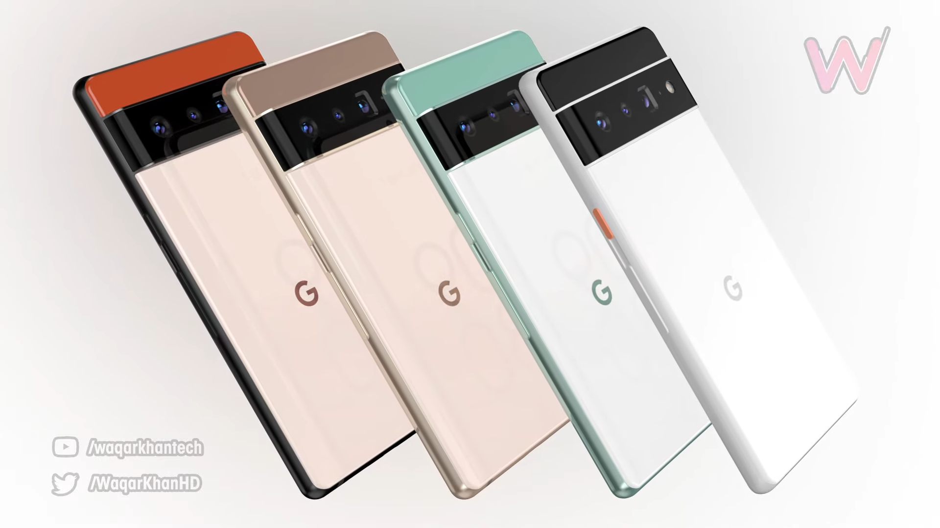
The Google Pixel 6 camera stripe can become a rich design playground
Much more than with a large glass slab with a protruding camera corner, that is. When we add the expected high-res, high refresh rate display, and the huge battery, the Pixel 6 XL is actually shaping up to be the phone to look forward to most this fall, provided that Google's second-to-none computational photography proves as good a triple camera as it is a single camera manager.
In a nutshell, even if no other manufacturer takes the Pixel 6 phone design cues, Google would have created a signature look for its handset line that will make them immediately recognizable. In a positive way, unlike Apple and its iPhone notch or baren camera islands. What do you think?







Things that are NOT allowed: