Pixel 3 only has gesture navigation and it is the future of Android
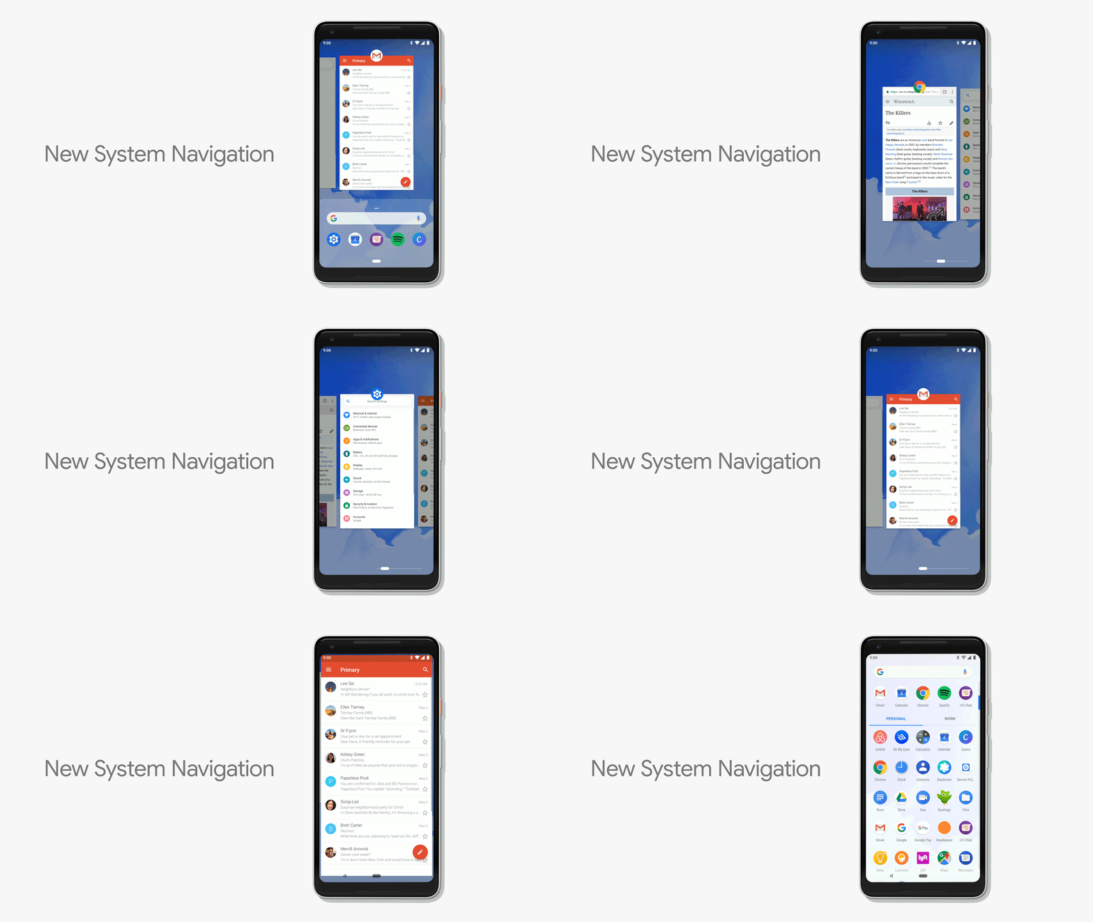
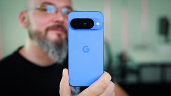
Gesture-based user interfaces, if well-executed, could be superior to traditional, button-based navigation, especially on bigger screens, where reaching down to the bottom is more cumbersome. Google seems to recognize this, as it introduced gesture-based navigation in Android 9.0 Pie as an alternative to the traditional navbar. With the Pixel 3 and Pixel 3 XL, Google has gone a step further to make it the default and only option.
That's right, on the Pixel 3 and Pixel 3 XL, you can't disable the gesture navigation and return to the familiar three-button scheme. But what's far more interesting and important, however, is that this decision also reflects Google's future plans for Android as a whole. In a reply to a user question on Twitter, the official @madebygoogle account tweeted that "Pixel 3 introduces a new pattern that will represent navigation on all Android phones going forward."
Hi! Pixel 3 introduces a new pattern that will represent navigation on all Android phones going forward. While change & adapting to new patterns is hard, we believe it's a better navigation pattern & makes app switching a faster experience.
— Made by Google (@madebygoogle) October 9, 2018
What this means is that gesture-based navigation will become an integral part of Android in the future and won't be limited to Pixel devices. Of course, considering the open nature of the OS, it is unlikely that Google will make it the only option and push phone makers to use it exclusively in their proprietary Android skins. So even if you don't like gesture-based interfaces, you'll still get your traditional navigation (as long as you stay away from Pixel phones).
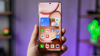
Having said this, many companies, such as Samsung, OnePlus, Xiaomi, and Huawei, have already begun developing (or released) their own takes on gesture navigation to varying degrees of success. Xiaomi's gesture UI is perhaps one of the best and it is easy and intuitive to use with either hand on both big and small screens. It is also arguably superior to Google's stock gesture navigation, as it doesn't take up any screen real estate with unneeded UI elements, whereas Google's implementation revolves around an interactive "pill" at the bottom of the screen.
Going forward, we're definitely going to see more Android phone makers offering different takes on gesture-based interfaces. We're just hoping that most Android skins will still offer the option to switch back to the traditional button-based navigation (for those who need it).
What do you make of this? Do you like this approach to controlling interfaces or would you rather tap your way through everything with the good ol' buttons? Tell us in the comments below.
ALSO READ:

Follow us on Google News





Things that are NOT allowed:
To help keep our community safe and free from spam, we apply temporary limits to newly created accounts: