Google Messages tests new read receipts redesign
Last year, Google gave its Messages app a makeover with a fresh design and new features. Now, it looks like Google is aiming to improve the app even more, as Google Messages is currently testing a new look for read receipts in RCS conversations.
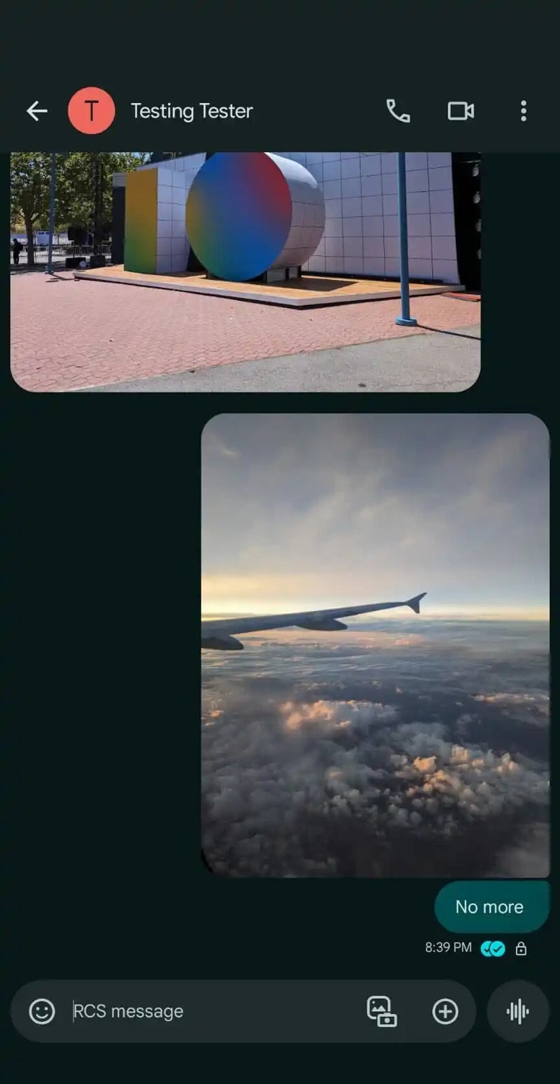
A recent report shows that Google is testing a redesign that moves read receipts inside the message bubble. Currently, read receipts are displayed below the message between the time/date and the RCS encryption lock.
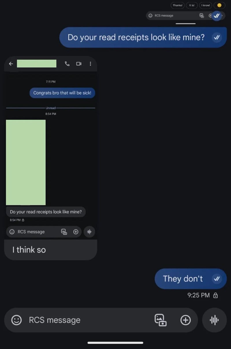
With the update, read receipts now appear on the right, inside a circle that is slightly lighter than the background. They still use checkmarks, and in images, they are shown in the bottom-right corner.
Google’s redesign makes read receipts visible on all previous messages, not just the latest one. This update isn’t available to everyone yet, and it’s unclear when it might be. Testing new features helps Google gauge user interest and adoption, so sometimes, features being tested might never roll out. However, it seems likely that this feature will eventually be released, though we’ll have to wait and see.
Google Messages comes preinstalled on many Android phones, making it the default messaging app for billions of people worldwide. Not long ago, Google reported that over one billion users are now using RCS in Google Messages each month.
However, it still has about half the monthly active users compared to apps like WhatsApp. If Google wants to compete better with rivals, making the interface more user-friendly could help. Plus, Samsung’s recent decision to drop its own Samsung Messages app in favor of Google’s could boost Google Messages’ user numbers even further.
Read receipts to move inside the message bubble
A recent report shows that Google is testing a redesign that moves read receipts inside the message bubble. Currently, read receipts are displayed below the message between the time/date and the RCS encryption lock.
Read receipts before (left image) and after (right image). | Image credit – 9to5Google
Google Messages comes preinstalled on many Android phones, making it the default messaging app for billions of people worldwide. Not long ago, Google reported that over one billion users are now using RCS in Google Messages each month.
Follow us on Google News




Things that are NOT allowed:
To help keep our community safe and free from spam, we apply temporary limits to newly created accounts: