Google Maps rolls out redesigned pins and new colors
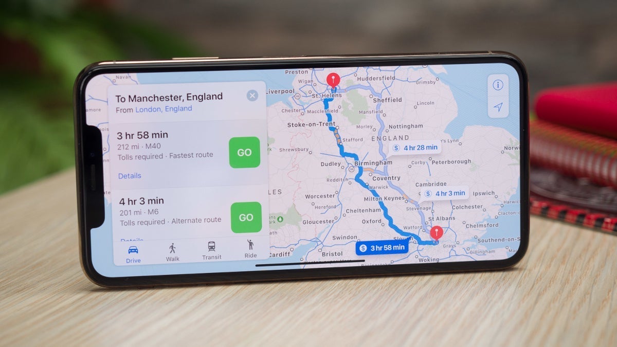
Last week, Google Maps rolled out a simplified bottom bar on mobile. Now, we're getting an update that brings new pin colors and shapes.
The iconic pin shape with a sharper point at the bottom is now gone. However, it's still in the app icon. Instead of it, with this new update, we're getting something shorter and more rounded with a white background. The icon that shows the category is housed in an inner circle. This matches the existing icon design for starts, flags, and hearts.
The new pin design makes the icons smaller which might allow Google to show more per map view. This server-side update is now rolling out for Android, iOS, and the web version.
I like the new design for the pins as it really does seem to allow for a more simple map, and can fit more information in it. The smaller pins give a cleaner look, and I'm all for that.
The iconic pin shape with a sharper point at the bottom is now gone. However, it's still in the app icon. Instead of it, with this new update, we're getting something shorter and more rounded with a white background. The icon that shows the category is housed in an inner circle. This matches the existing icon design for starts, flags, and hearts.
Most pins have remained the same while some have changed. For example, the one for museums is now purple instead of teal. Other color tweaks with the update are more subtle like the zoo icon going lighter. The change is also applied to text.
Image Credit - 9to5Google
The new pin design makes the icons smaller which might allow Google to show more per map view. This server-side update is now rolling out for Android, iOS, and the web version.
Follow us on Google News










Things that are NOT allowed:
To help keep our community safe and free from spam, we apply temporary limits to newly created accounts: