Google just stole the worst iPhone feature ever: It makes Pixel 6 unusable with one hand
This article may contain personal views and opinion from the author.
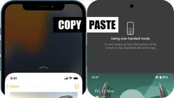
Right… Where do I start!
I’ve been using the Pixel 6 Pro for two weeks now, and I can confirm that the experience is far from perfect. However, software-based bugs are something that can be ironed out with updates. The Pixel 6 and 6 Pro will receive regular support from Google, so I wouldn’t be too worried about random app crashes, for example.
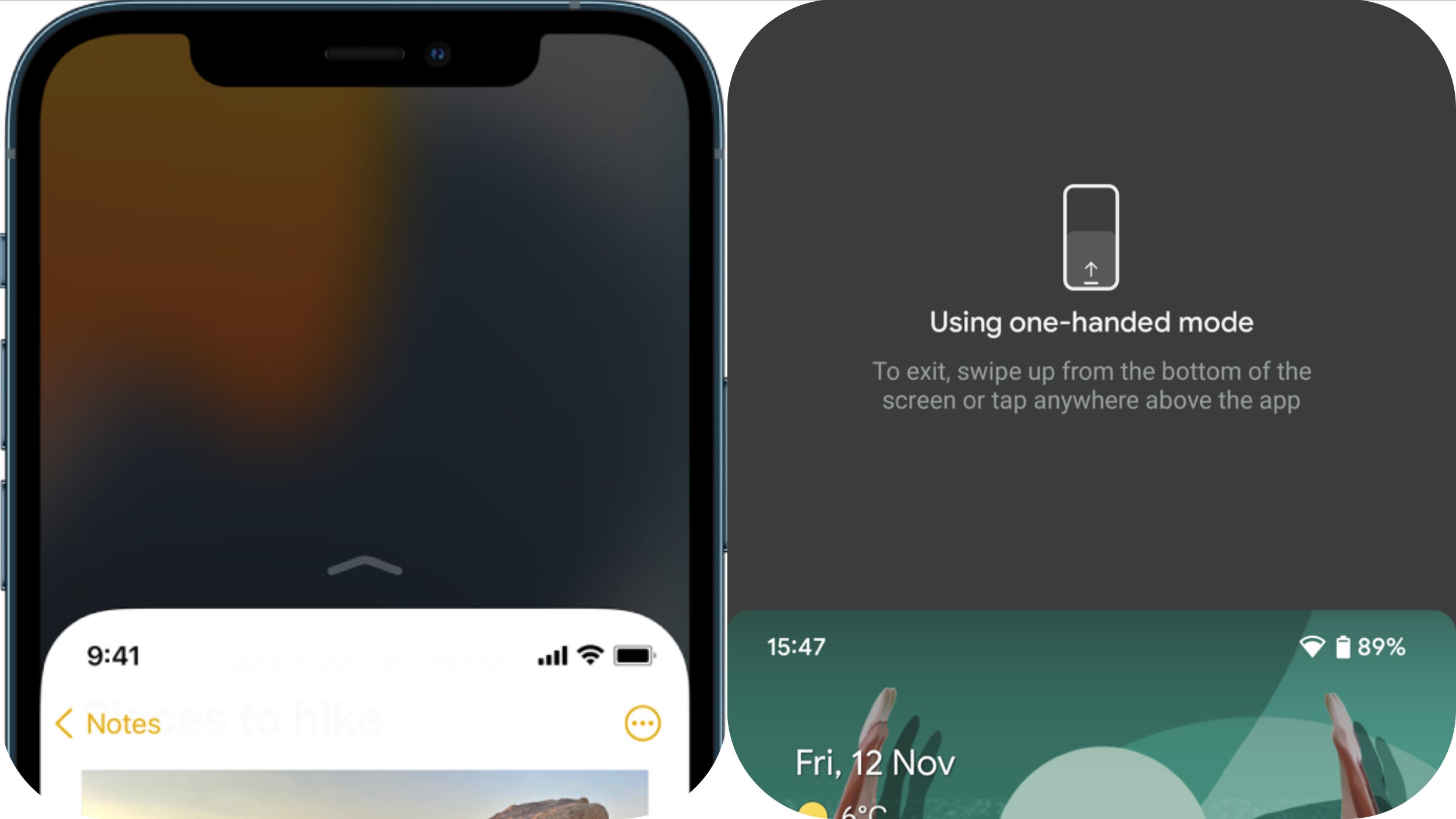
Pixel 6 and Pixel 6 Pro: Android 12 one-handed mode is pretty much useless
So, it seems like the under-display fingerprint scanner will remain the Pixel 6’s biggest flaw. However, apart from the offensively slow and unreliable scanner, the Pixel 6 and 6 Pro have another big problem, at least in my book. And this one is neither directly related to a software bug nor to a hardware issue. It’s simply a design flaw, which Google made by choice.
Samsung and One UI one-handed mode
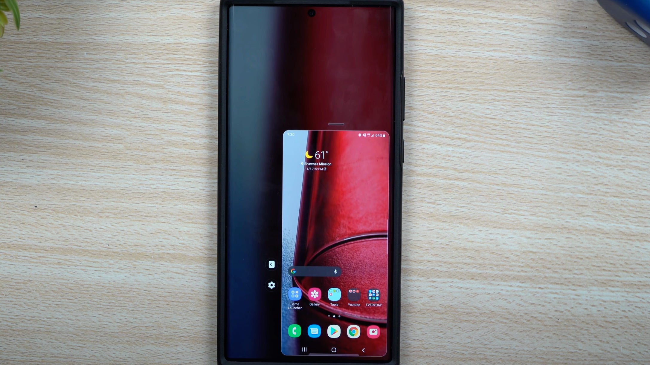
You enable one-handed mode in your Galaxy device settings, and then to summon one-handed mode when you need it, you swipe down in the center of the bottom edge of the screen if you’re using gesture navigation or double-tap the home button.
Samsung gives you all kinds of customization options - you can resize the active screen area, and you can move it to the left if you’re a lefty.
Huawei and EMUI/Harmony OS one-handed mode
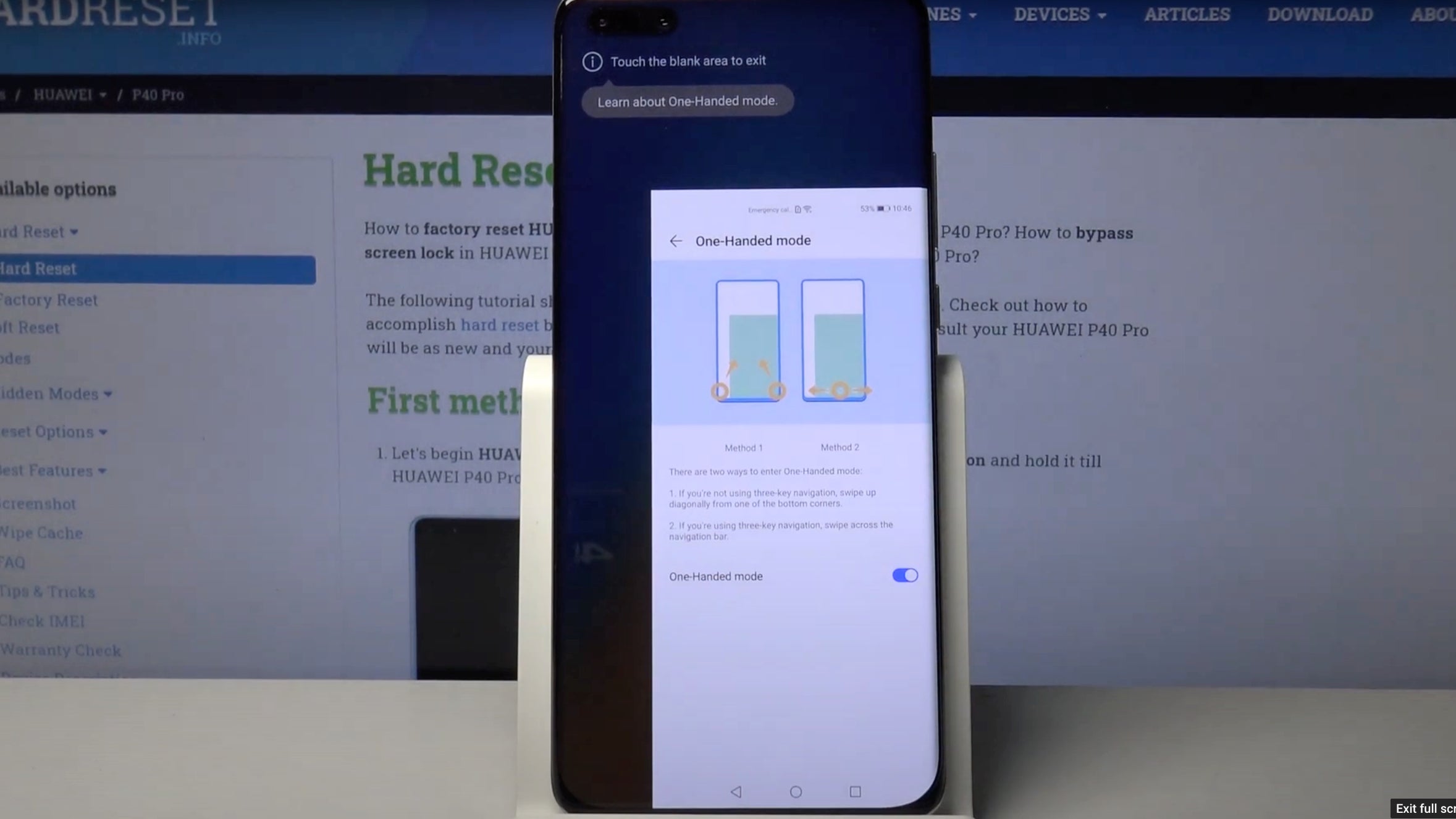
While Samsung’s one-handed mode is well-implemented, it’s Huawei’s version that’s my favorite.
To activate one-handed mode on my Huawei P30 Pro, I simply slide my finger across the bottom of the screen, either to the left or right, and this immediately scales the screen down. At least on this software version, you can’t resize the screen area like on Galaxy, which almost makes it cleaner and easier to use.
iPhone and iOS 15 one-handed mode
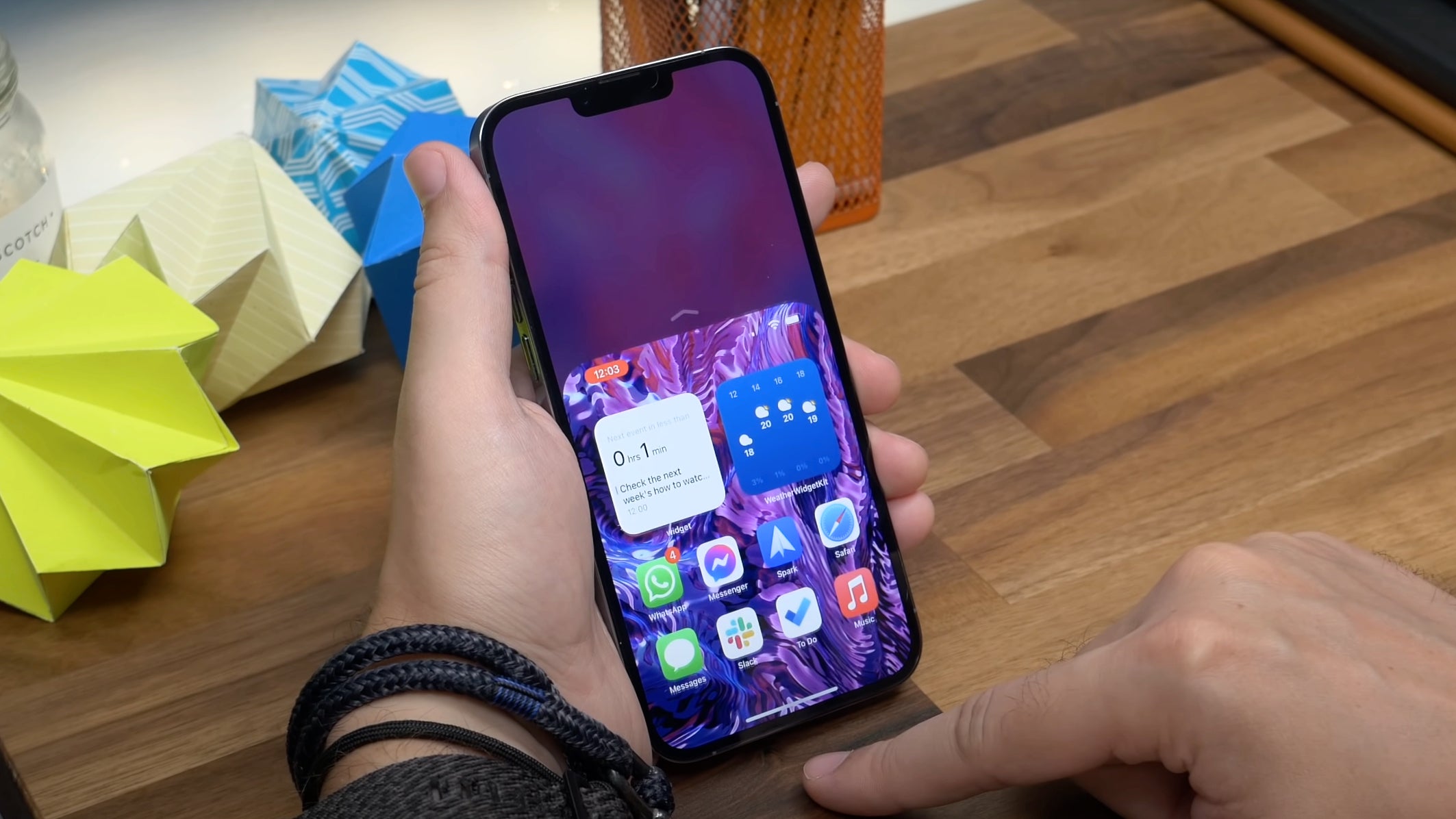
In true Apple fashion, the iPhone’s one-handed mode is super simple and totally un-customizable.
I believe we’ve come to agree that simplicity's been one of the best traits of the iPhone. For example, the seamless Face ID experience or the intuitive Night Mode. However, “it just works” unfortunately doesn’t apply to the iPhone’s one-handed mode. In fact, if anything, I’d go as far as to say… “it just doesn’t work”.
To go into the one-handed mode or Reachability as Apple calls it, you either swipe down in the center of the bottom edge of the screen (Samsung borrowed this from iOS) or double-tap on your home button if your iPhone has one.
Fine. However, pretty much anything, and I mean anything you’ll do after you’ve gone into one-handed mode, will disable the Reachability feature, which basically renders it useless, if you want to do anything more than reaching the Instagram icon on your home screen.
Google Pixel and Android 12 one-handed mode
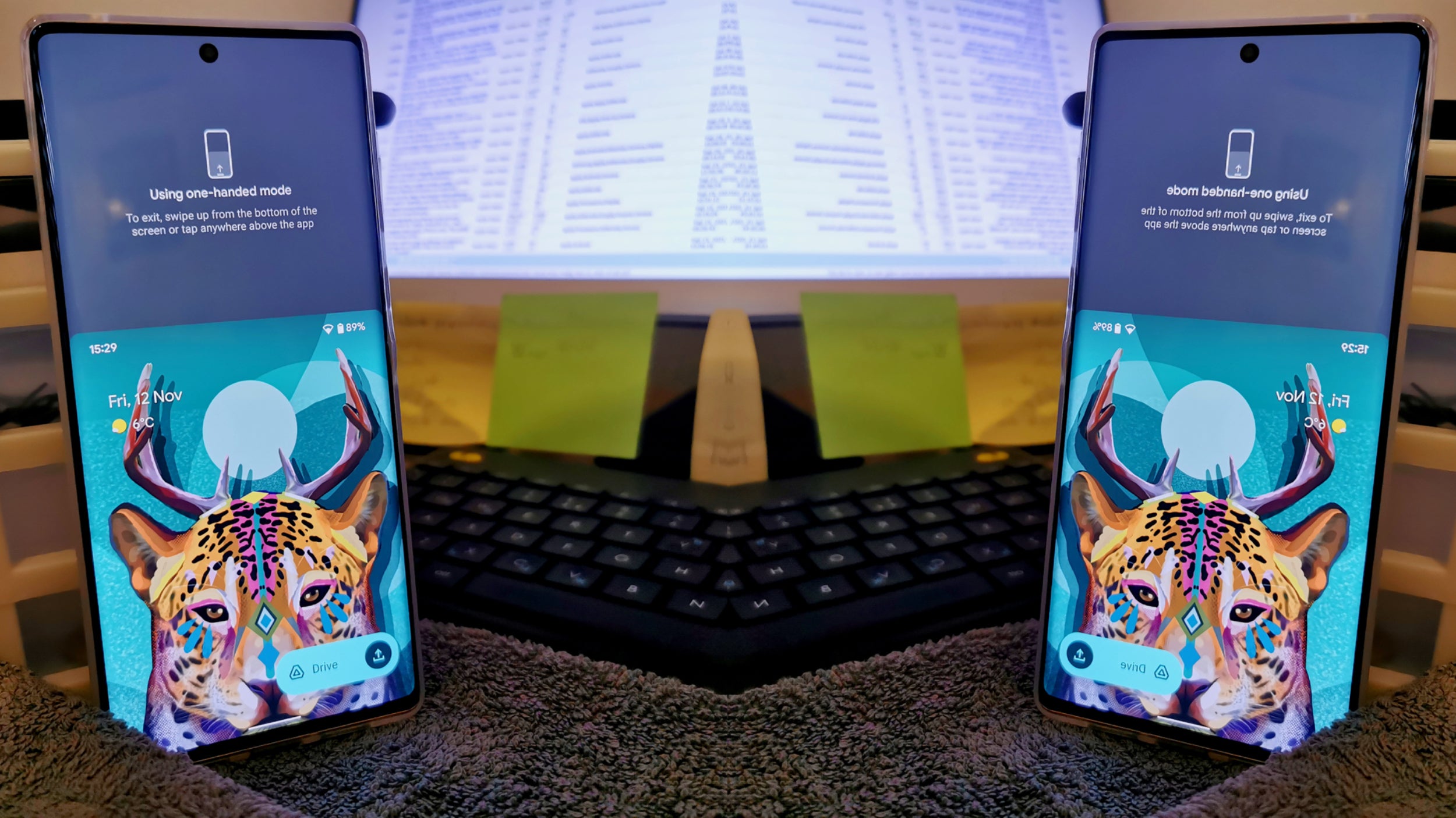
So, take a guess! Which route has Google gone down? Well, you already know from the title, but yes - Google ripped off the iPhone’s Reachability feature.
- You want to type with one hand? Sorry, you can’t.
- You want to see your full home screen, but just smaller? Nope.
- You want to reach the notification panel? Buy another phone.
I can keep going on and on. There are 1000 things you can’t do in one-handed mode on the Pixel 6 and 6 Pro.
Why is Google copying the worst implementation of one-handed mode?
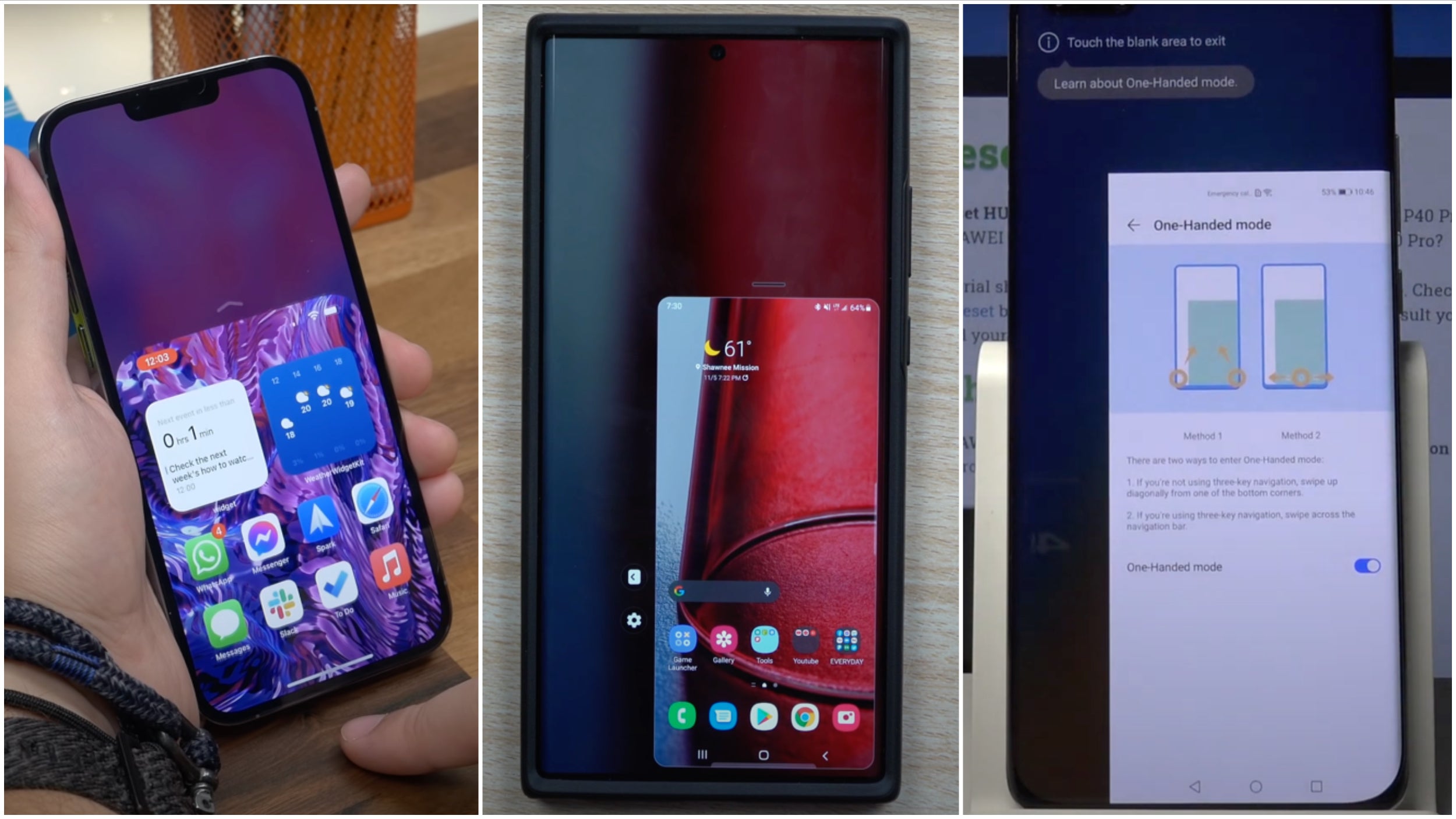
What makes Android Android is customization, options, functional design over aesthetics - not a pretty-looking UI element. For the record: Yes, Android 12’s one-handed mode does look more modern. But it’s also far from being practical.
In the end, that’s not the only compromise Google’s made when it comes to designing the Pixel 6 and Pixel 6 Pro. I’ve already covered the new camera bar on the Pixel 6 series and how it seems to trade looks for functionality.
Ironically, in this case, Google went counter-Apple. So it seems like both Android 12 and Pixel 6 have borrowed some iOS and iPhone traits and features, but it’s almost as if they took the wrong ones and left out these that would have made the Pixel 6 better.
I’ll leave you with one thing. Google, if you’re reading this:
We want the Pixel to become a better Android phone. Not a better iPhone. Leave that to Apple.
P.S. Please, feel free to steal the good stuff! That goes to Apple too. We wouldn’t mind split-screen multitasking, Cupertino...






Things that are NOT allowed: