Google Home app getting redesigned light controls and a new Inbox

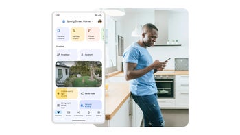
Following the massive update that the Google Home app received back in March, it is now working on a new version with some additional changes. Some of the most obvious changes are the introduction of an Inbox and redesigned lighting controls.
This redesign, as reported by 9to5Google, is currently rolling out server-side to those who are enrolled in the Google Home Public Preview program. One of the most obvious design changes is the introduction of a notification bell icon that sits on the top of the favorites tab. Tapping on this notification bell brings up the Inbox feed, which is basically a redesigned activity tab.
Another very noticeable design change is what is rolling out with version 3.1, which will completely transform the look of the lighting controls. This change is currently only visible on that version which is only available in the Dogfood build, meaning the version of the app that is still being tested internally and with a trusted group.
The new lighting controls replace the familiar adjustment ring with a pill-shaped slider, enhancements to the color controls, and a grid of lighting presets. The enhanced color controls now let you adjust the temperature and color, allowing you to get more granular when wanting to pick a specific color.
Source: 9to5Google
It's not clear when the new version will be rolled out to users. However, judging by the work has been done on it so far, it's clear that Google is committed to making the Google Home app a one-stop-shop for your smart home.


Things that are NOT allowed: