Google Files App gets new "Recents" carousel for faster file access
The Files by Google app on Android has undergone an interesting change to its "Recents" feature, making it faster and more convenient for users to access their most recent files.
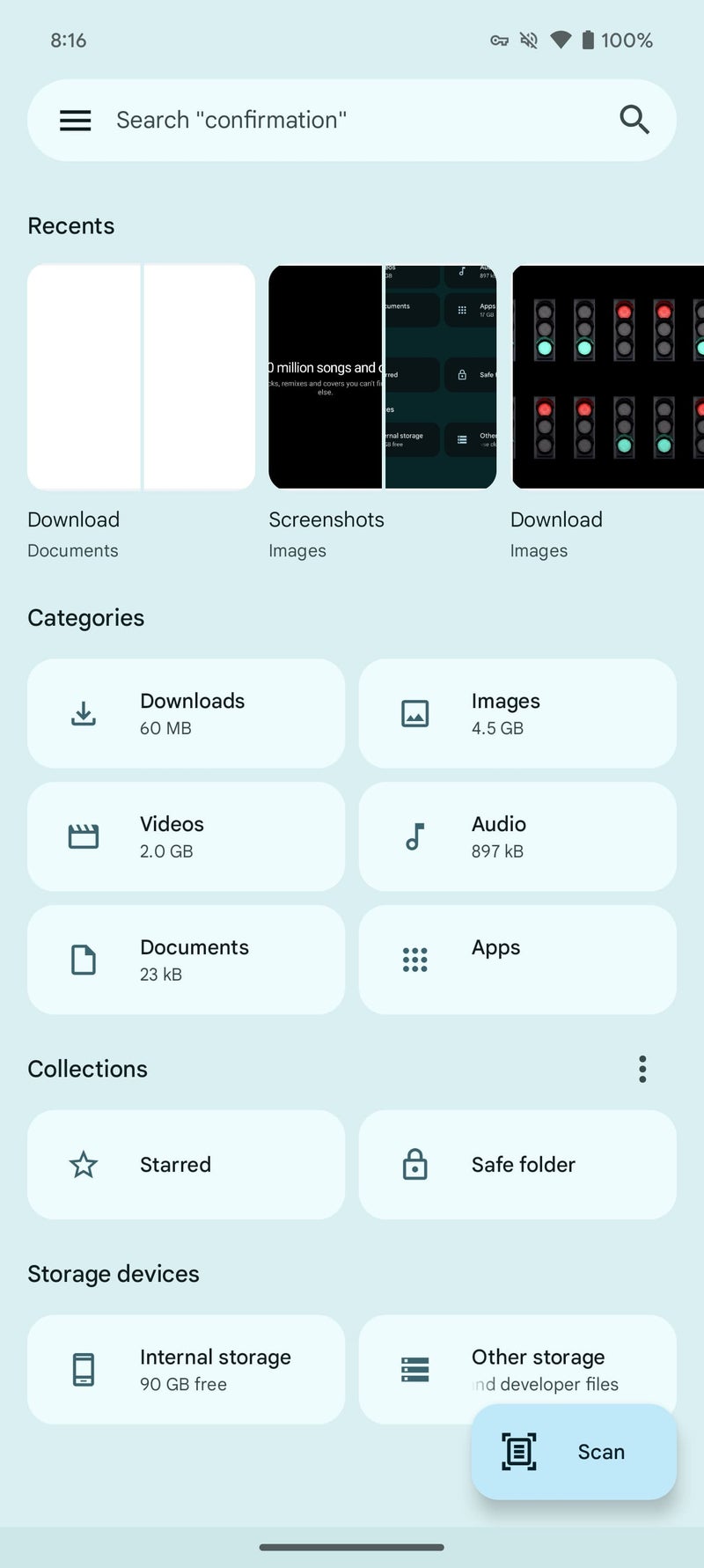
Previously, "Recents" displayed folders like Camera, Screenshots, and Downloads, with a 2x2 grid providing a small preview of each folder's contents. To access a specific file, users had to tap on a folder and navigate to the desired item within.
Now, with the latest beta version of Files by Google, "Recents" has been transformed into a carousel of rectangular cards that directly show a preview of each individual file, including images and documents. This change eliminates the need to navigate through folders, making it faster and easier for users to find and open recent files.
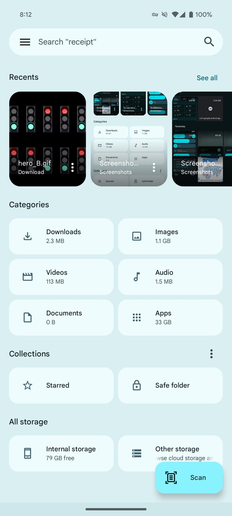
Each card in the carousel displays the file's name and extension at the bottom, along with a three-dot overflow menu that allows users to quickly share, delete, or add the file to starred items. The carousel shows 10 items at a time, and users can tap "See all" in the top-right corner to access a new "Recents" tabs view that organizes files by their respective folders.
This update to Files by Google's "Recents" feature is similar to the carousel design that Google Photos uses for its Memories feature. It prioritizes speed and convenience, allowing users to access recent files directly from the carousel without having to navigate through folders first.
This new "Recents" carousel is currently available in version 1.4374.x of Files by Google, which is the latest beta version. After updating to this version, it may take a moment for the new view to populate.
This change represents a significant improvement in the user experience for Files by Google, making it more efficient and user-friendly for users to access their recent files. I expect that it will be a welcome change by those that are regular users of the app, which hasn't seen any significant UI changes in a while.
Previously, "Recents" displayed folders like Camera, Screenshots, and Downloads, with a 2x2 grid providing a small preview of each folder's contents. To access a specific file, users had to tap on a folder and navigate to the desired item within.
Now, with the latest beta version of Files by Google, "Recents" has been transformed into a carousel of rectangular cards that directly show a preview of each individual file, including images and documents. This change eliminates the need to navigate through folders, making it faster and easier for users to find and open recent files.


Old Files by Google "Recents" view versus the new carousel | Images credit — 9to5Google
This update to Files by Google's "Recents" feature is similar to the carousel design that Google Photos uses for its Memories feature. It prioritizes speed and convenience, allowing users to access recent files directly from the carousel without having to navigate through folders first.
This new "Recents" carousel is currently available in version 1.4374.x of Files by Google, which is the latest beta version. After updating to this version, it may take a moment for the new view to populate.
This change represents a significant improvement in the user experience for Files by Google, making it more efficient and user-friendly for users to access their recent files. I expect that it will be a welcome change by those that are regular users of the app, which hasn't seen any significant UI changes in a while.

Popular stories


Latest News

Things that are NOT allowed:
To help keep our community safe and free from spam, we apply temporary limits to newly created accounts: