Google's Play Store changes should improve the quality of apps for the Galaxy Z Fold 5
We may earn a commission if you make a purchase from the links on this page.
In an effort to get Android app developers off their keisters to optimize their apps for Android tablets and other large-screened devices, Google announced in the Android Developers Blog that it has updated the Google Play Store in order to help those with tablets, foldables, and Chromebooks more easily find "high-quality large-screened apps."
One change involves putting video banners on the listings of optimized games. Google says that this will allow users "to get a sense of gameplay in an immersive way." The listing of these games has also been changed to include a multi-column layout that brings the content of the listing higher up on the page.
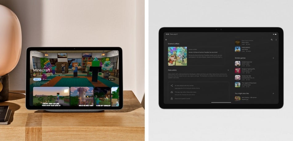
Optimized games will get a video banner and a multi-column layout
Another change made by Google involves ranking apps that follow Google's new large screen app quality guidelines. The change will help Google promote apps that look better and are resized for larger screens, aren't letterboxed, and support both landscape and portrait orientations. Google says that "Apps and games that adhere to our large screen app quality guidelines will now be ranked higher in search and Apps and Games Home." Curated Android app collections will take all of these things into account as will Editor's Choice in determining which apps to feature to users.
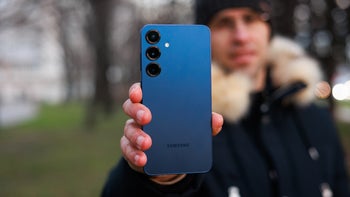
Pre-order the Samsung Galaxy Z Fold 5 now!
Google has also added a rail to the left side of the Play Store on Android devices sporting larger screens. This places menu items closer to users' thumbs, especially in landscape mode. Google adds, "...we’ve moved the Top Charts and Categories sections to Apps and Games Home. On tablets and Chromebooks, we’ve made the Kids experience a primary tab, since these devices are often shared with children."
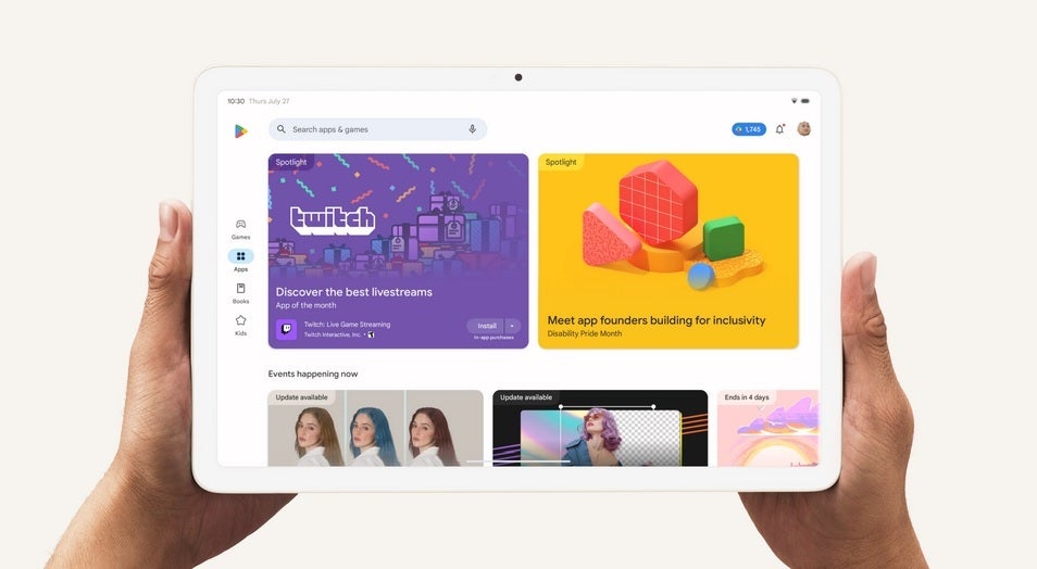
The Play Store will add a rail to the left side on large-screened Android devices bringing items closer to users' thumbs
And on large-screened devices, Google has changed the search experience by showing search results and app details side-by-side which means that users don't have to switch back and forth between pages when looking for new apps.
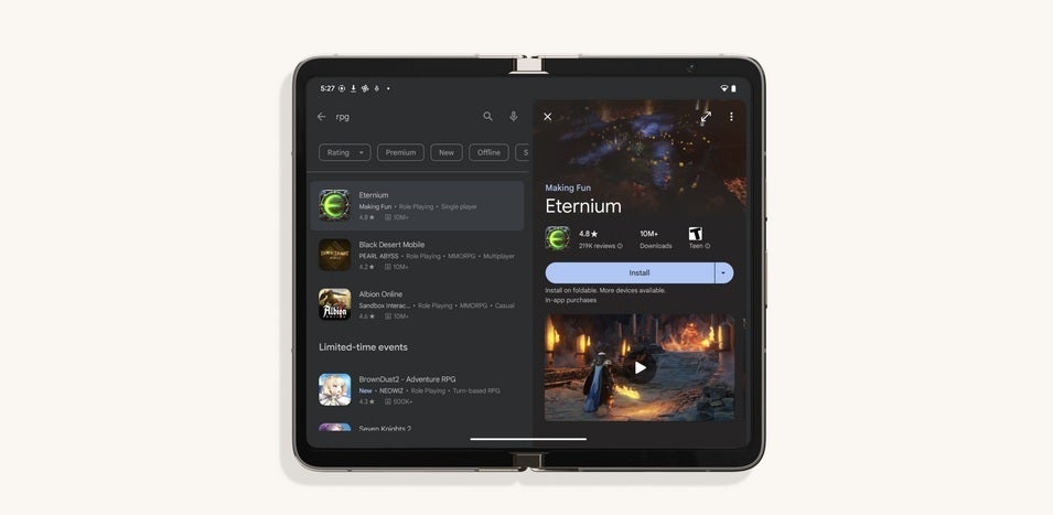
Search results on large-screened Android devices will be side-by-side with app details
The changes will be rolling out over the "coming weeks" and Google says that this is "just the beginning of our journey in creating a tailored Play Store experience for large screens." Developers who don't want to optimize their apps to look and work better on large-screened Android apps will, in theory, miss out on having their apps promoted compared to apps that have been optimized to meet Google's standards.
Follow us on Google News


Things that are NOT allowed:
To help keep our community safe and free from spam, we apply temporary limits to newly created accounts: